The combination of colors in the interior: combine curtains and wallpaper
To create a harmonious and beautiful interior, it is necessary to take into account the color balance of finishes, furniture and decor items. So, wall decoration and curtains on the windows should ideally fit each other or successfully contrast with each other. It all depends on the style of the interior and its tonality. Today we will talk about the important color combination of curtains and wallpaper.
Special features
Modern manufacturers produce wallpapers of various colors. This means that there are absolutely no obstacles for consumers in creating an interesting and original interior.Canvases of classic or bright colors can be glued to the walls. It all depends on the personal preferences of the owners and the immediate style of the room.
However, in any room must be present organic color combination. This applies not only to the balance of shades of finishes and furniture, but also decorative elements. If the colors of the interior components in combinations look inharmonious or displace each other, the design can turn out to be ridiculous and incomplete.
One of the most common decorative details in the interior are curtains. They not only complement the design of the room, but also protect the space from the penetration of sunlight. Moreover, these details are indispensable if your dwelling is located on the lower floors, since unauthorized people can drop into the unlocked rooms.
Few people pay enough attention to the compatibility of shades of curtains and wallpaper, which is a strong omission. These elements should match each other in color. Otherwise, their bad combination can spoil the image of the room.
Fundamental rules
There are several key rules, following which, to form an organic and complete interior. no trouble:
- The main rule in the selection of curtains for certain wall wallpaper is that these parts should not be painted in the same shades. This combination can lead to the fact that the interior seems too boring and "bland", and the curtains against the walls dissolve and lose any decorative sense;
- if you want the colors of the wallpaper and curtains to fit each other and have similar shades, then you need to take into account one simple rule: the color of the curtains should be different from the walls, at least for a couple of tones. Many designers argue that in such situations it is better to choose darker fabrics that stand out from the wallpaper;
- it is better to select models that are similar in color, rather than sharply contrasting with each other;
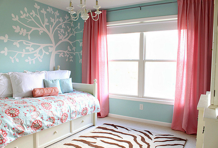
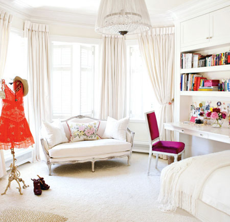
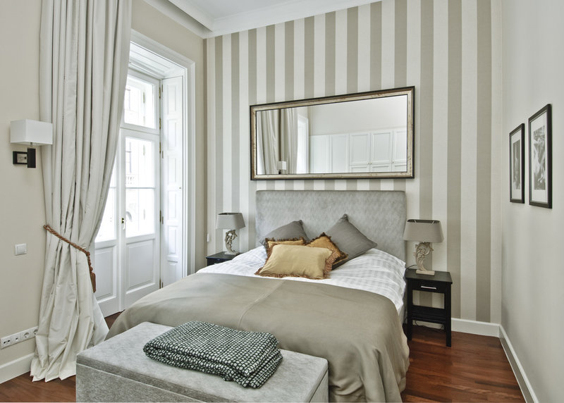
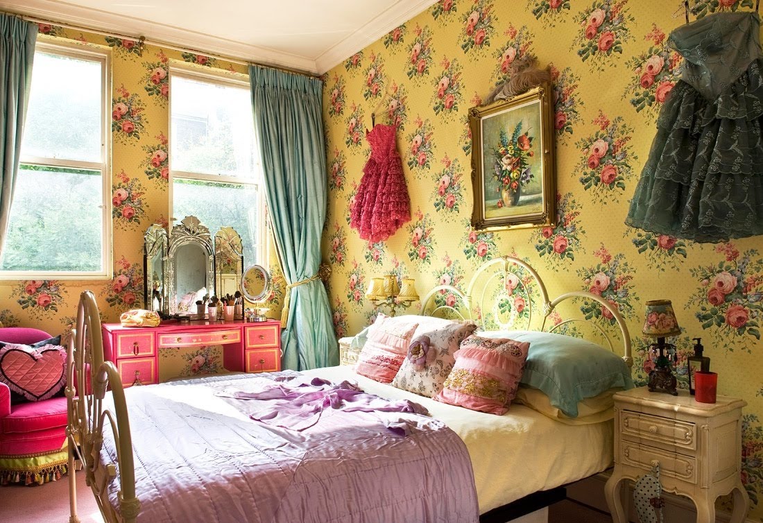
- as close as possible in color curtains and wallpaper is recommended to buy for the design of the bedroom. Such combinations have a relaxing effect and create a soothing atmosphere in the room;
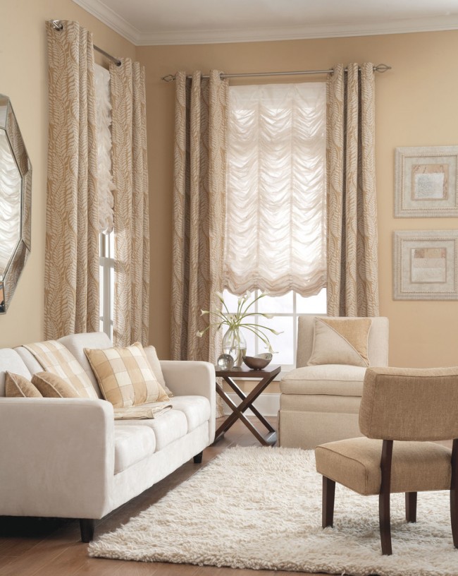
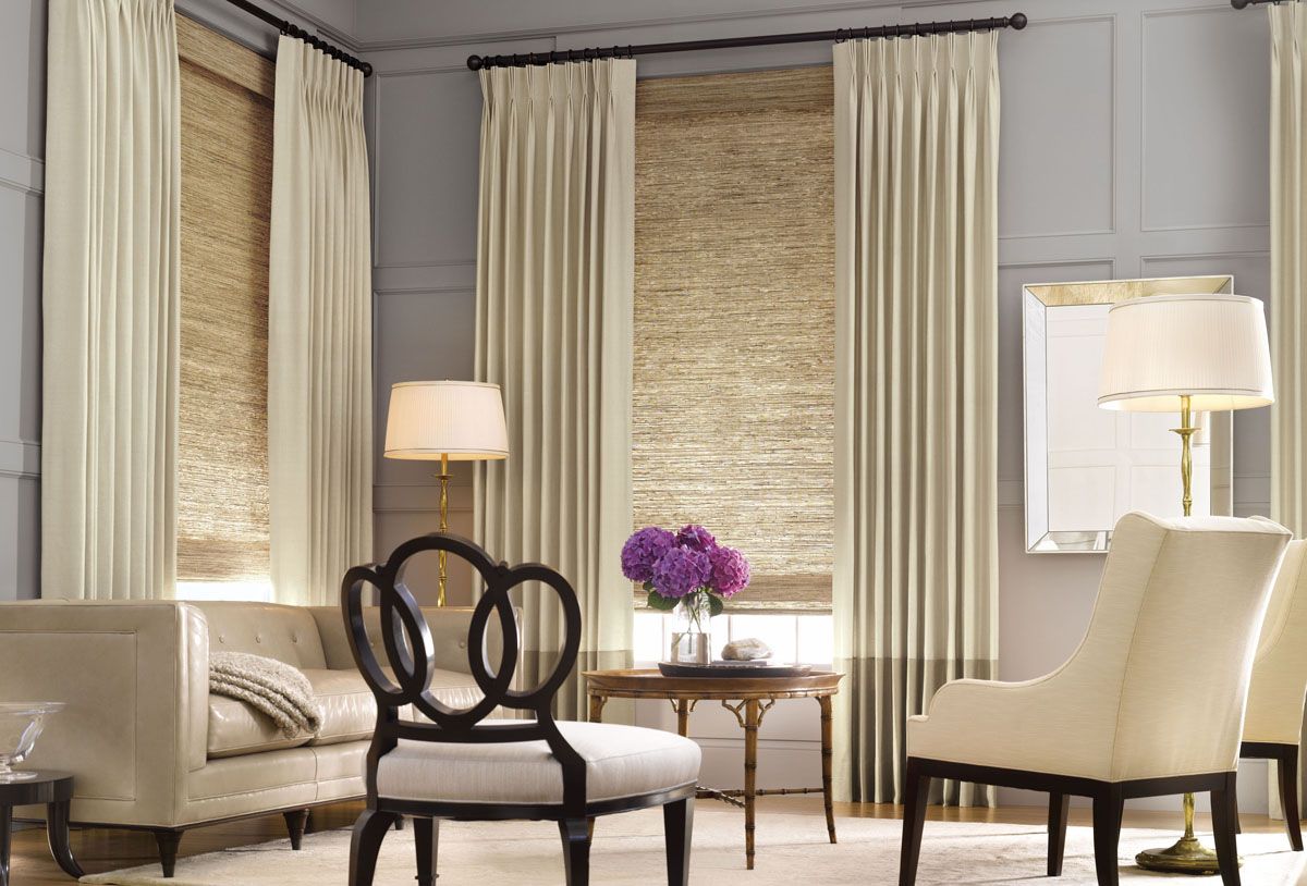
- it is necessary to take into account the fact that the pastel shades of the curtains are considered to be universal, since they can be combined with almost any wall colors. For example, nude paint is permissible to use in both light and dark rooms;
- If you want to buy both wallpapers and curtains of similar colors, you can turn to another interesting technique: choose wall coverings of the same color, and curtains - completely different. But in the latter, the fabric can be decorated with prints or patterns painted in a color similar to wallpaper;
- in bright and saturated ensembles it is not recommended to choose curtains with classic dull patterns, otherwise the interior will look boring and monotonous. If you want to revive the ensemble, then you can hang white curtains in it. They may also have an unobtrusive mother-of-pearl shade;
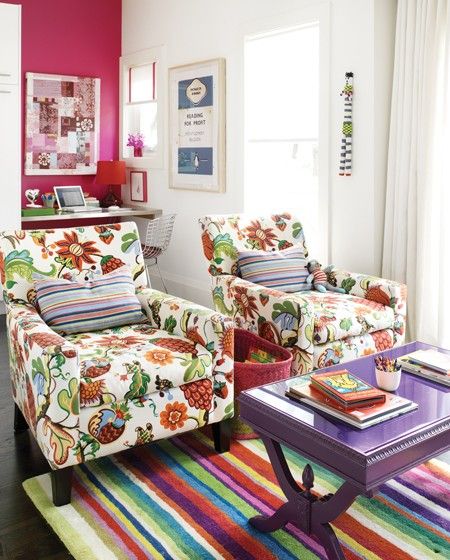
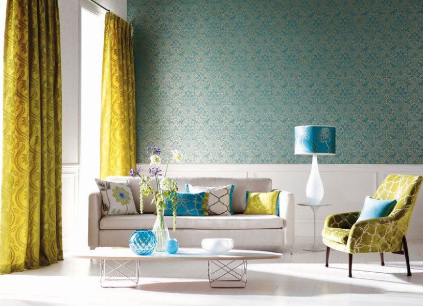
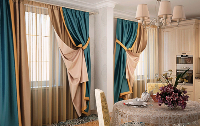
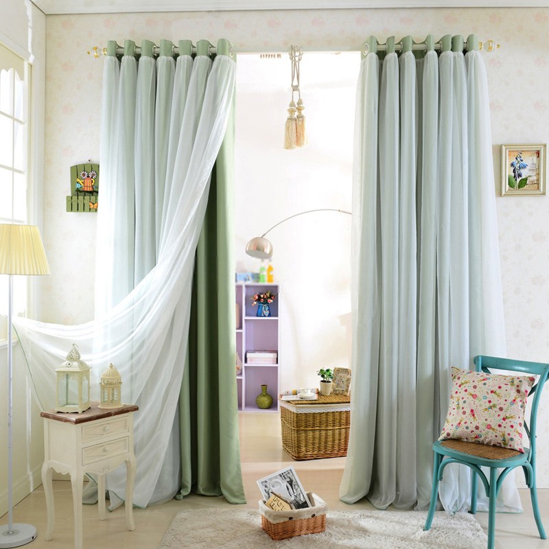
- some owners bring in the interior and another one - the third shade. For example, it can be multi-layered fabrics of different colors. Such design decisions are considered quite bold. It is recommended to choose a third brighter shade that will be in harmony with the other two colors.
Warm tones
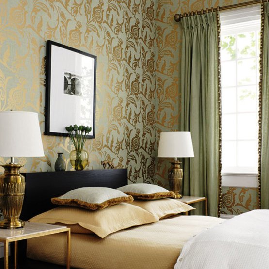
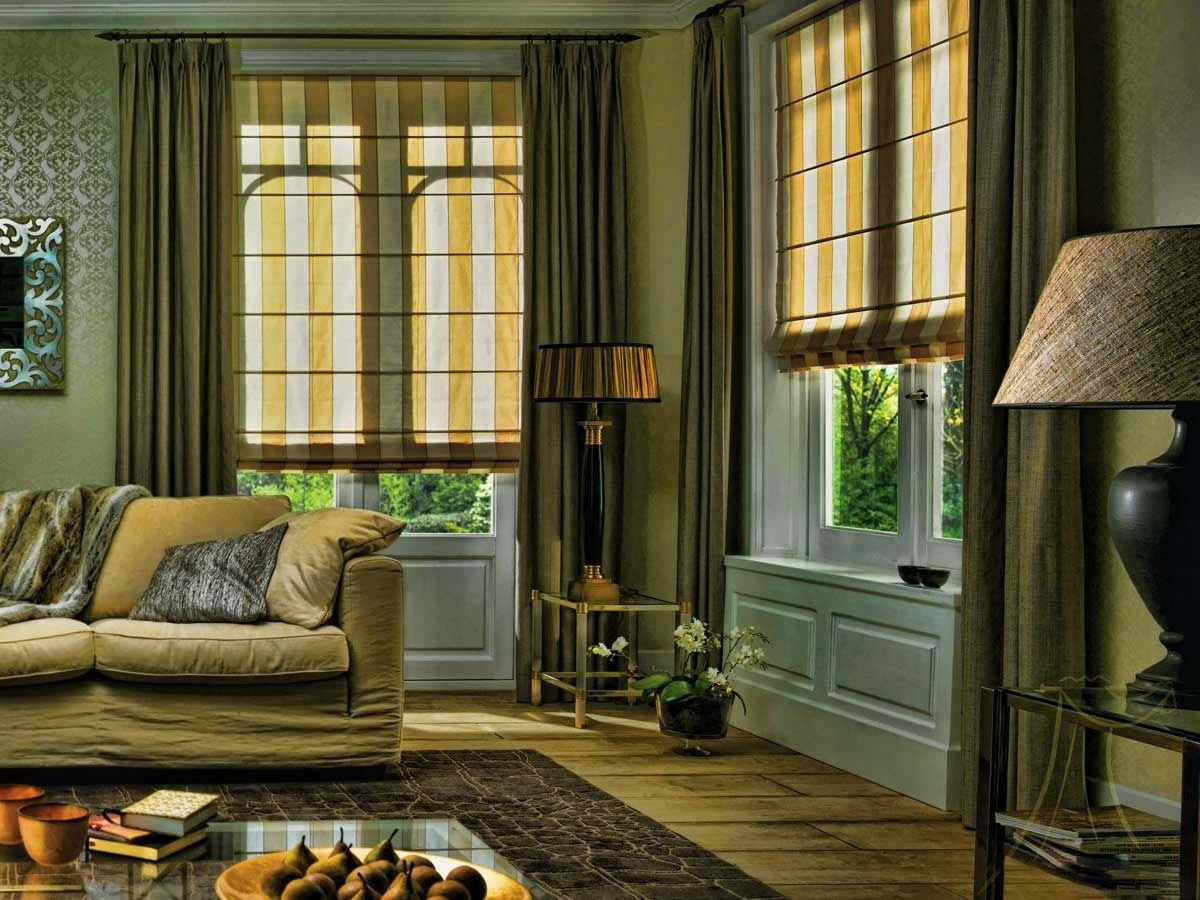
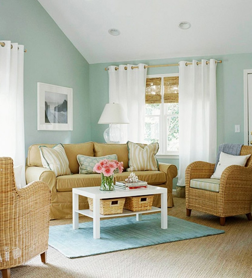
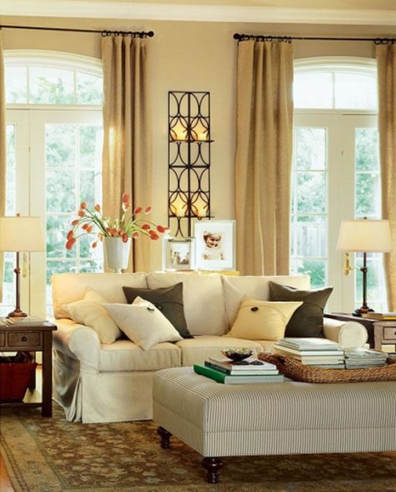
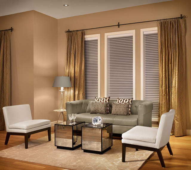
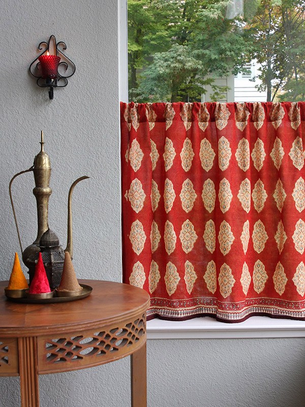
One of the most popular and attractive combinations of warm colors in the interior. They are in harmony with many shades and differ in an unobtrusive look. For example, beige details are closer to light. They include shade of baked milk and champagne.Curtains of a similar palette, as well as golden, yellow, red and orange products are perfect for such a range of wallpapers. Original solutions will be fabrics of both warm and cold rulers:
- blue;
- green;
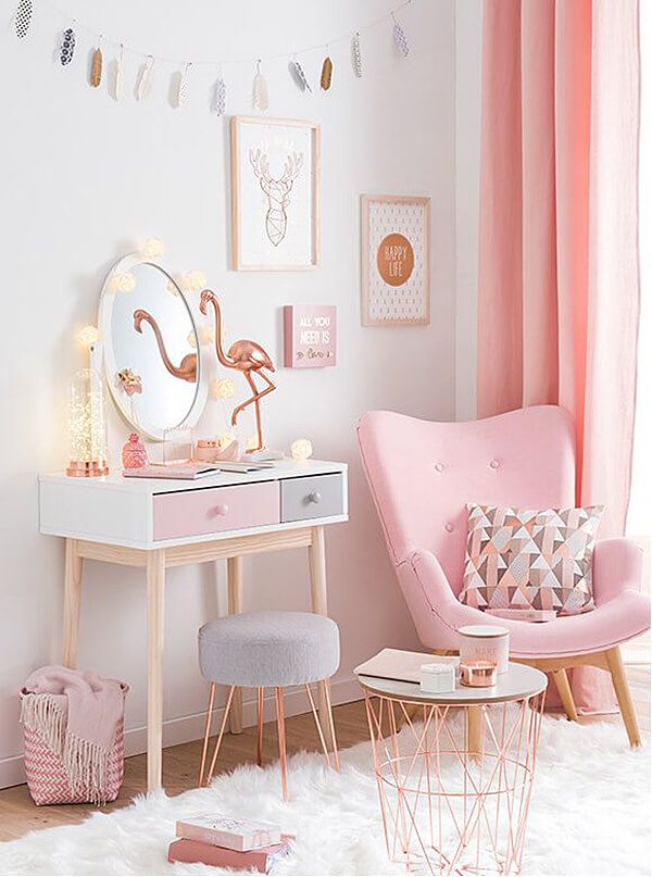
- pink
- lilac;
- and even black.
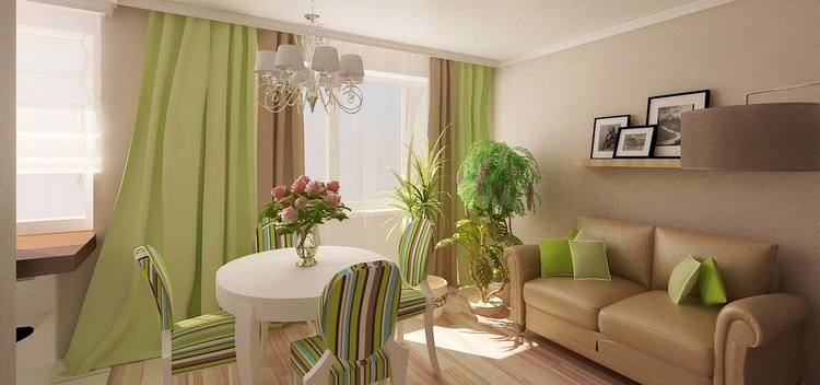
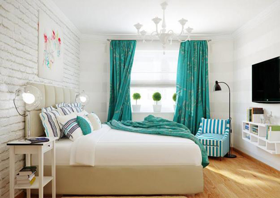
Also, warm tones can include soft brown and peach items. They look great in combination with pink, red, yellow, turquoise (and green), rich red, white or sand tones. The main thing, so that they are combined with contrasting cool shades.
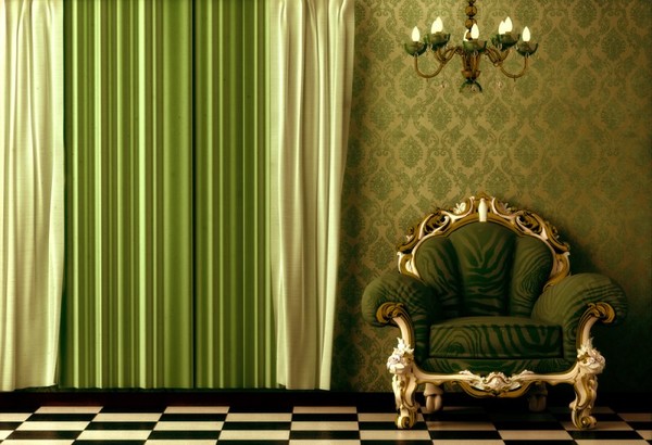
Recently, finishing materials and textiles of pistachio and olive color are popular. Such elements are recommended to be diluted with yellow, white, chocolate or scarlet "companions".
With warm colors in the interior, be careful, as they can visually reduce the space and make it monotonous. They must be diluted with cold, dark and light colors to make the situation more “alive”.
Cool shades
Cold shades in the interior can visually make the room more spacious. However, not all palettes are also suitable for them:
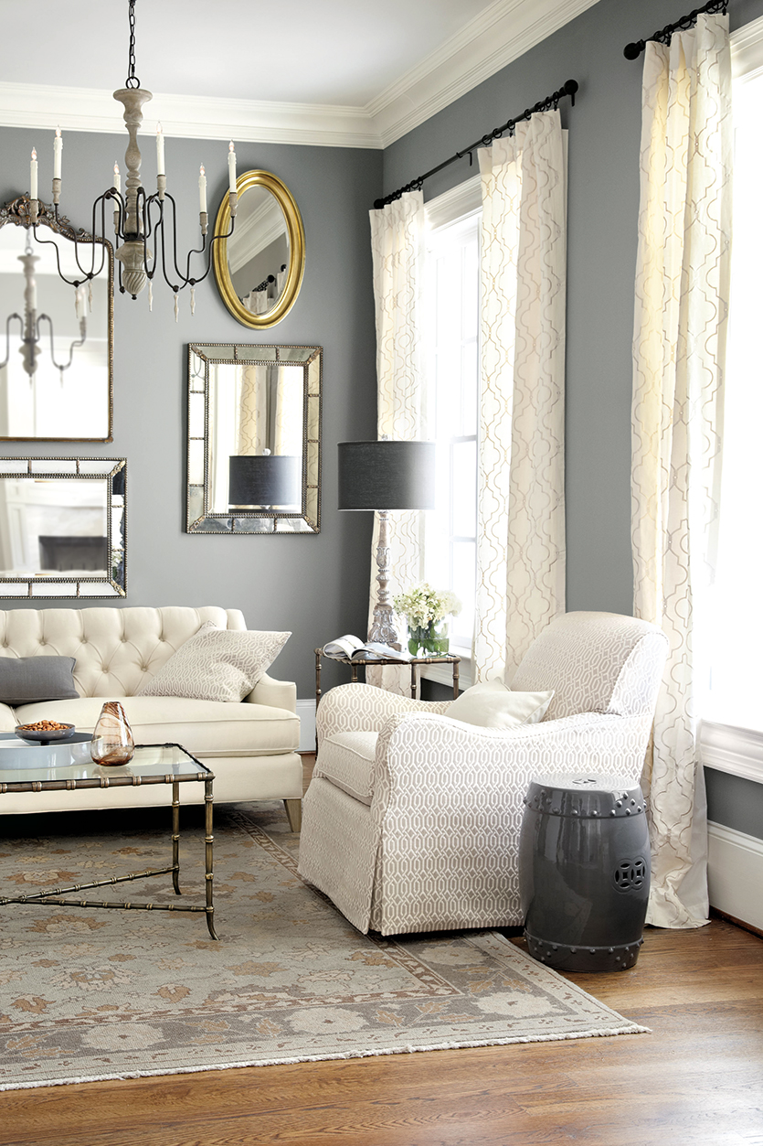
- universal are shades of white. To curtains or wallpaper of this color, you can safely choose absolutely any ornaments;
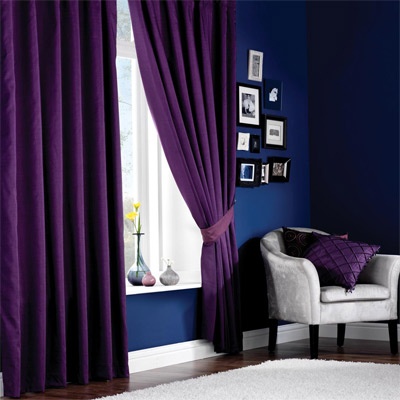
- textiles of violet or lilac shade are perfect for the blue walls;
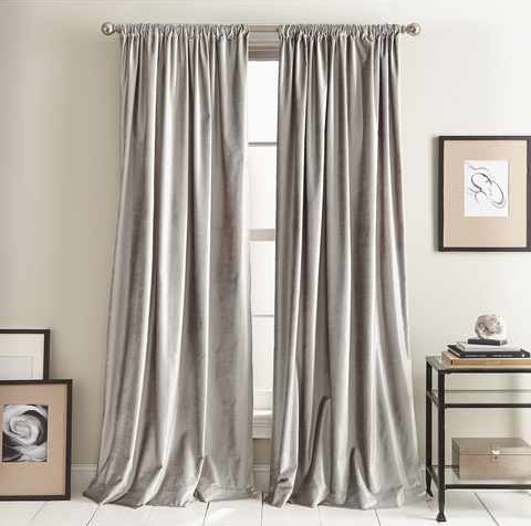
- if there are airy blue wallpapers on the walls, they are recommended to choose silver or gray curtains;
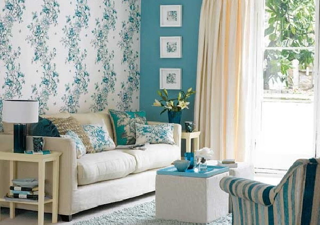
- cool emerald or turquoise curtains will look organically with many colors of the walls. However, one of the brightest and most sensual is the tandem with burgundy wall covering.
Cold combinations are recommended to be diluted with a small amount of “warm” interior details. This is necessary so that the ensemble does not seem too "frosty."
Actual trends
The trend of recent years is the wallpaper and curtains of the following attractive colors:
- calm pastel shades of "custard", as well as neutral dairy products;
- cool and futuristic metallic coatings and fabrics;
- expensive silver tones;
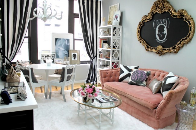
- Contrasting black-and-white combinations ideal for modern or hi-tech;
- golden paint, which often complement the unobtrusive and elegant prints;
- dark gray-green canvas.

Popular patterns
Today in the shops you can meet not only plain wallpaper and curtains, but also options with interesting patterns and prints. One of the most fashionable and interesting are surfaces with contrasting monograms. As a rule, these decorations are complemented by wallpaper. They can be glued in the living room and in the bedroom. They are diluted monotonous light or thick curtains.
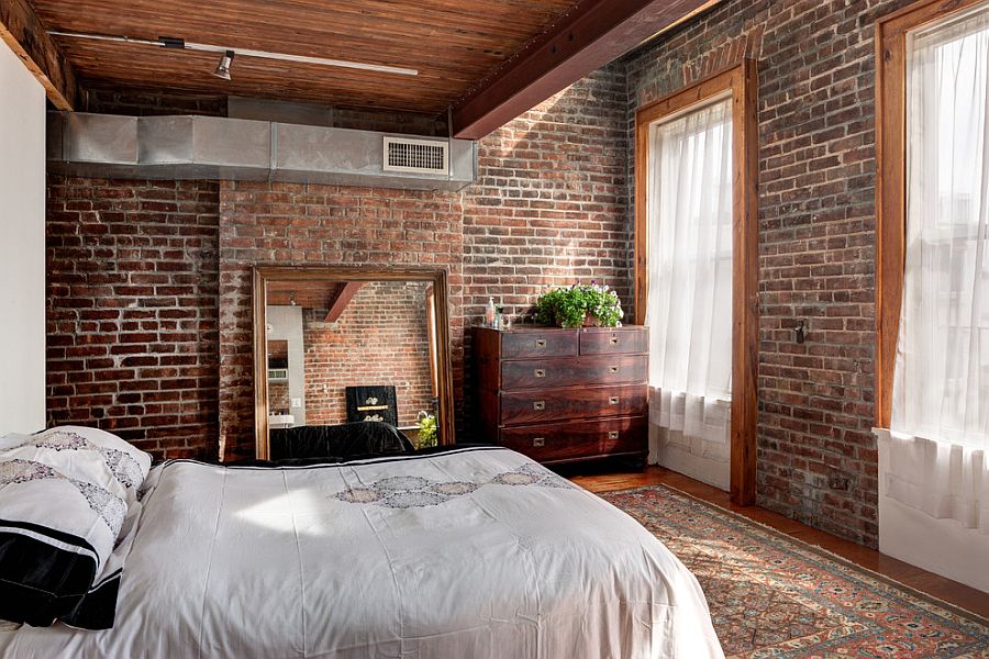
Also today are very common wallpaper under the brick. They are well combined with many fabrics: both monophonic and decorated with beautiful prints of simple and regular shapes.
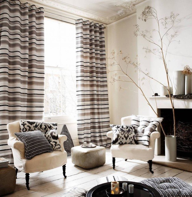
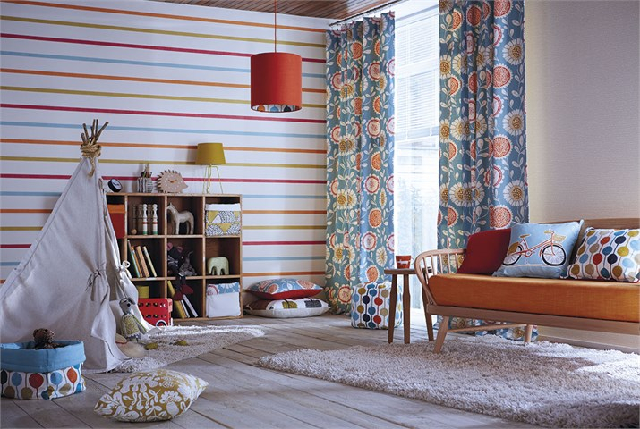
Using a pattern such as strips, you can slightly change the structure of the layout. For example, surfaces with vertical striped print visually lift the ceiling and look great in classic ensembles. If the stripes are arranged horizontally, then they visually "pushing" the wall, making the space wider, but slightly lower.
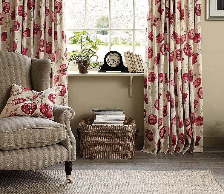
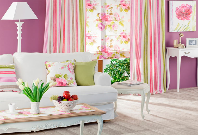
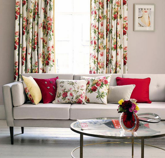
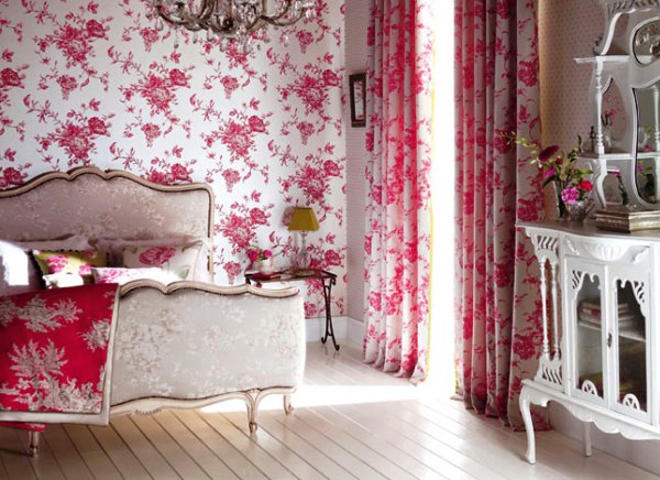
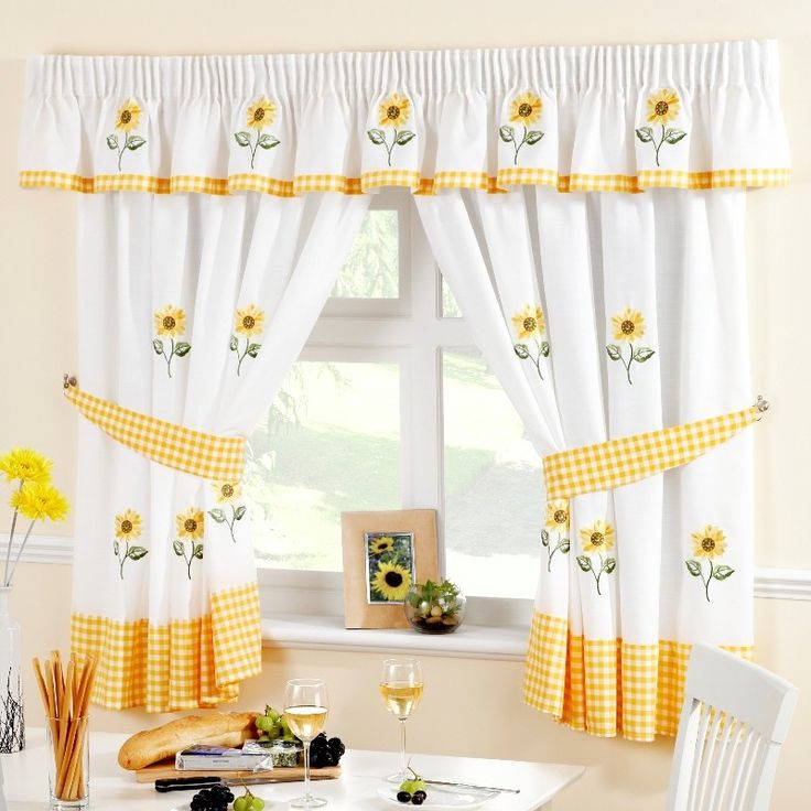
Another popular decoration of both wallpaper and curtains is a flower. For wall decoration with such patterns, it is permissible to choose curtains with similar compositions. However, the flower must be larger on the fabric.
Selection of suitable prints should occur in accordance with the style of the interior.
Choose a single style
Choosing a harmonious combination of curtains and wallpaper, you must adhere to The main stylistic direction of the room:
- In the classic ensemble, you can enter monochromatic materials of wall decoration or wallpaper with stripes. In such interiors it is better to use fashionable Roman or Italian curtains of a neutral shade;
- White wallpapers and contrasting black-and-white curtains on metal cornices are perfect for a modern interior;
- if you like bright shades and elegant contrasts, then you should decorate the room in the Art Deco style;
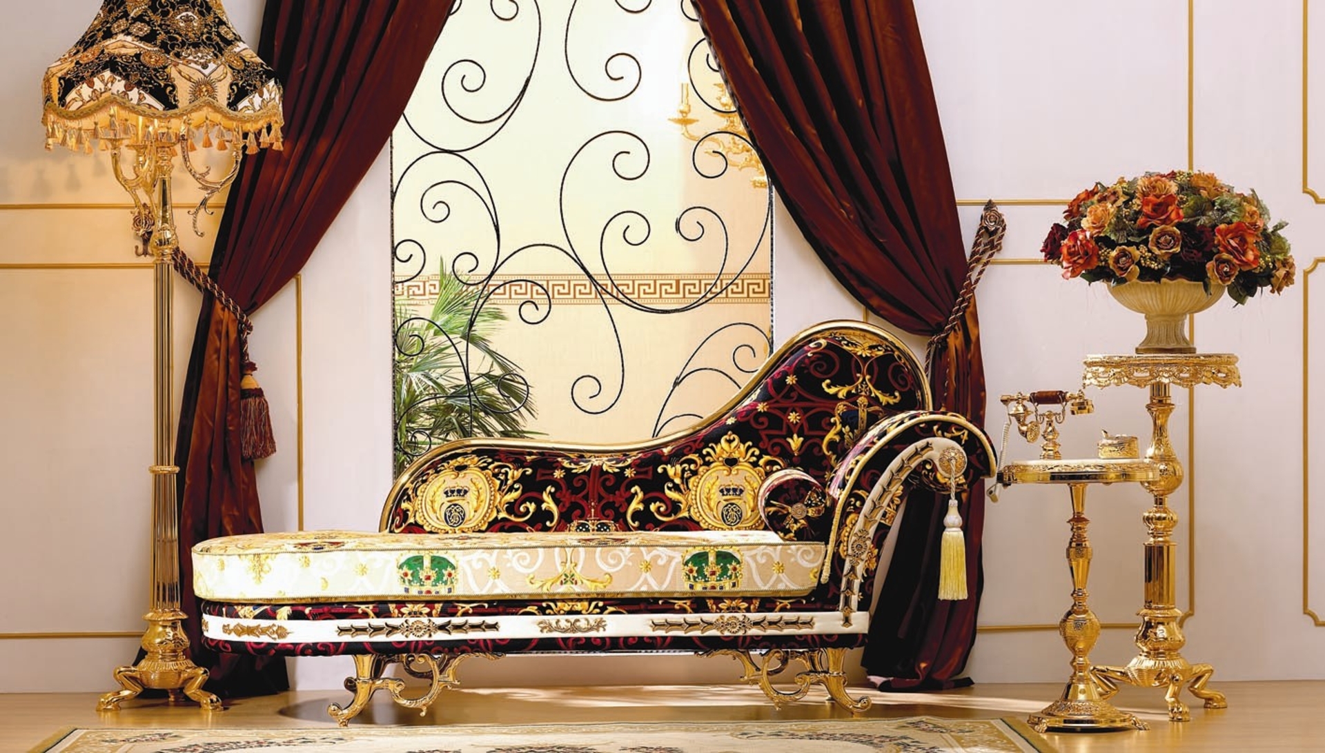
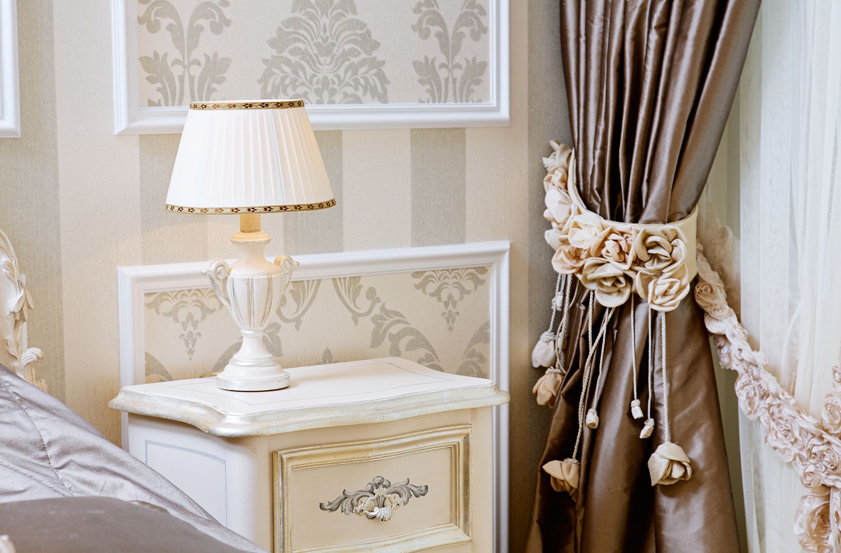
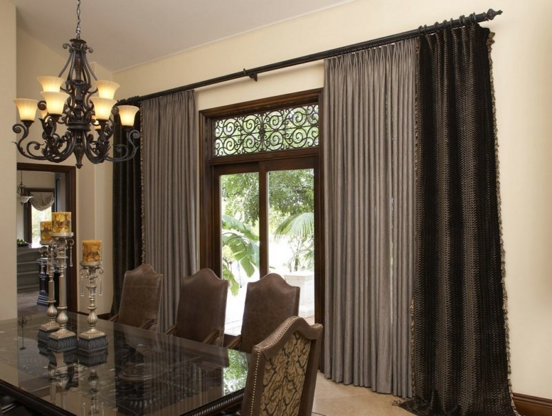
- for more luxurious and fancy ensembles, it is recommended to choose extremely expensive materials of the highest quality. And curtains, and curtains in such an environment can be decorated with golden prints. The fabric of the curtains for the pompous room is often dense and solid (or velvety);
- Today, eco style is very stylish and attractive. For him, it is worth picking up wallpaper and curtains made from natural materials, painted in wheat, soft green and brown colors;
- Natural materials are also appropriate in rustic country style. For this interesting and slightly casual interior you can use fabrics with ethnic prints, painted in simple and inconspicuous tones;
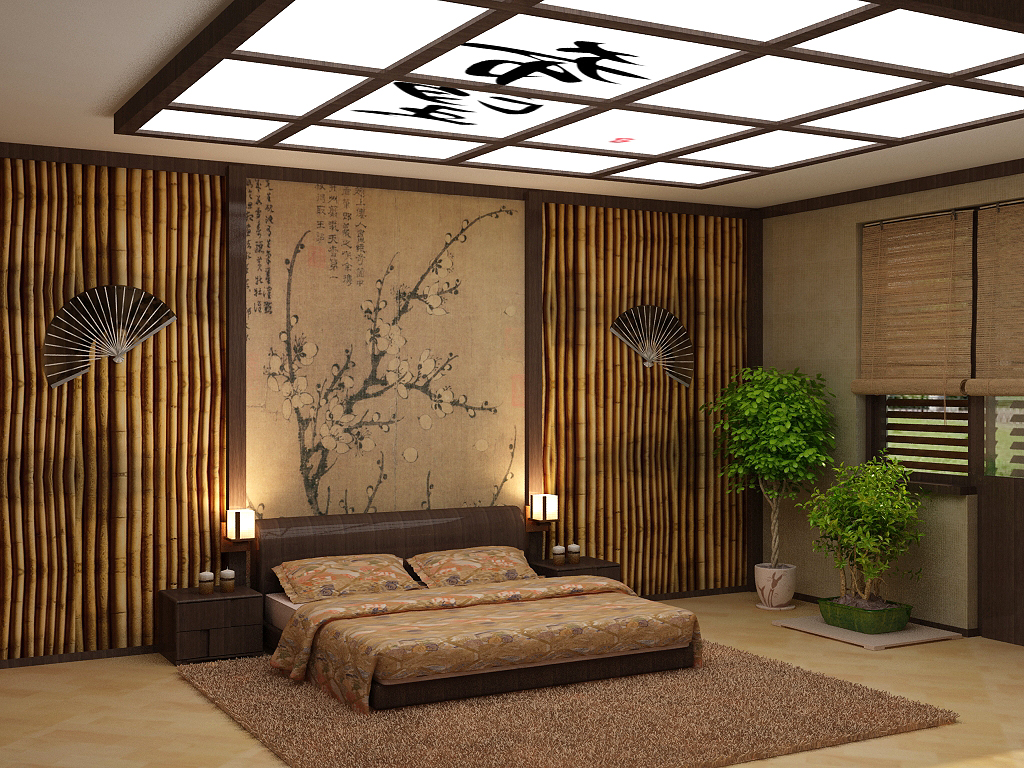
- in an interesting and multifaceted Japanese style will look great wallpaper, which is silk-screen printing, and contrasting dark curtains. If you dilute this setting with a selection of appropriate decorations, the image will turn out to be very pacifying and beautiful.
Room Design Options
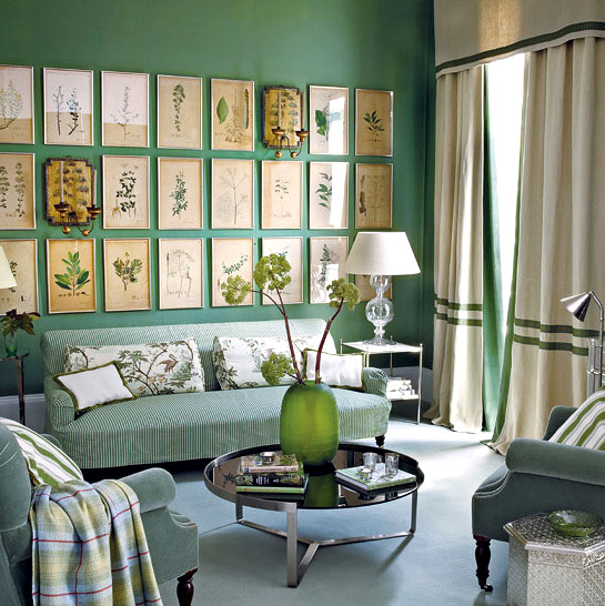
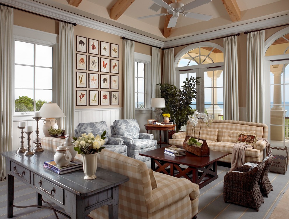
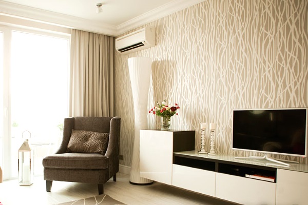
Living room
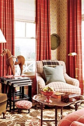
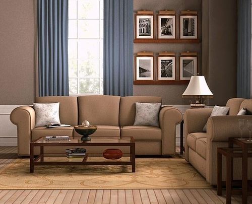
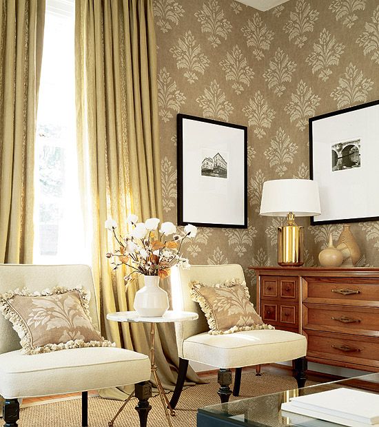
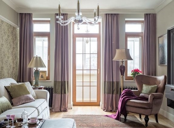
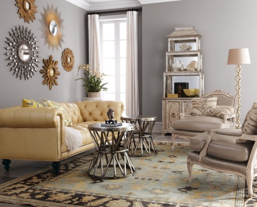
For the hall is better to choose wallpaper and curtains of similar shades. Such a combination will have a calming effect. For such premises It is not recommended to pick up unnecessarily motley and coarse things. Relatively strict wallpaper and curtains will be the perfect solution for a stylish living room.
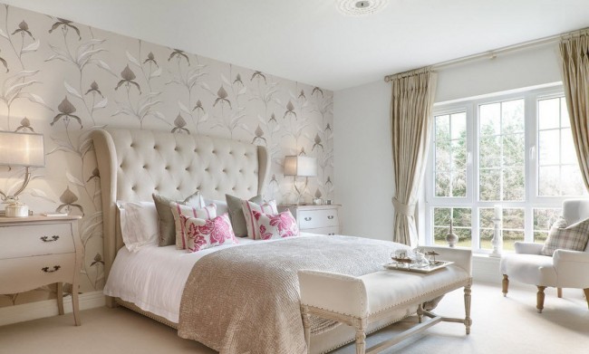
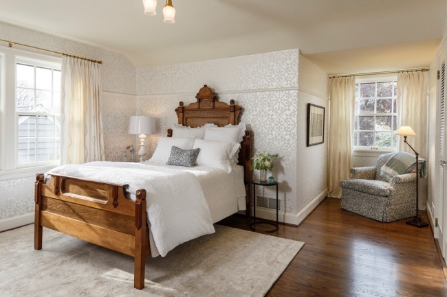
Bedroom
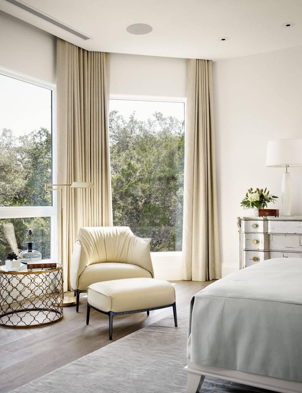
For a bedroom, it is recommended to select wallpaper and fabrics of calm or pastel colors. They should not excite the nervous system with bright elements or excessively variegated prints.
In such interiors, you can also use the surface of similar colors or, on the contrary, contrasting thick curtains of dark shades.Such things look great in both compact and spacious bedrooms.
Too motley and contrasting patterns or prints are better not to use, as they will fit poorly in the soothing atmosphere of the bedroom.
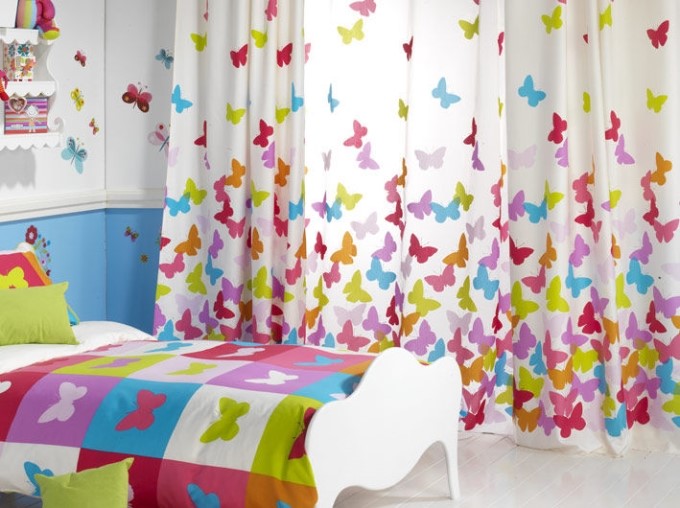
Children's
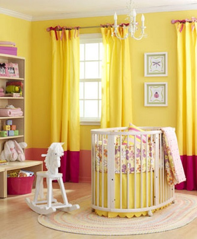
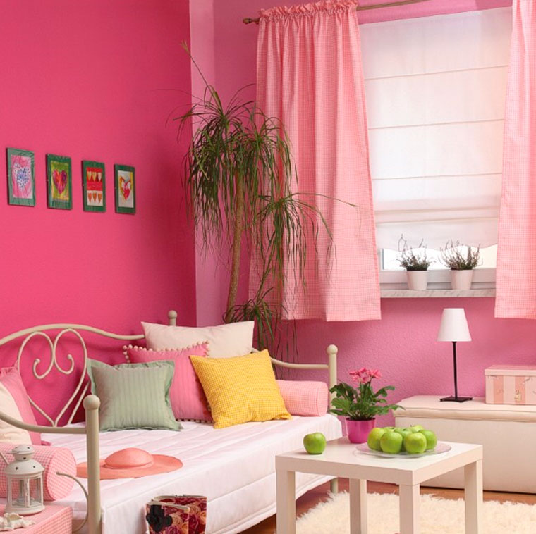
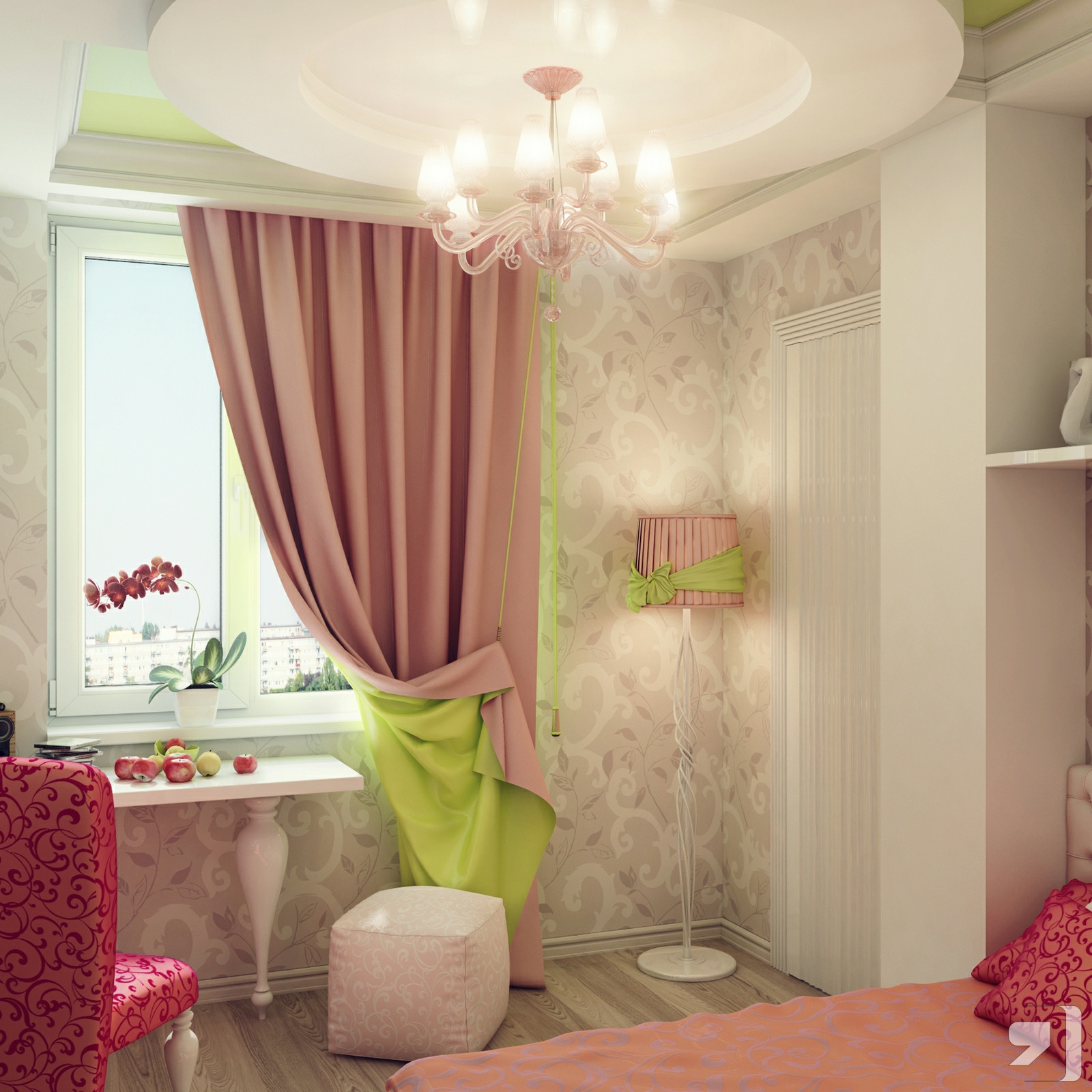
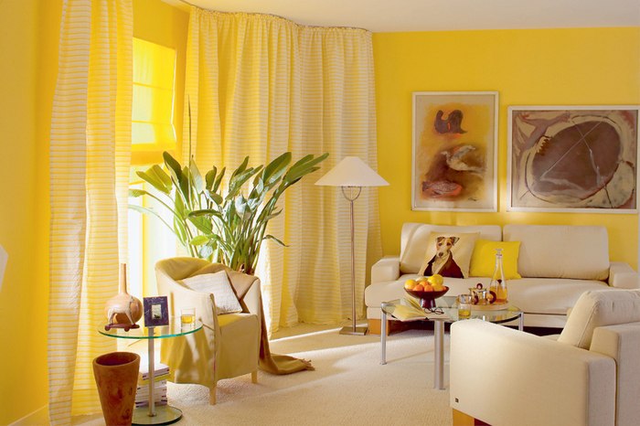
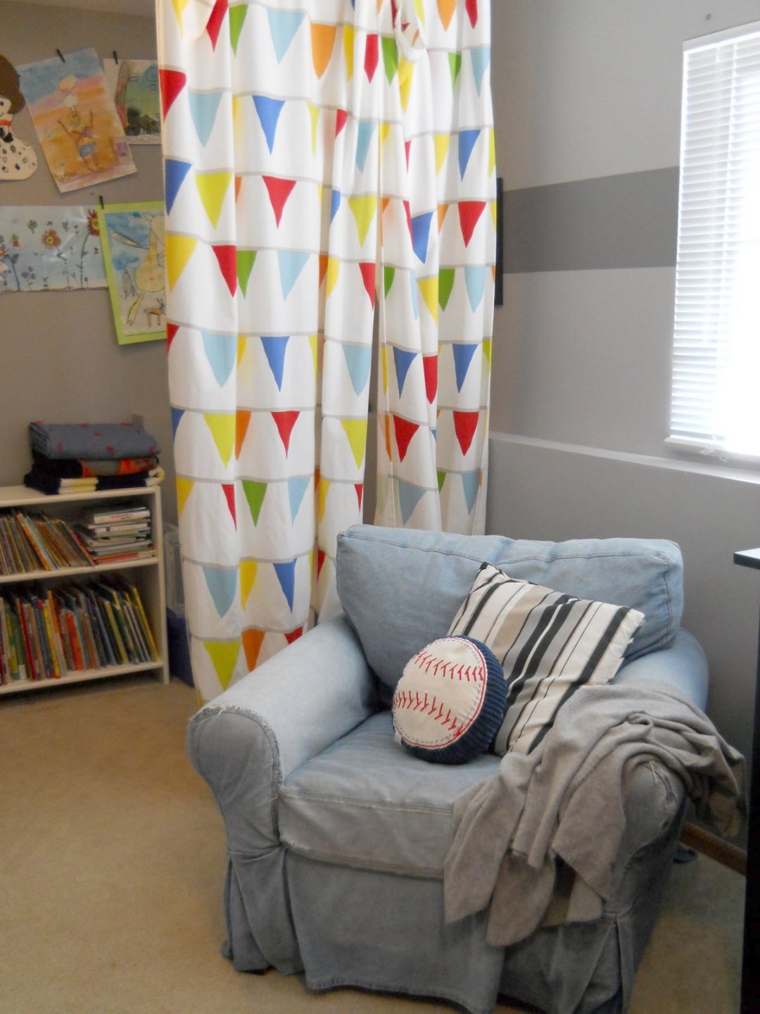
For the nursery, you can pick up and brighter materials. However, for wall decoration it is recommended to choose pastel and positive colors (yellow, green, orange, peach, pink, blue, lilac). It is possible to dilute soothing tones in such rooms with the help of rich curtains of bright and cheerful colors. They can also be applied drawings with cartoon characters, beautiful flowers and other similar elements.
Kitchen
In the kitchen, you can use in sharply contrasting with each other tones. In addition, in such rooms often present shortened curtains or not very lush and bulky tulle, which is not striking and does not attract too much attention.
If you chose bright and rich curtains for the kitchen, then they should be supported by a decorative detail of a similar color.
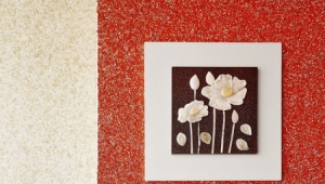
Beautiful design ideas and options
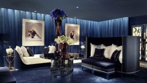
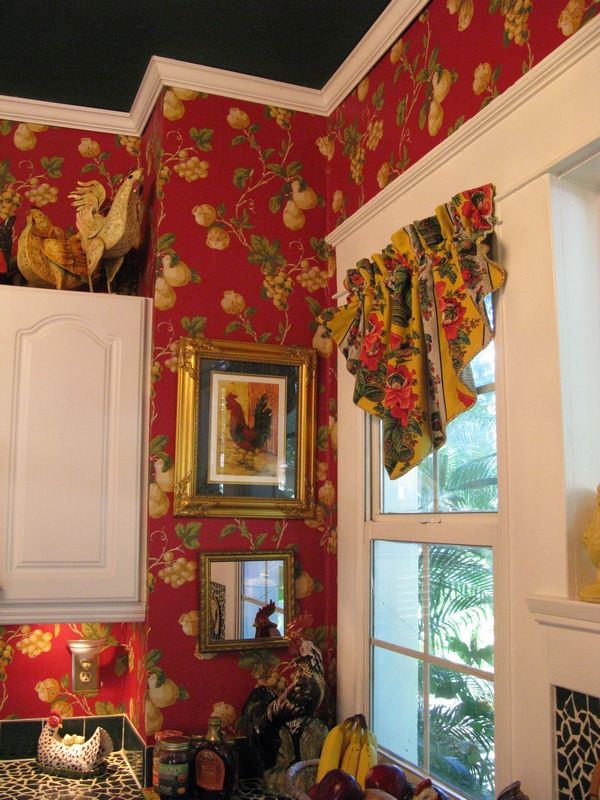
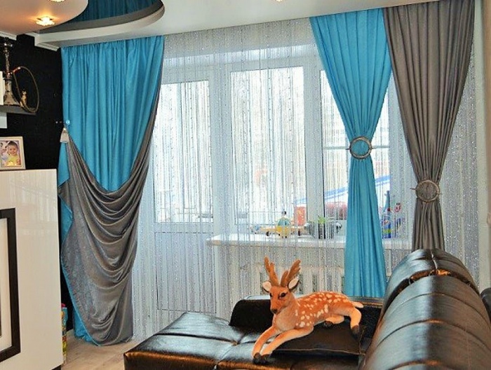
If you like bright contrasts, then you should decorate the wall behind the bed in the bedroom with wallpaper with black floral patterns, and paint the remaining walls with dark red tones. Hang silver or gray curtains with black stripes in such a room and place the bed with black and white bedding and a high green headboard. The combination will be very interesting and non-trivial.
In a bright room with milk wallpaper and the same light ceiling, light curtains of soft brown color will look organically. They can be hung on a simple pale green or pistachio cornice. Put in this room a bright bed with a soft chocolate blanket and pillows, as well as live plants in snow-white vases.
Against the background of laconic snow-white wallpapers, dense long curtains of pale chocolate color with darker floral prints will effectively stand out. They should be hung on the round metal cornices and placed near bright paintings with dark brown frames of wood.
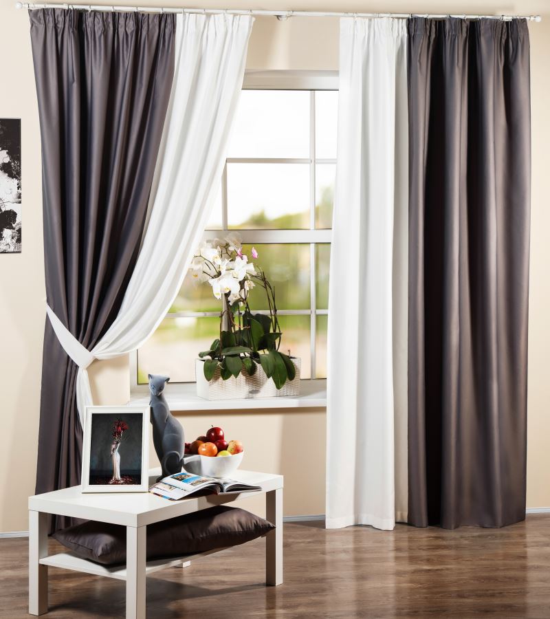
If you want to bring into the interior not two, but three interesting colors, then you can turn to double-layer curtains combining gray-brown and blue shades.Hang them on top of translucent white tulle in a snow-white room with a white ceiling and a light cream floor. Put in this room leather dark brown sofa to maintain the dark material of curtains.
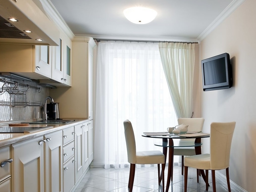
In the kitchen or in the dining room with soft-milky walls, a clean white ceiling and the same light tiled floor, it is worthwhile to hang translucent cream curtains on a contrasting dark cornice of a dark gray color. In such a situation, bright chairs with wooden legs, a glass table and a wooden set of creme brulee will look great.
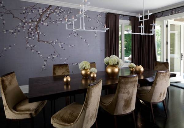
Dark blackout curtains will look amazing in an ensemble with purple wallpaper, decorated in the upper part with floral patterns (for example, sakura branches). Put on this background natural wood furniture of dark colors and soft chairs with velvety chocolate upholstery. To prevent the ensemble from appearing too dark and gloomy, the ceiling should be trimmed with white materials and snow-white metal ceiling lights should be used.
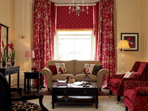
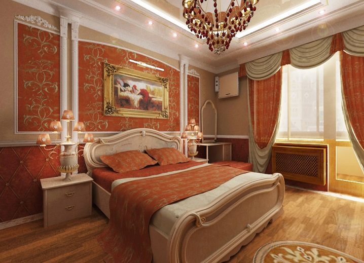
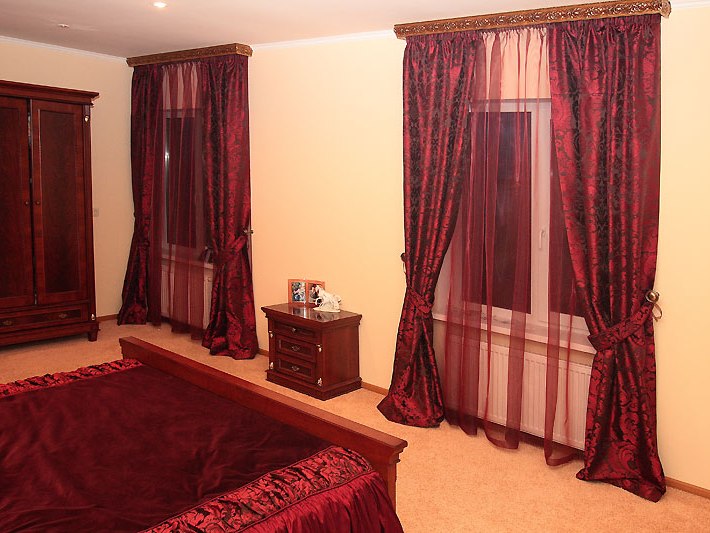
And passionate and sensual colors are best combined with more calm and neutral tones, especially when it comes to the bedroom.For example, thick red curtains of velvety heavy fabric will look organically against the background of soft peach wallpaper. In such a room will find its place a chest of drawers and a cabinet of mahogany or wild cherry. As for the bed, it should also be made from a natural array and decorated with good-quality cherry-colored bed linen.
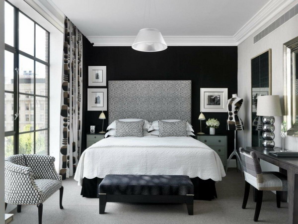
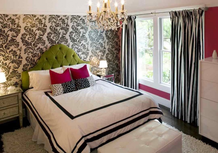
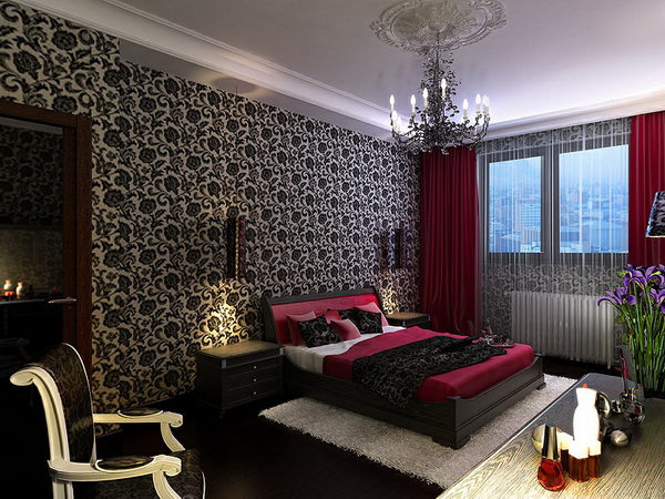
Dense red curtains will look spectacular in the bedroom with patterned black and white wallpaper, black seamless floor and a dark bed, complemented by a burgundy rug and pillows. To complete such an interesting interior should be wrought dark chandelier, white fluffy carpet and pompous chairs with white curved-shaped armrests.
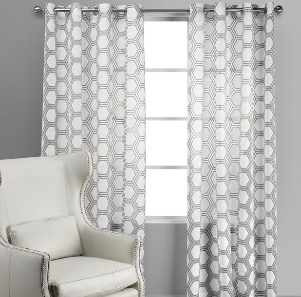
In an interesting modern style most often used plain wallpaper of classic and neutral tones. For example, it can be pale gray wallpaper and simple straight white curtains with geometric contrast patterns. It is better to hang them on a chrome cornice and place a small white chair with a high back next to it.
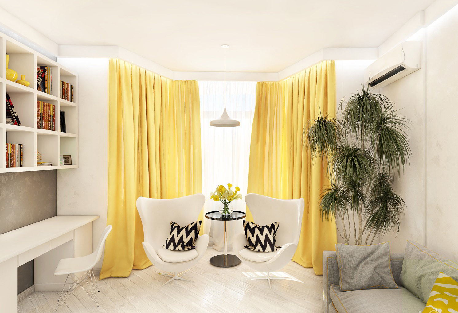
Dense yellow curtains will look spectacular against a white wallpaper in the spacious living room.Place light futuristic chairs in front of the window opening and decorate them with black and white decorative pillows. Complete the ensemble with live plants, a gray little sofa and white bookcases.
For information on how to correctly select the color of the curtains, see the following video.