Yellow wallpapers: add comfort and light to the room
Wallpapers are one of the significant elements of finishing the room, filling the atmosphere with the desired mood and comfort. Not every selected shade is able to convey harmony as positively as possible, as it can be done with yellow wallpaper. Properly selected canvases can add comfort and light to any space.
Color features
The influence of color shades on mood and human health is a scientifically proven fact. A special feature of the yellow color in the interior is the use of the desired temperature and degree of saturation. It is a color that symbolizes warmth, joy and harmony. It adjusts to the positive, active life position and good, and also affects creative thinking.
If the tone concentration is exceeded, he instantly changes his properties and acts on every household in his own way. It is harmonious for optimists and people who are light on the rise, but it is completely unsuitable for individuals suffering from depression. The tone of the shade must be chosen correctly, otherwise it may provoke the nagging of the household to each other and will excite the psyche.
Yellow wallpapers are not a universal design solution that can pull out any interior. It is necessary to select furniture and style for them thoroughly and taking into account many nuances, among which texture, color temperature, color and compatibility with contrasts, space decoration methods and properly selected lighting of a particular room are of particular importance.
For harmonious wall decoration This shade needs a companion: thus, it is possible to eliminate the excess of tone and create a harmonious environment. The yellow color of the wallpaper welcomes different contrasts, which depends on the original tone. The use of this wall trim of excessive intensity can suppress other contrasting tones of the interior composition.
Shades and design
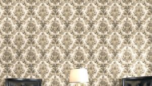
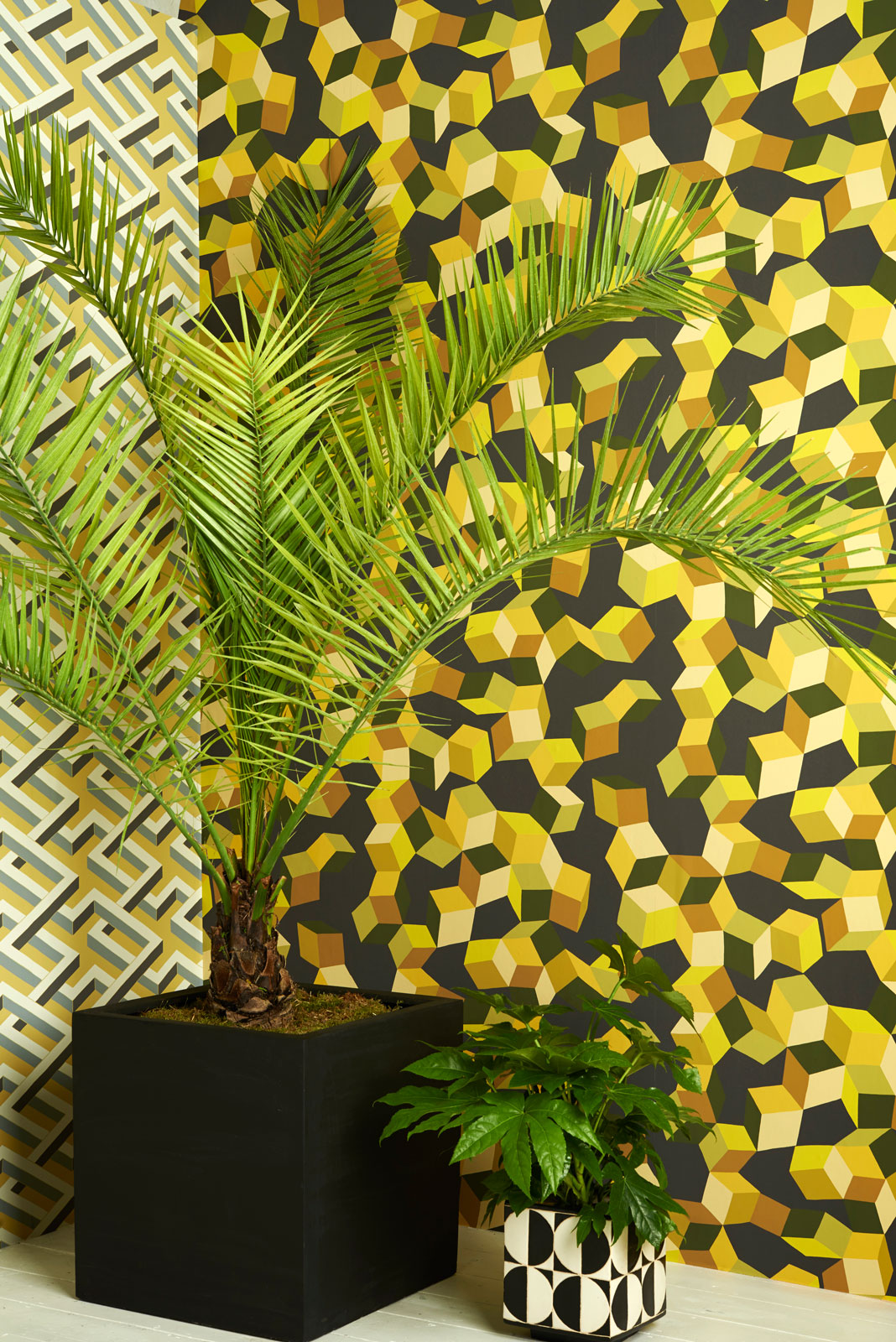
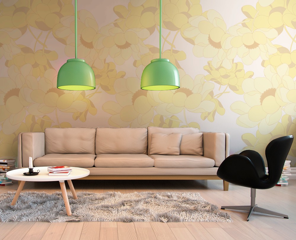
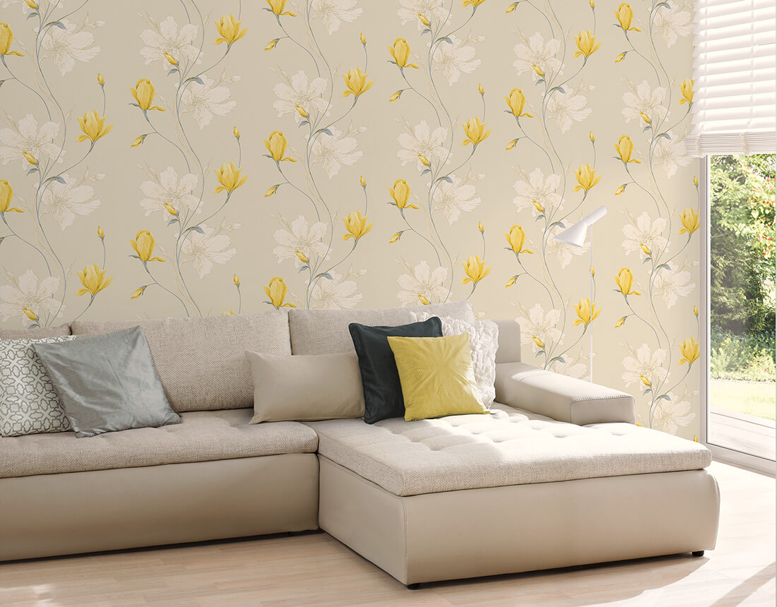
The yellow color of the wallpaper is multifaceted and consists of different shades. Depending on the addition of two strong colors (red or blue) to it, it is warm or cold.Yellow can be mustard, sunny, bleached, tender, yellow-red, golden, sandy-yellow or cool gray-yellow, yellow-green, olive-yellow, diluted yellow-black. It is undesirable to use this color scheme in its pure form.
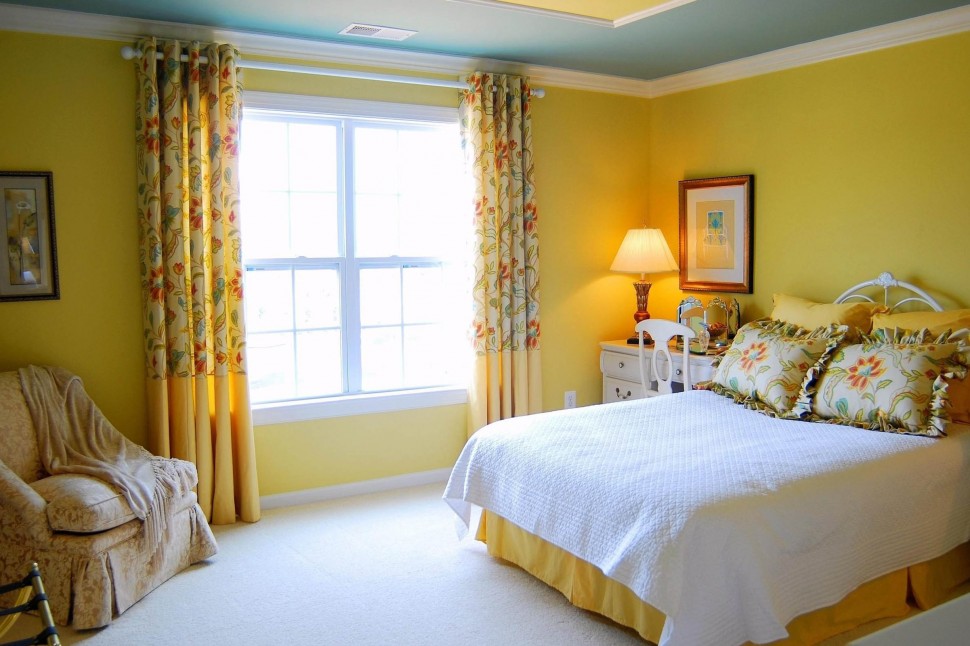
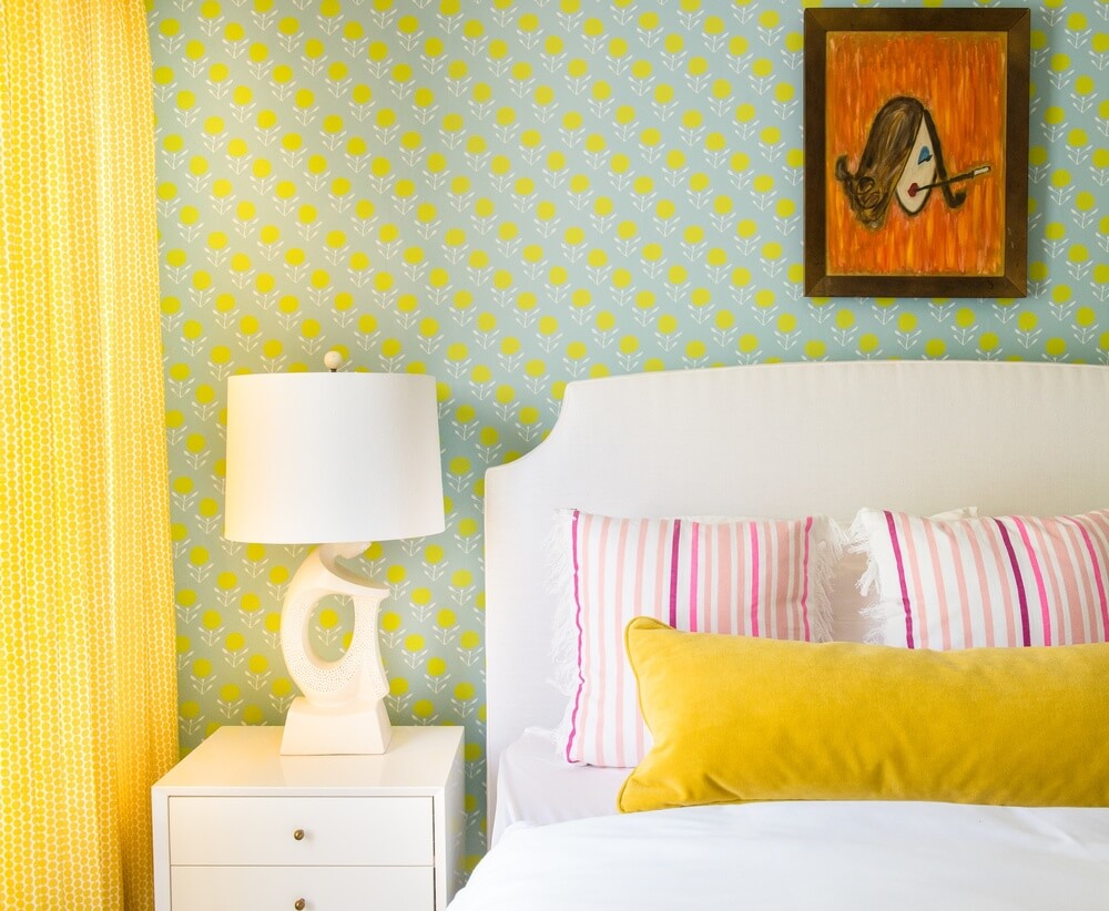
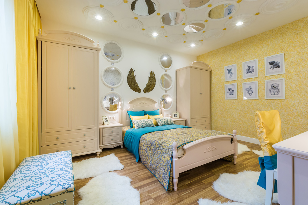
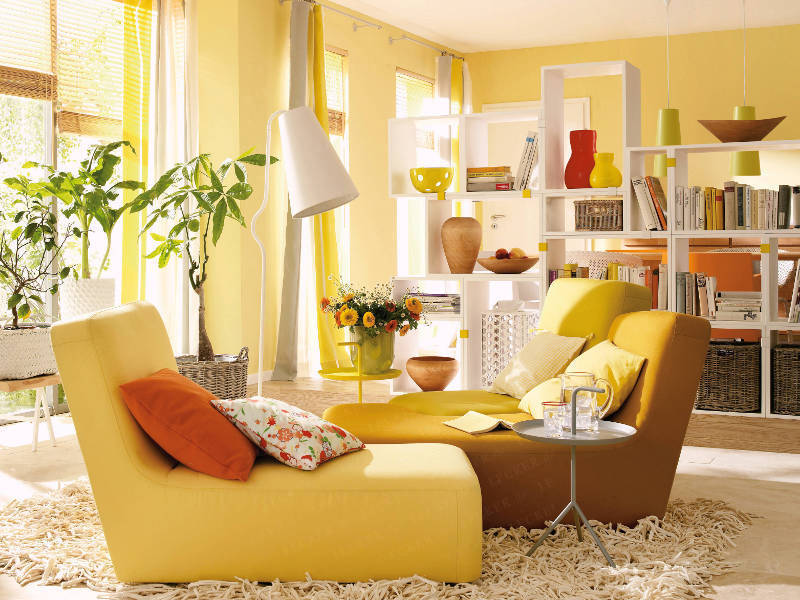
It is preferable if it is diluted with one of the strong colors and diluted with a white tone. Bright colors are appropriate in the interior of the children's room, and the design for common rooms or bedrooms welcomes muted blended tones. For example, paints with the addition of red are suitable for the kitchen, and for the bedroom - with hints of blue.

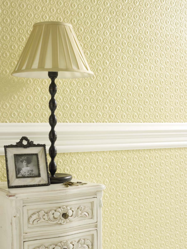
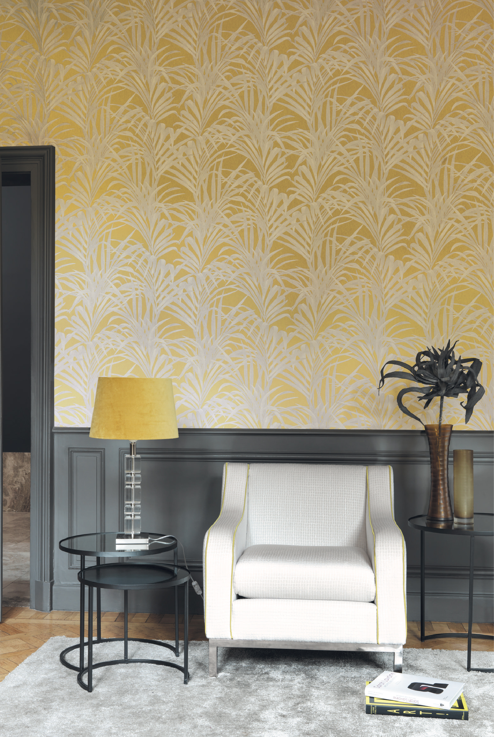
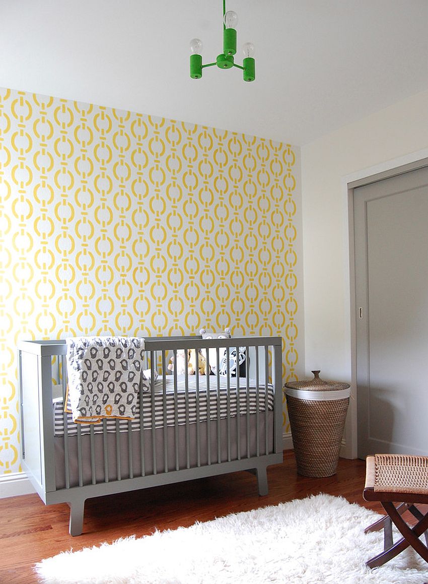
Yellow color is picky about picking a pattern. One of the best methods of decorating space with wallpaper of this color is the emphasis on texture, which can be matte, velor, plush, embossed, with a small pattern extruded on the front surface. Gloss over yellow background is not allowed.since it breaks any design idea.
Looks great pattern, embossed. He better conveys the desired pattern than contrasting shades of the color palette.
Prints
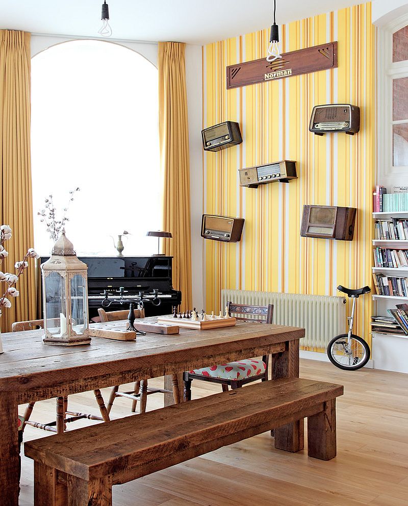
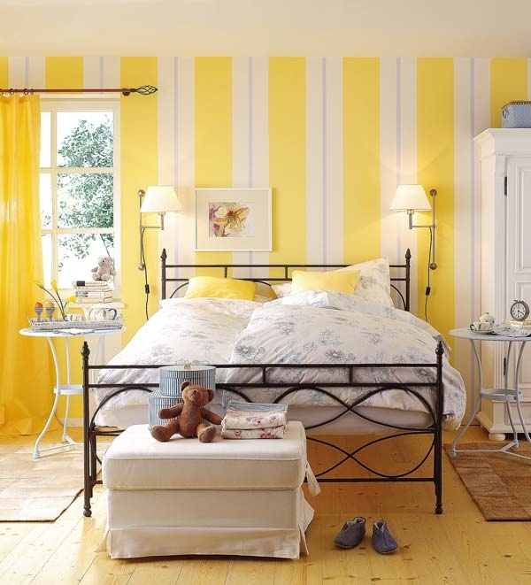
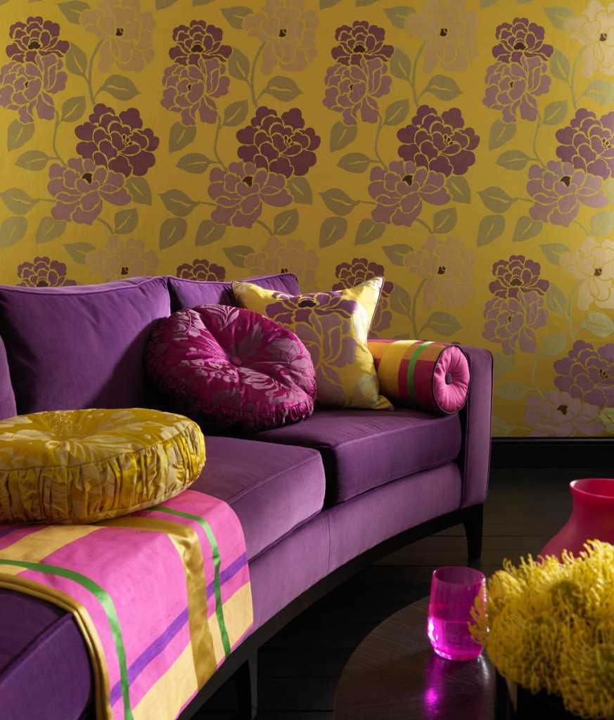
The choice of pattern is based on the shade of the pattern. Ideally, if it is 2-3 tones darker than the main yellow color.This pattern looks better than any contrast, even the most sophisticated. The best types of prints are relief stripes separated by shallow grooves of the texture.
The color is quite monotonous, especially if it is composed with a different tone trim. Thus, it is easier to choose furniture, to demonstrate the beauty of the paintings, to zoning a section of a wall or a separate ledge, niche. Textured wallpapers allow color support through pastel linen with a pattern to match the wallpaper.
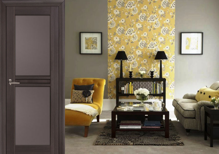
If a print is selected, then the combination of wallpaper with interior items becomes different. First, it should not be much, even if the picture is weak. This can be a single plane of the wall or even better - a small vertical zone of two strips of meter width and support on the adjacent plane in the form of a narrow strip.
If there is more yellow in the room, the situation risks being heavy. When you want an abundance of this color, it makes sense to beat him with a pattern chosen on a beige background. It is important to dilute the wallpaper with large window and door openings, decorate the plane with moldings, ceiling moldings or other decor. The most harmonious decorations of yellow wallpapers are:
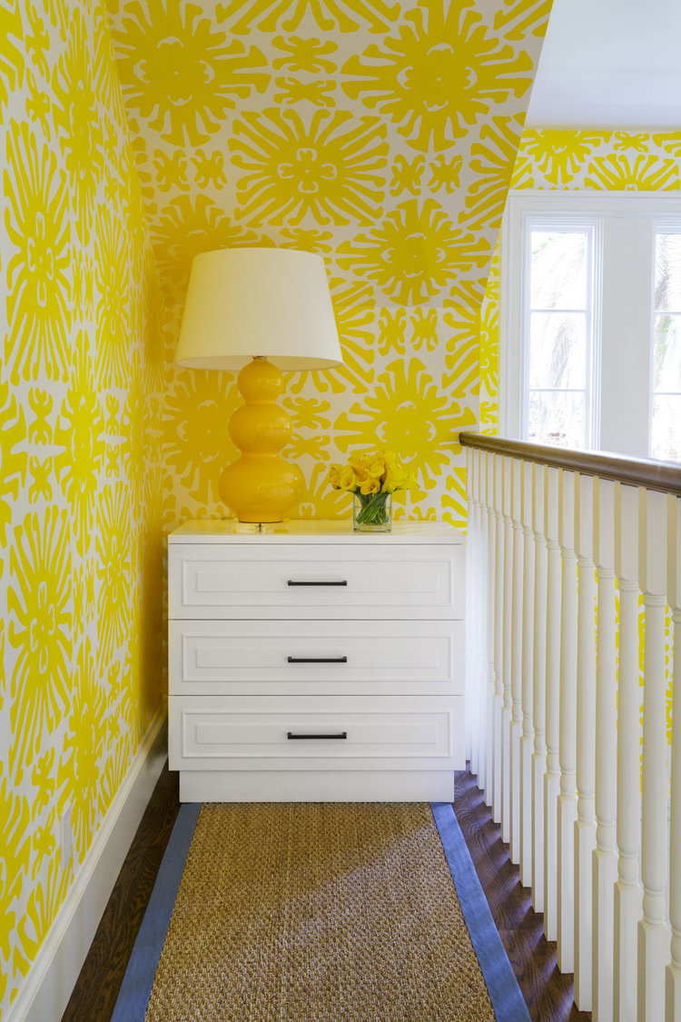
- geometric figures;
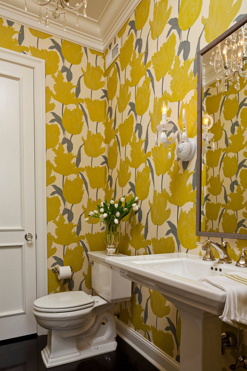
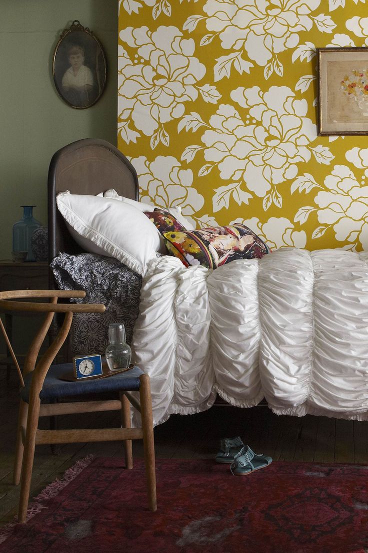
- flower theme;
- narrow vertical strip;
- embossed monograms;
- marble imitation;
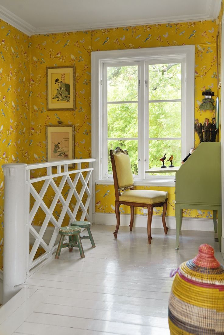
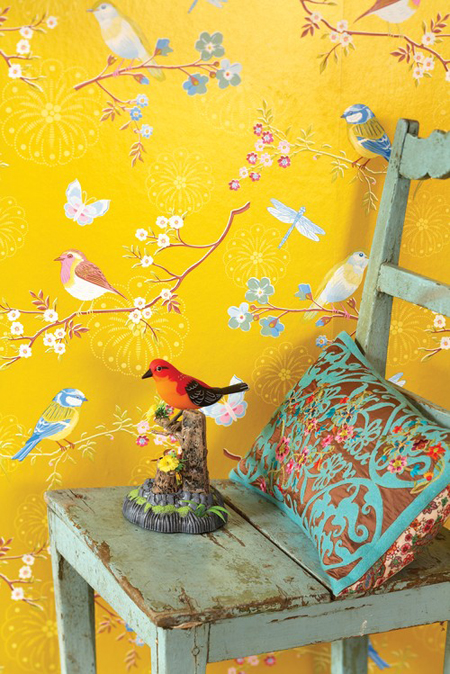
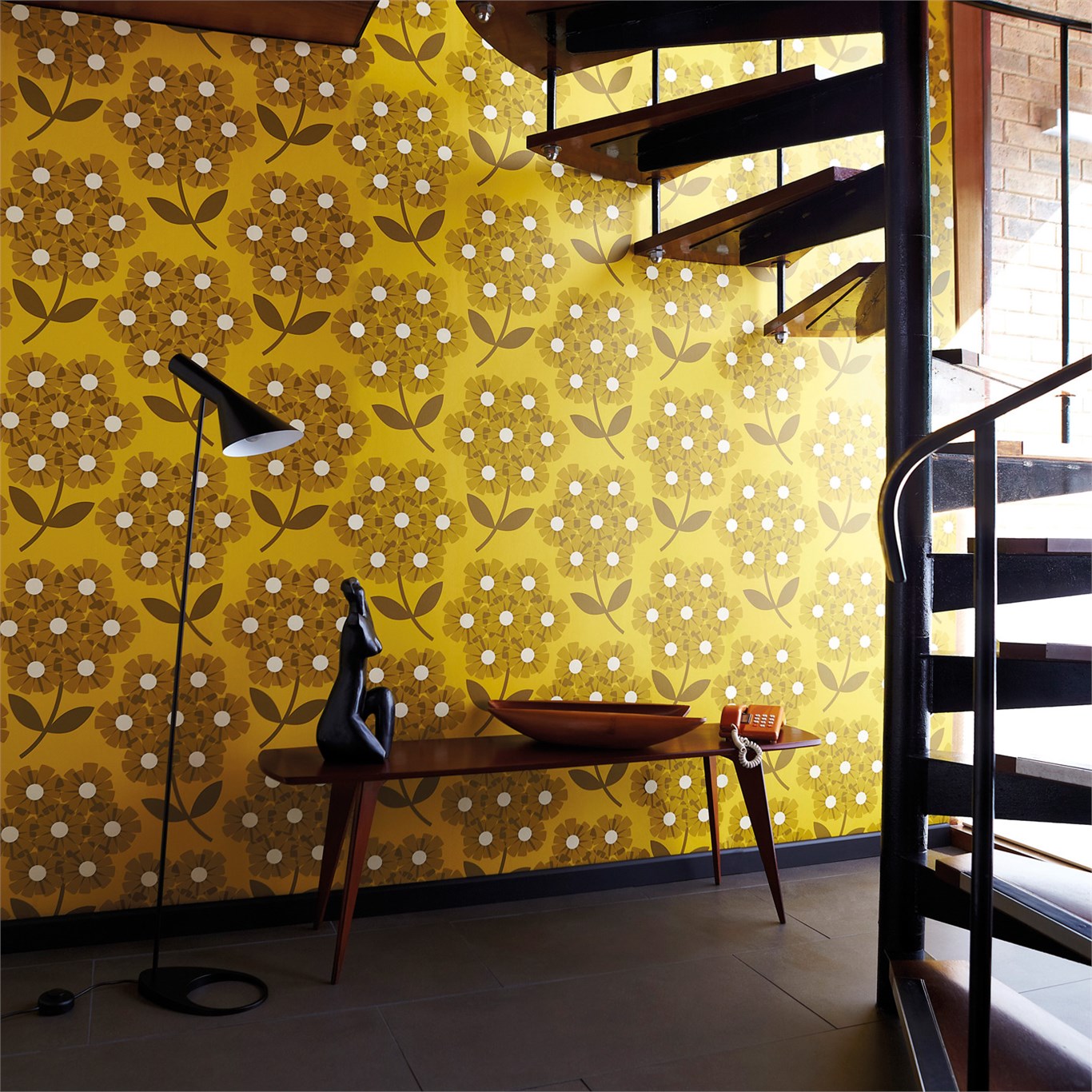
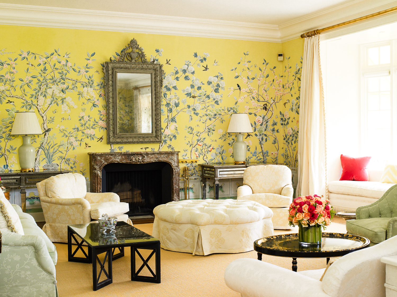
- simple drawings with birds;
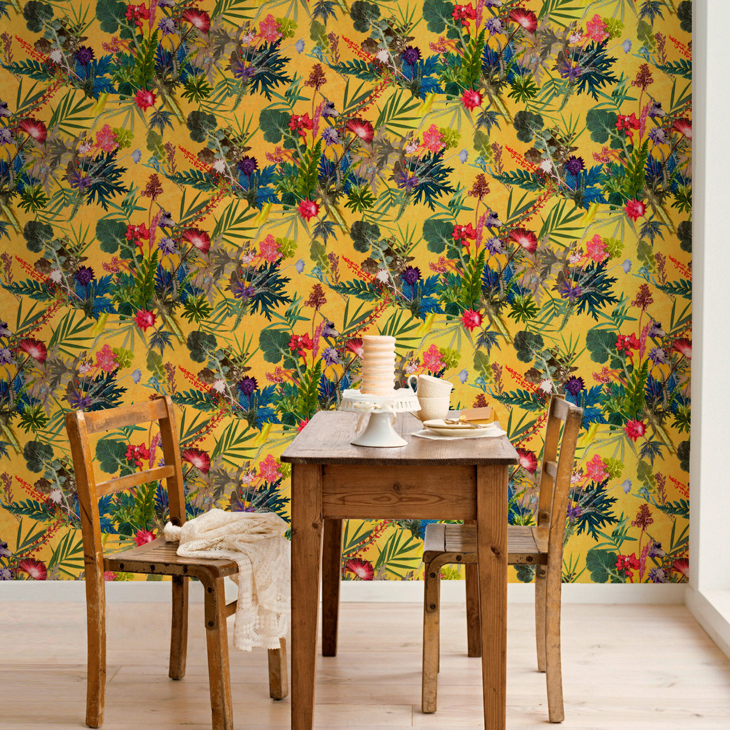
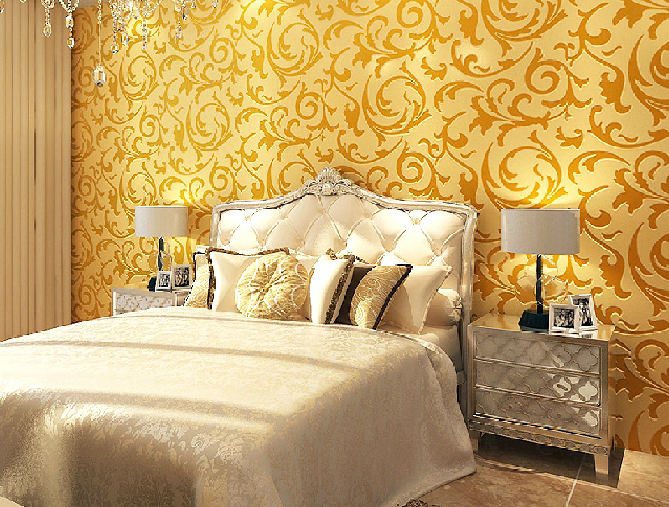
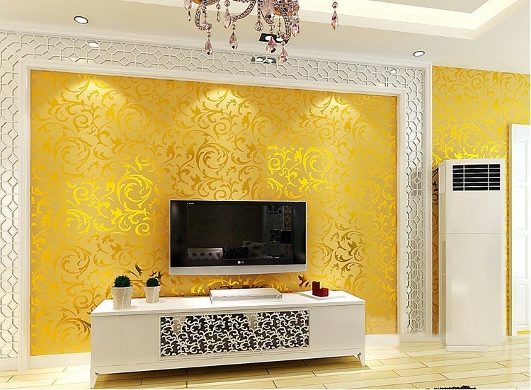
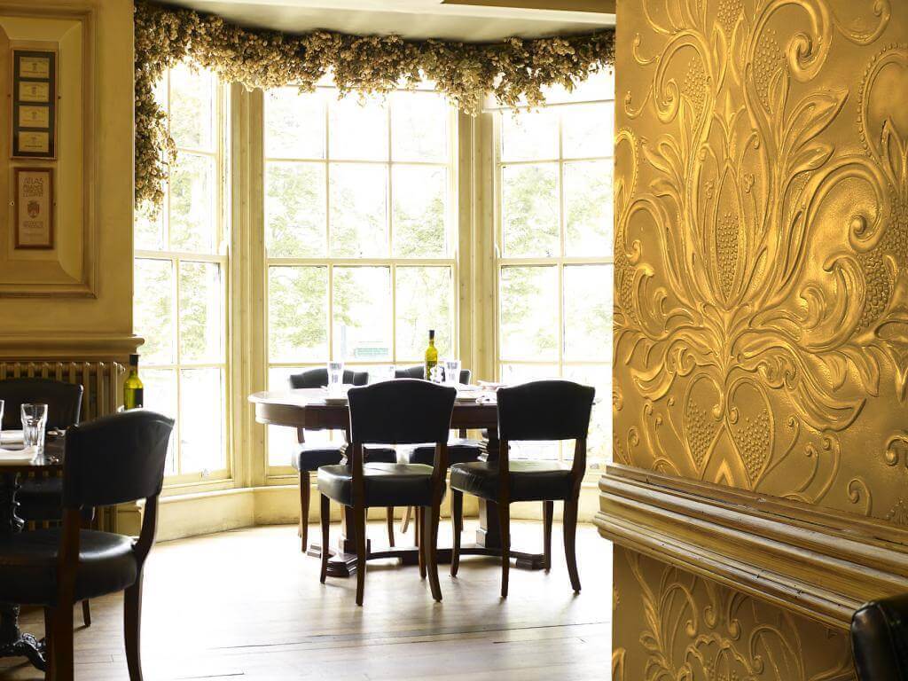
- golden floral motifs with branches and leaves.
Unsuccessful prints include matting, bright yellow patterns on a pale yellow background, uncomplicated combinations of a floral pattern and a cage in one pattern, as well as small polka dots.
Color combinations
In order to choose the contrasts of the interior composition correctly, you need to know the tones that are most successfully combined with yellow wallpaper. Among them are combinations:
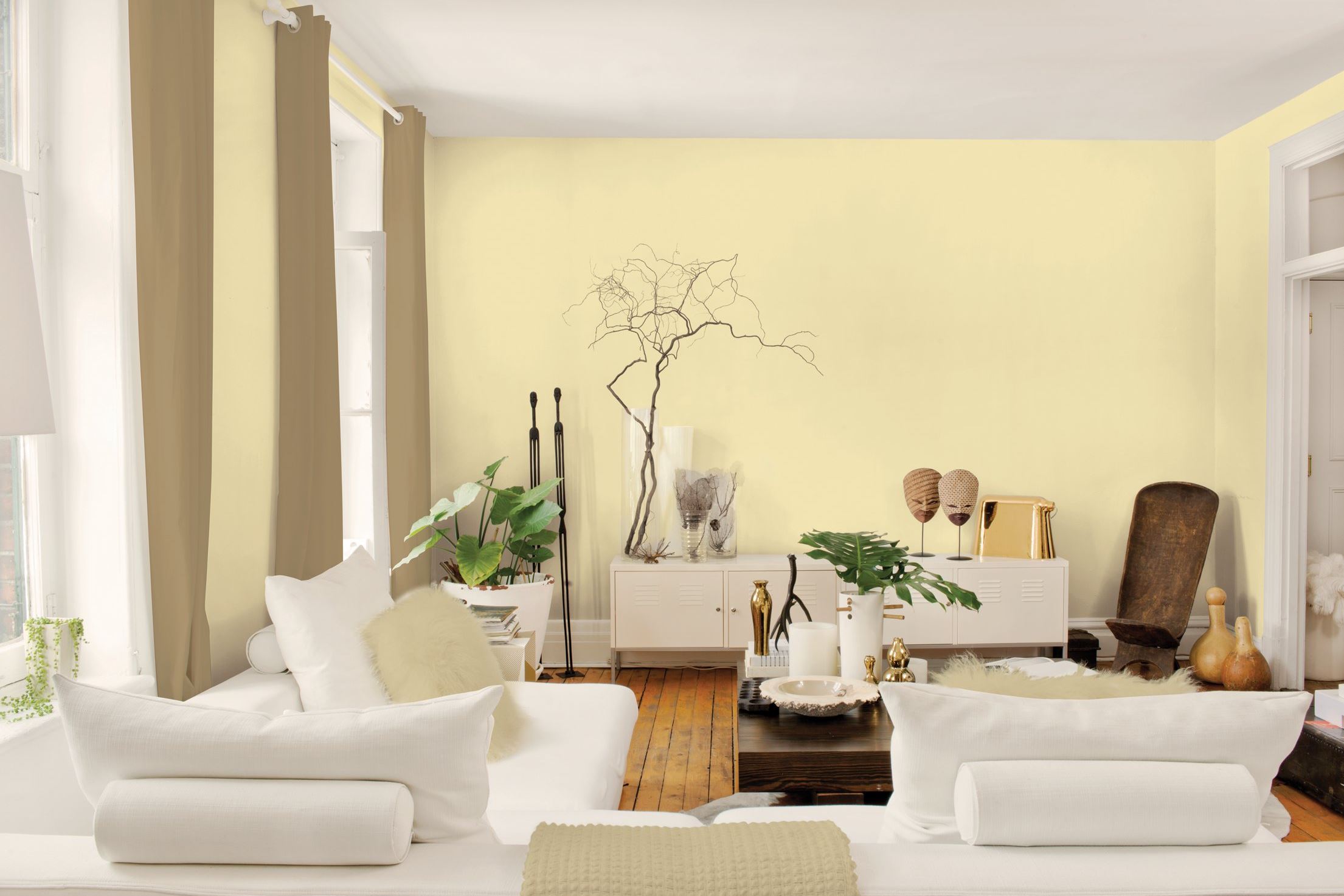
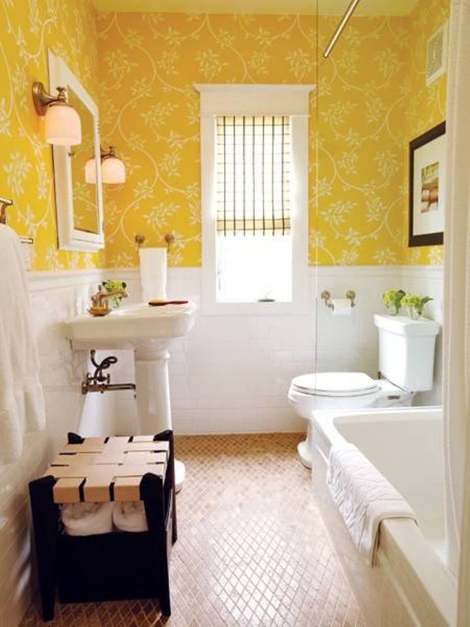
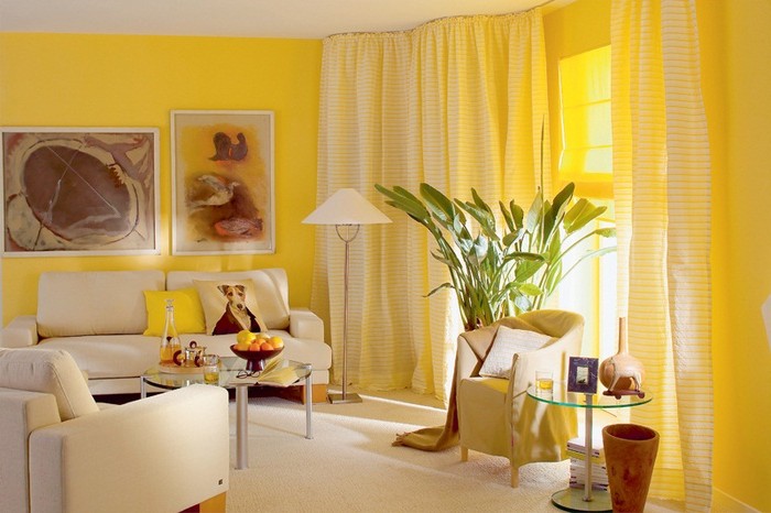
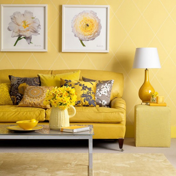
- yellow and white (a classic technique that draws out any design, emphasizing the uniqueness of the style with warm shades);
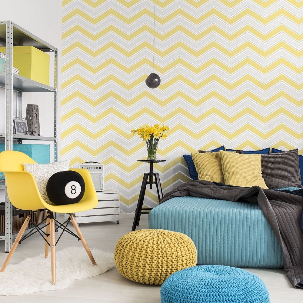
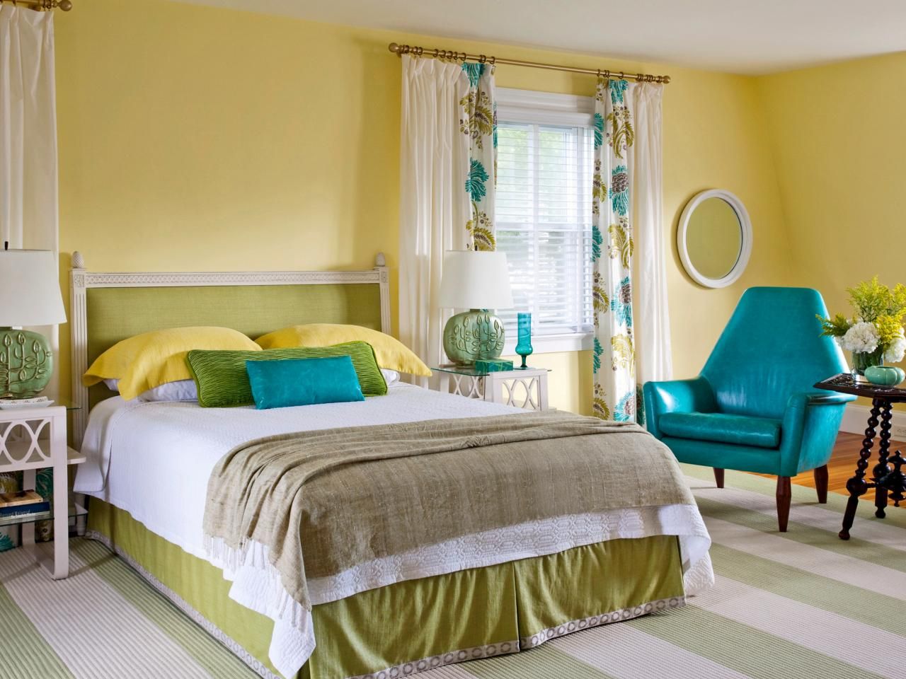
- cool yellow and blue (one of the fashionable methods of modernity, through which you can equip a room with an accent of dynamism, comfort and creativity);
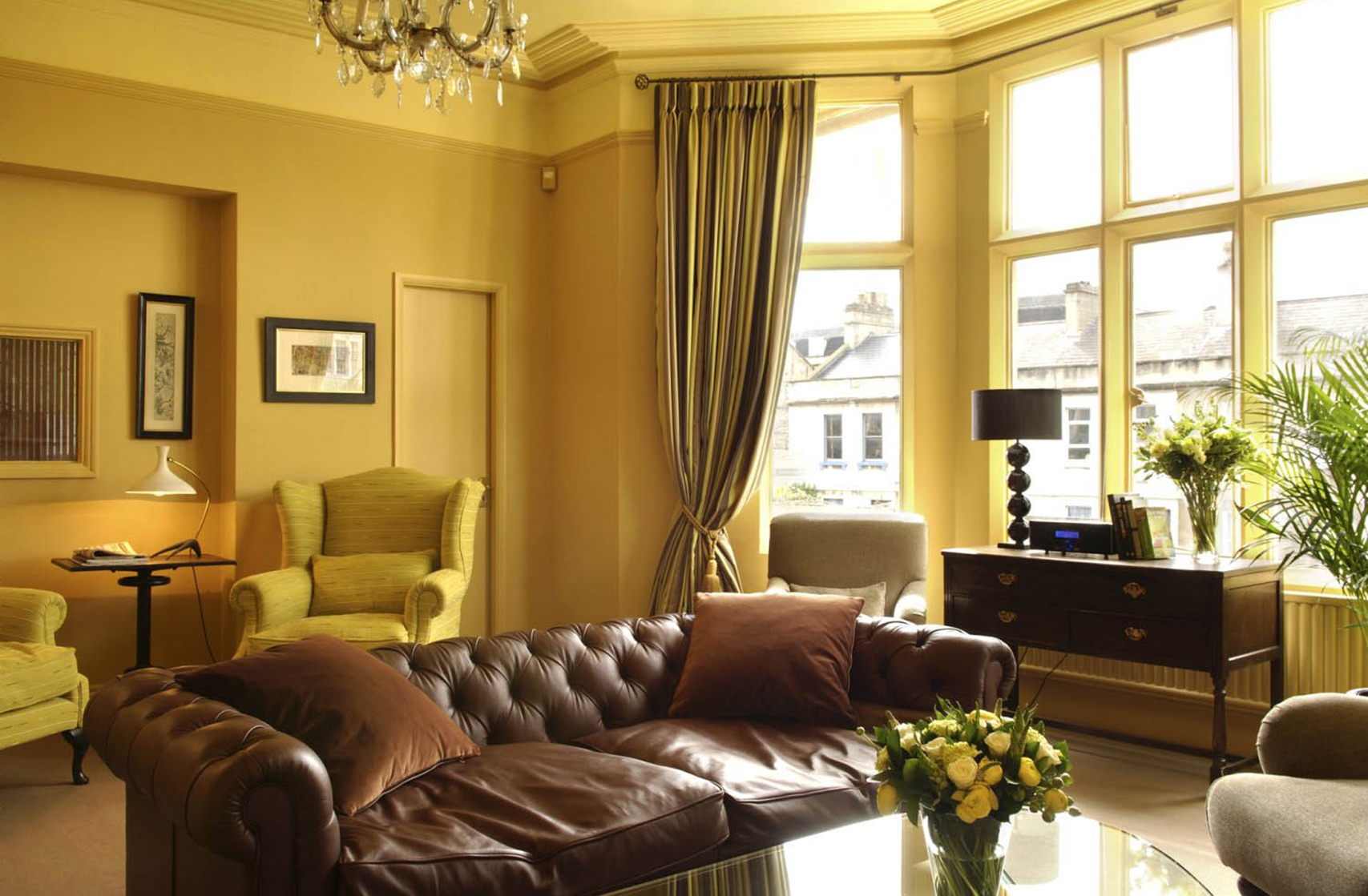
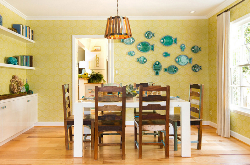
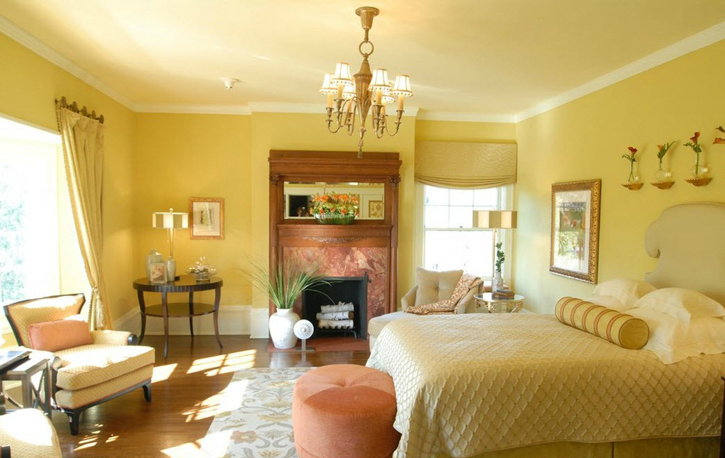
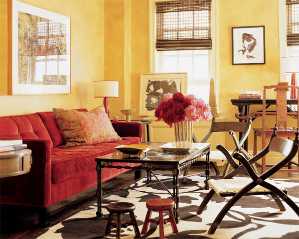
- yellow-beige and brown (giving the style of solidity and presentability, a good reception for decorating the space of the living room, study or home library);
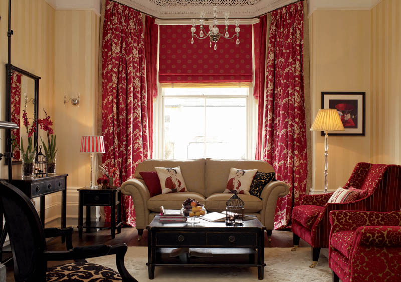
- sand-yellow and maroon (a favorite method of creating a royal interior with the addition of gilding and a certain massiveness);
- yellow and beige (method of softening yellow beige, whereby you can enter the wallpaper in different rooms of the dwelling).
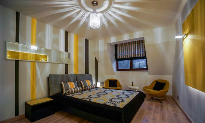
Depending on the selected contrast, the yellow tones can visually change the area, drawing the height of the ceiling or changing the width of the walls. One of the interesting design techniques is the combination of yellow and gray and the use of white ornament. The infusion of light orange shades into the main background should be careful so as not to overload the ensemble.
What curtains fit?
The yellow color does not like bright contrasts and can begin to compete with them, exerting "pressure" on the household. As soon as the yellow wallpaper complements the dark or bright colors of the curtains, the room accepts clear boundaries and seems heavy. Light shades of curtains and tulle, on the contrary, add space and visually save space from borders.
Much in this case depends on the temperature of the paint of the lining: lightness is created by combining the wallpaper of a cold yellow color, diluted with white and curtains of blue, light turquoise hue. Wherein It is important to combine the two tones gently: For example, it is better to add a beige shade of the floor and turquoise textiles of pastel linen or decorative pillows to the yellow color of the wallpaper and the blue tone of the curtains.
The combination with burgundy color looks harder. In this case, undesirable pictures on the wallpaper. One has only to show the uniqueness of the lining of the relief texture. In order not to overload the interior, it is better to choose textiles translucent.
The combination of yellow wallpaper with blue curtains is one of the most difficult.
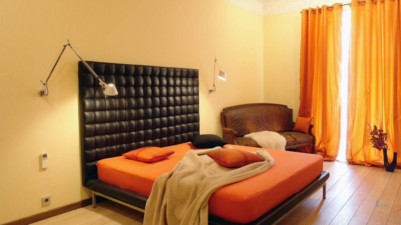
If you want bright contrasts, you should use them in the design or decoration of curtains. It is better to choose yellow-brown curtains with white tulle and an inconspicuous pattern (for example, circles, floral styling) or interesting patterns on a beige background for such wall decoration. This solution is great for interior compositions in country style.
If you need to maintain the classic direction, it’s better not to find a better white, beige, light peach shade of curtains. Such curtains are capable of supporting yellow wallpapers better than other colors. To make them better visible It is necessary to supplement the yellow canvas contrasting double companion.
Combination with furniture
In the room, decorated with yellow wallpaper, furniture should be a contrast, preferably diluted with different tones. Remember that the color is complex, therefore it needs dosing.If the wallcovering is based on plain wallpaper that you want to support with similar furniture, choose a set that is different from the shade of the canvas. Thus, it is possible to avoid merging the two elements of the situation into a single spot of light.
It is better to choose furniture with contrasting frame trim. For example, woody chocolate legs and sides.
If you want to add decorative gilding to the interior, it is better to do this through the decoration of lamps or minor accessories (floor lamps, moldings or mirror frame).
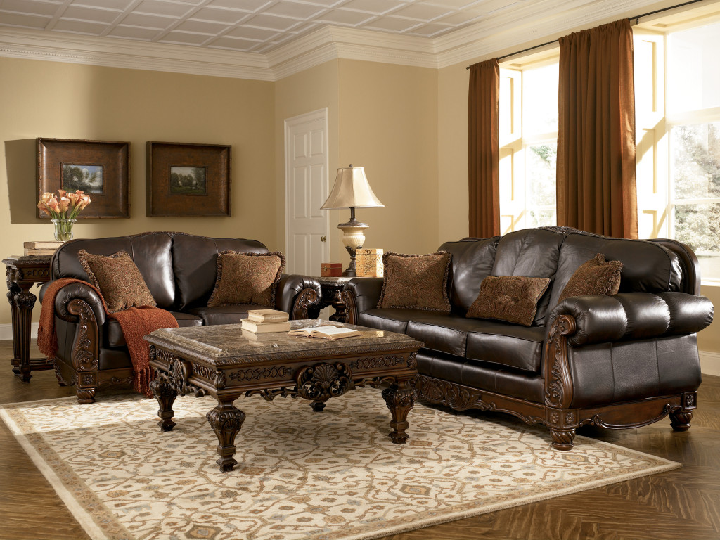
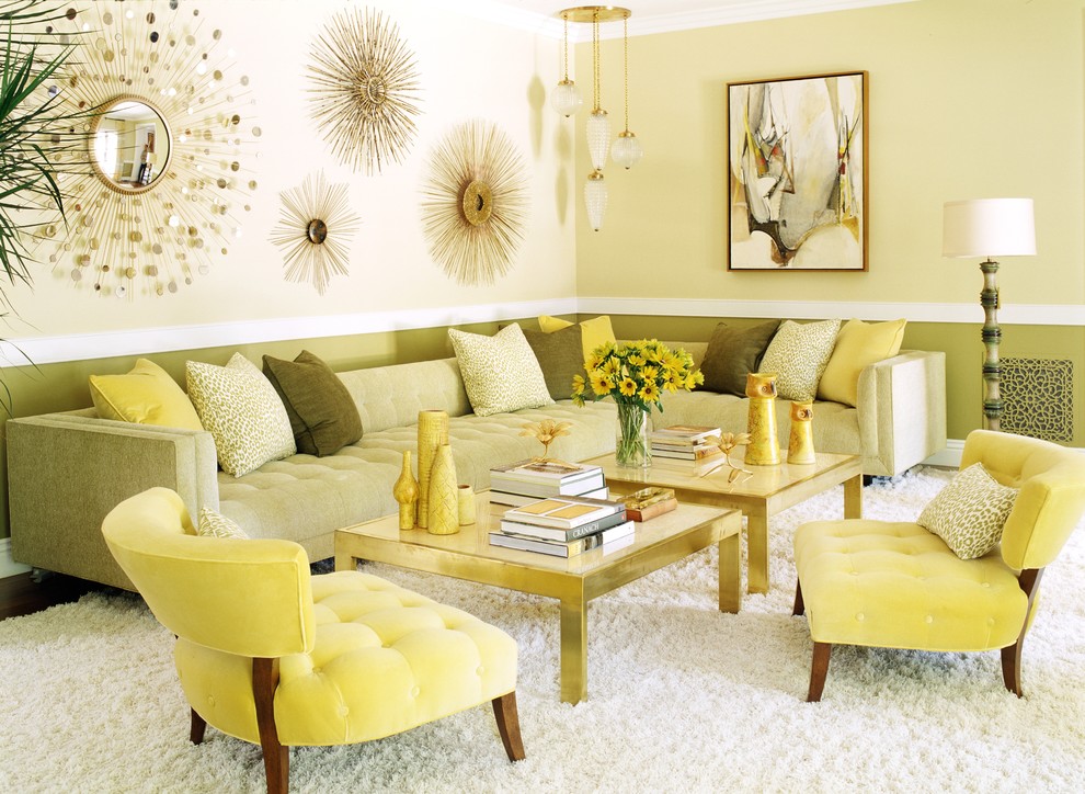
The ideal solution is to use white furniture in the interior. For example, it looks harmoniously in the kitchen and bathroom. For the interior of the living room or office is better to choose wood shades. The darker they are, the more solid the atmosphere.
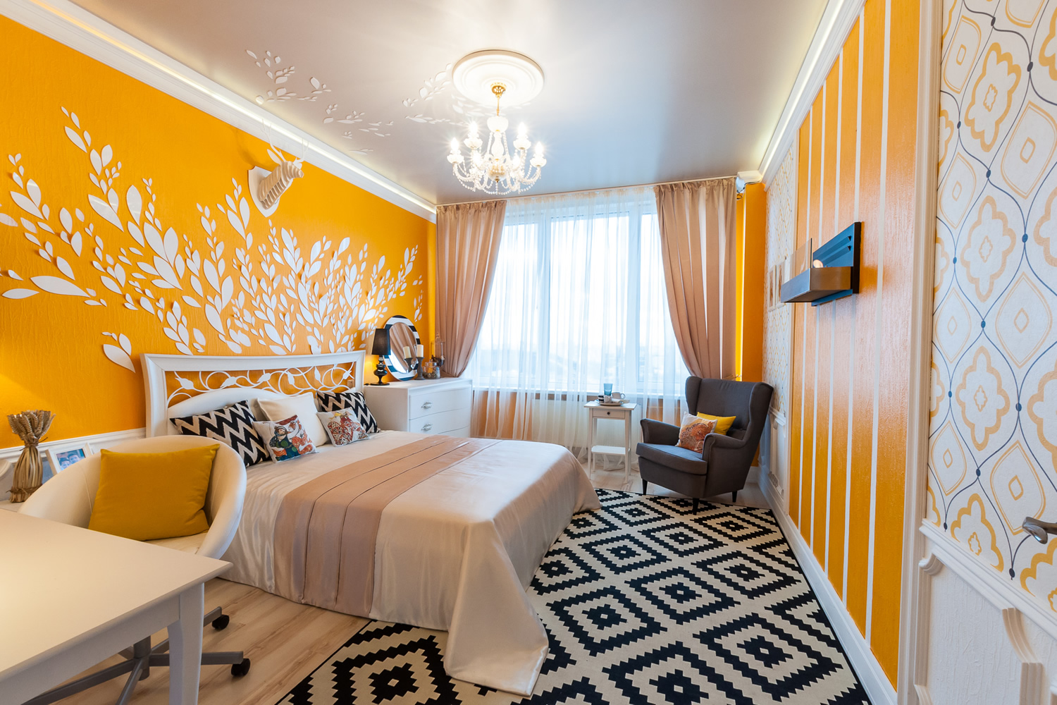
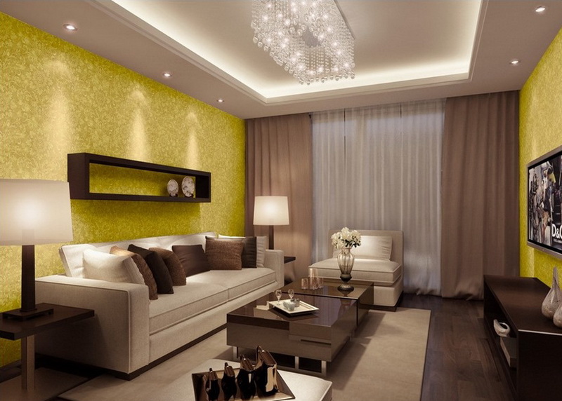
In the bedroom and living room the furniture looks good in diluted white yellow-orange tone with a cocoa shade pattern. A good design will be the use of textiles with gold plating on a brown background. The sofa and the chairs of a dairy shade made of a leather will approach to dark-yellow tone of wall-paper.

Choosing furniture and curtains, eliminate their coincidence in tone, otherwise the interior risks becoming boring. Ideally, in the space was at least four shades of the color palette. They should be chosen in the following way: two main contrasts (starting from the color of wallpaper and furniture) and two shades that soften the transition of contrasts (one similar in tone to the wallpaper, the other to furniture).
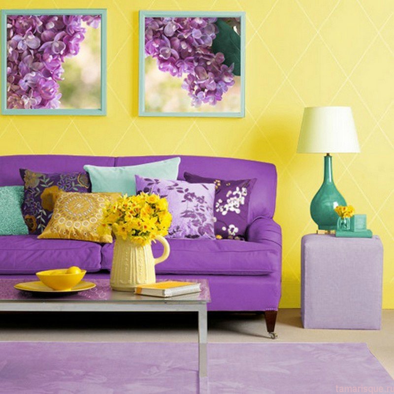
If you want to combine the yellow color of the wallpaper with a violet shade of furniture, you should support the color of the sofa by drawing pictures by placing them in the guest area of the wall, adding an attached cupboard or a light lilac carpet to the decor. In this case, it is recommended to dilute the duo of colors with decorative pillows with a pattern to match the aroric.
How to choose?
Since it's not easy to pick up yellow wallpapers, you should take note Some useful recommendations:
- so that the yellow tint of the wallpaper looks stylish, expensive and appropriate, exclude from the selection list budget paper varieties of thin and glossy plan, choose between vinyl, flizelinovymi, textile, liquid counterparts or glass wallpaper for painting (they will last longer and their texture is much better);
- if the shade is close to hot, do not choose a canvas with an abundance of gold in the pattern, as cold coatings with embossed ornament look much better on the walls;
- so that the surface of the cladding is flawless, buy wide meter wallpaper that reduces the number of joints and simplifies the decoration of the walls;
- Exclude from the list of choice paintings with a bright contrasting pattern: such wallpapers are difficult to combine with furnishings and much better if the beauty of the wall coverings is accentuated by dark furniture legs or accessory details;
- Pay attention to the picture: wallpaper in the children's room should be light and airy, pomp is appropriate in the interior of the living room or home library (if possible, rely on the originality of the texture);
- the shade is demanding of the number of interior accessories: if there are a lot of small things in the room, the motley wallpaper pattern is excluded (it is better to pick up textured fabrics);
- if the furniture is black, pick up paired wallpapers, zoning a small fragment of the wall with a canvas with a discreet print (some plain wallpaper combined with black look limited, you need to gently combine contrasts).

Beautiful examples and options
In more detail to imagine how to successfully create a design with yellow wallpaper, you should refer to examples of experienced designers.
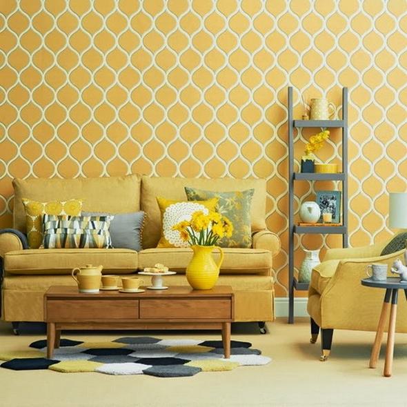
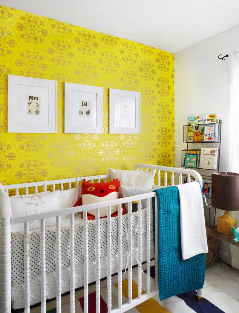
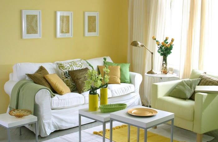
Composing the interior of the room in yellow tones, you can use different shades of yellow: paste over the walls with pale yellow wallpaper, support them with bright-colored furniture, decorate the overlaps with white paintings with colors that have yellow centers, separate the color spots with a whitish shade of the floor covering, light gray glass table and throw pillows with a gray print.
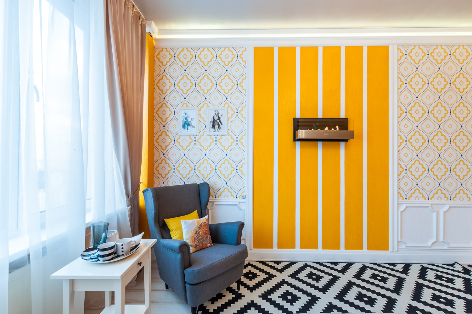
If you want to zone the space, you can paste over the accent zone with wallpaper with a relief pattern, setting a white sofa with multi-colored cushions against the wall, and the working area should be highlighted with a contrasting lining in a strip along the wall and ceiling, pasting with a white-lilac wallpaper.
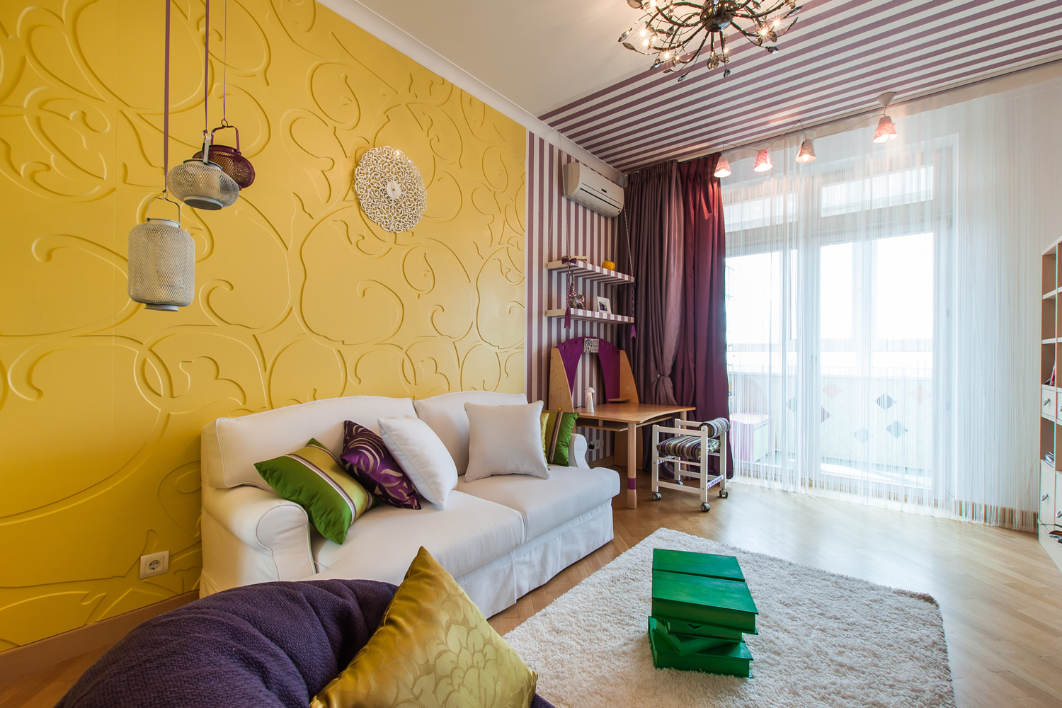
Taking the bleached yellow tint of wallpaper as a basis, you can finish the decoration with plain wallpaper, adding light furniture to the interior, and highlighting the sofa with a white cover, decorating it with contrast decorative pillows of pale orange, green, marsh tones, and supporting the delicate composition with white curtains in soft orange stripes.
It is possible to competently combine the yellow tone of the finish with the gray one: paste one wall with warm yellow stripes, and select the second as a companion with a similar background and a gray abstract print, arrange the furnishings in gray, leave the floor and ceiling bright with muted wine and smoky blue hues of decorative pillows.
About what curtains to pick up to the yellow wallpaper, you will learn from the following video.