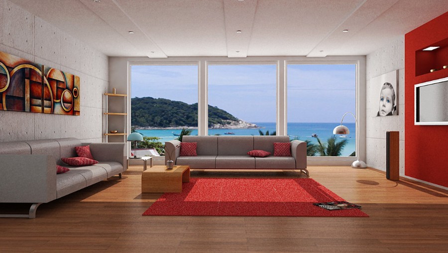
Red carpet in the interior
More recently, the carpet was considered an old-fashioned design element. He modestly settled on the floor of an incomprehensible spot, often not having any reference to interior items. Today, designers look again to him, but this time the carpet is subject to certain rules, taking into account the color characteristics of the canvas. The red carpet in the interior deserves the most attention: this color is quite catchy, so when drawing up a design with it, you need to know a number of nuances.
Color features
Red carpet in the interior of the room is not a way to cover the floor is not the first freshness. The saturation of the tone tends to attract attention, so it is worth considering: the floor should be perfect, whether it be laminate, parquet or linoleum. And the red color is out of place on the floor, the tone of which gives red.
Regardless of whether the red carpet is used as a single accent or is tied to a specific item, the color must be muted, otherwise a sharp atmosphere will be created in the room.According to psychologists, the mass of red or its excessive brightness can cause irritability and distraction.
An abundance of color is unacceptable: the carpet itself and a small link are sufficient (for example, in the form of a lamp floor lamp, a pattern on curtains, a flower pot).
Since red itself is sufficiently strong, very emotional and even aggressive in tone, it should be used properly in the interior, in the form diluted with another shade.
This can be done by mixing colors with a predominance of red or choosing a carpet with a pattern.
What to look for when buying?
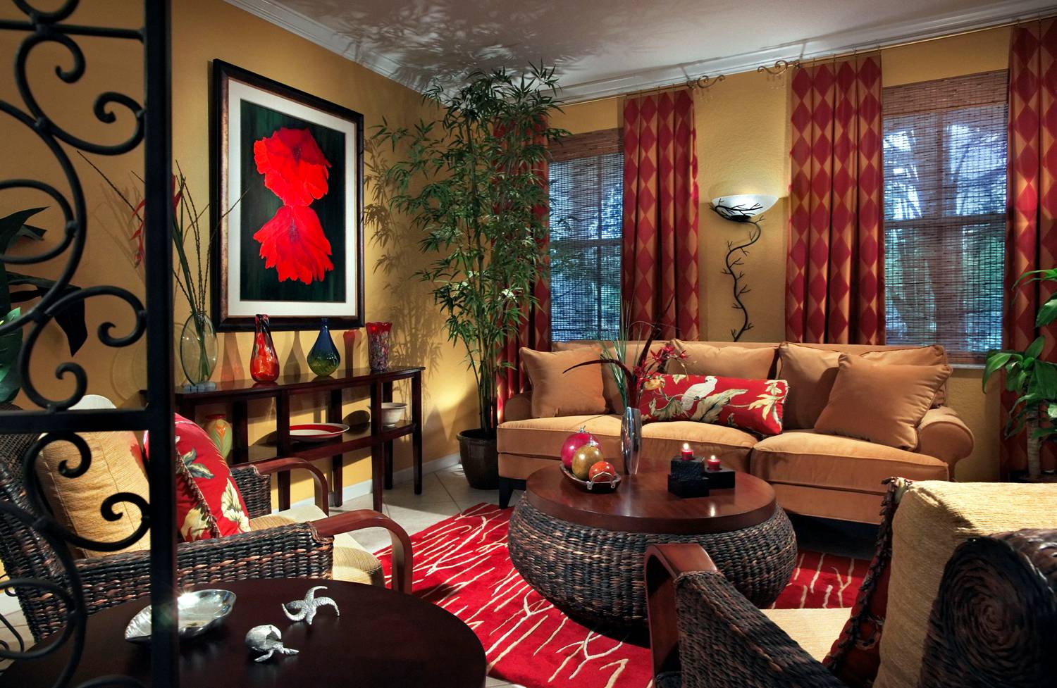
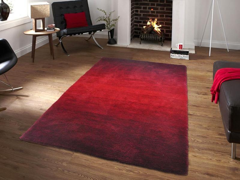
Do not give in to the opinion that the red color is a sea of positive and vitality. Shade is alien inspiration and creativity, but it demonstrates a storm of feelings, swiftness and confidence. The red carpet is able to “warm up” the atmosphere of the room. If he is in a room with windows to the north side, this is a good choice: over time, the owner of the room will feel that this is the warmest place in the house.
Before you buy a red carpet, it is worth considering every little thingso that the product is in harmony with the general idea of the design, and not overwhelming all attention to itself, breaking the style into incomprehensible parts.
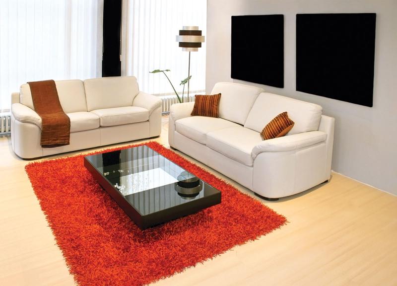
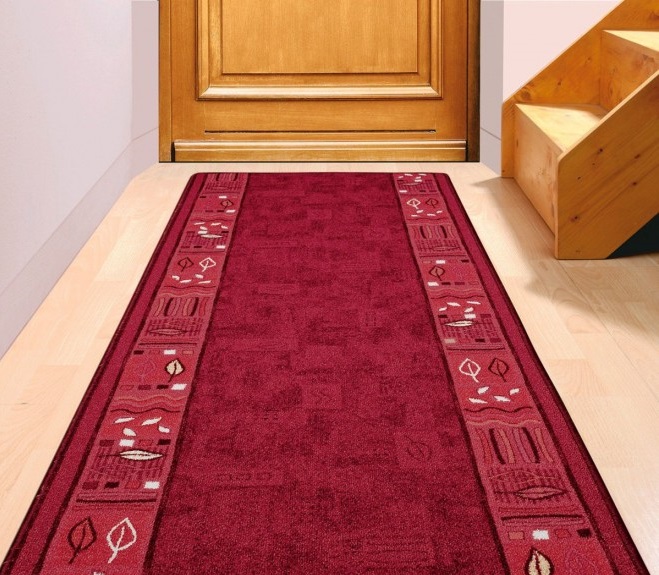
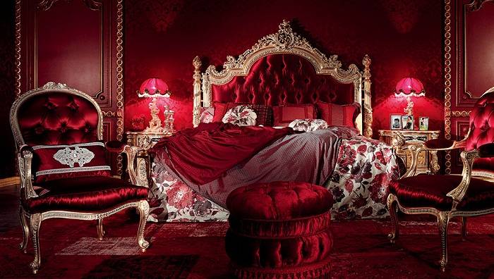
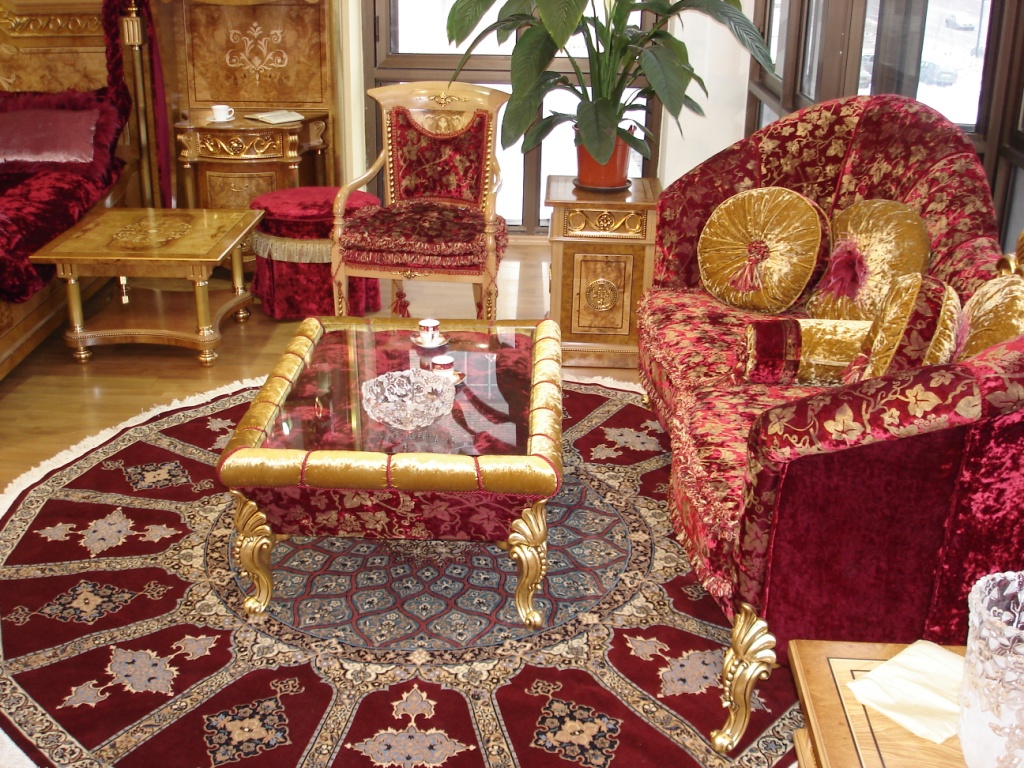
The important point is the choice of the shade itself.Ideally, it can be a wine red or red-blue tone. The combination of two strong colors allows you to achieve a balance of compatibility with many shades of the color palette, successfully fitting the carpet into a different interior. No acid, sharpness: the shade of the carpet should be soft, have. If the first look at the model hurts the eyes, the purchase should be abandoned.
A good option is a model with an infusion of red orange and sand tones in red.
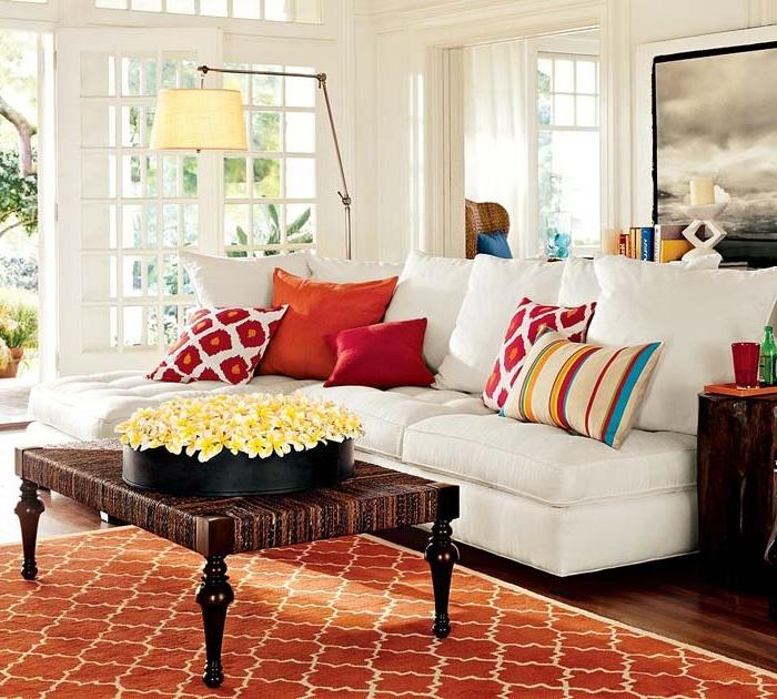
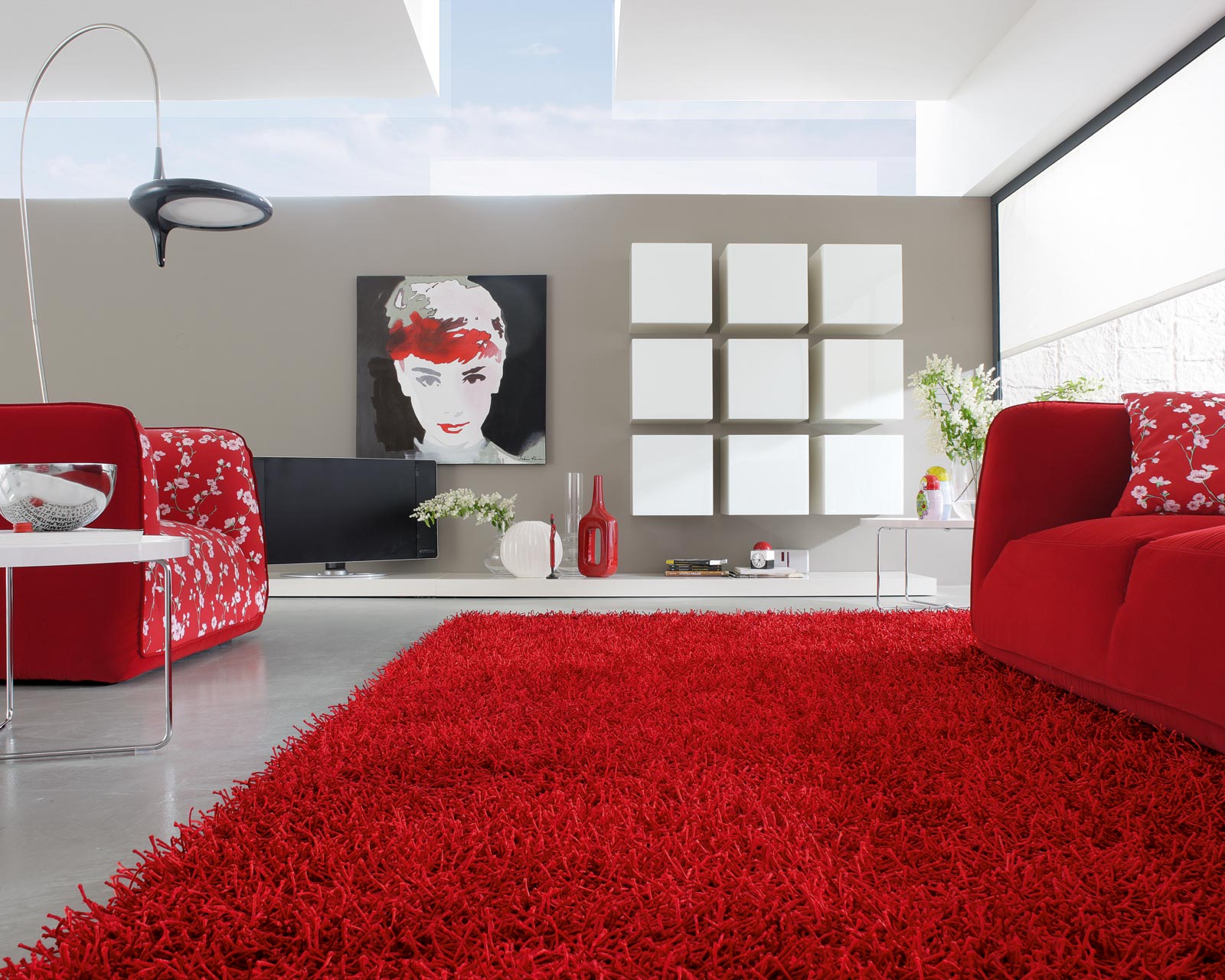
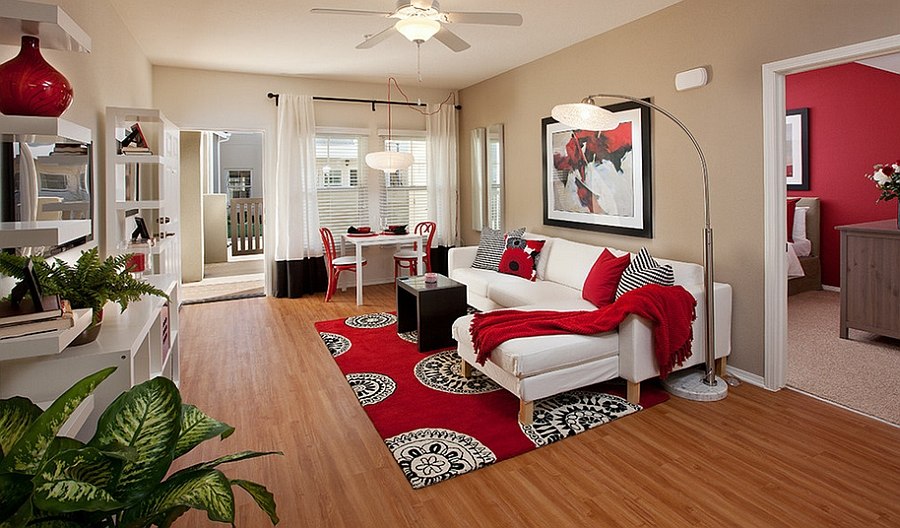
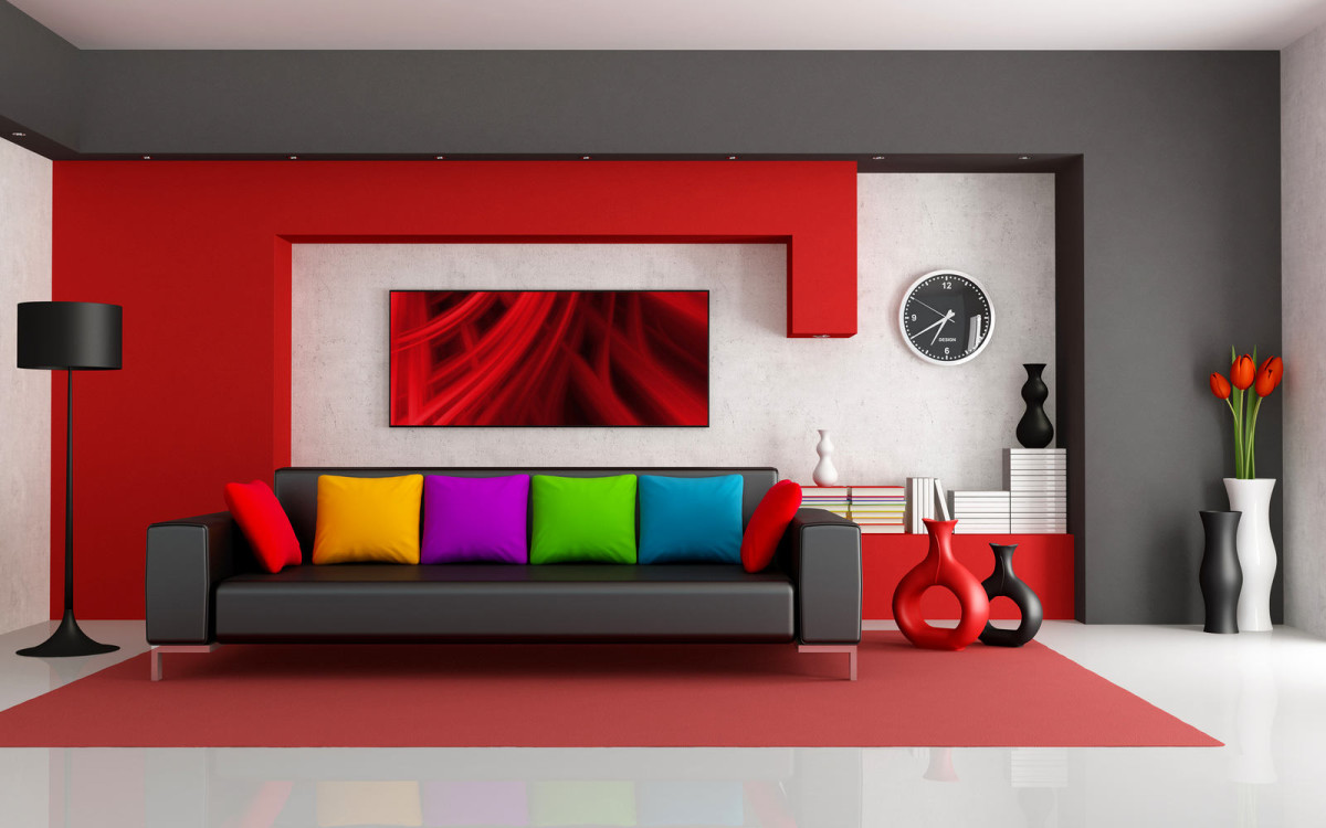
Having picked up a shade of a carpet, it is necessary to mean that red color is picky in combinations. Invalid contrast of red and black tones, it is sharp and looks ugly. The only thing in which black color can appear is small details. However, if without black in any way, it will save a metallic or silver undertone. Since, according to the rules for arranging shades in an interior, red needs dark strokes, it is more harmonious to designate this in black and brown. It will provide a soft infusion of carpet in red colors in the existing interior design.
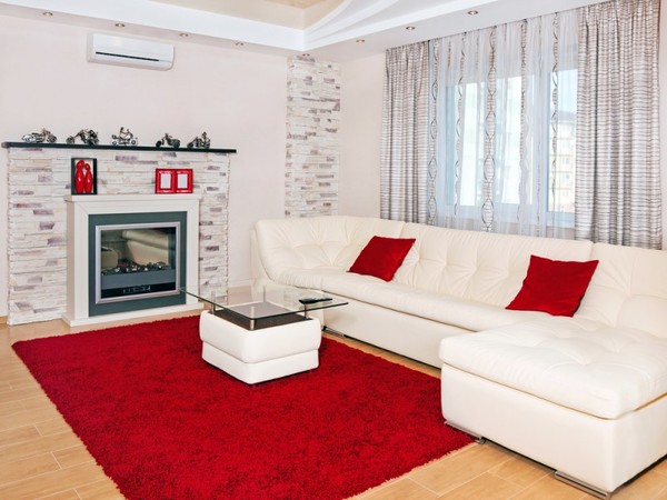
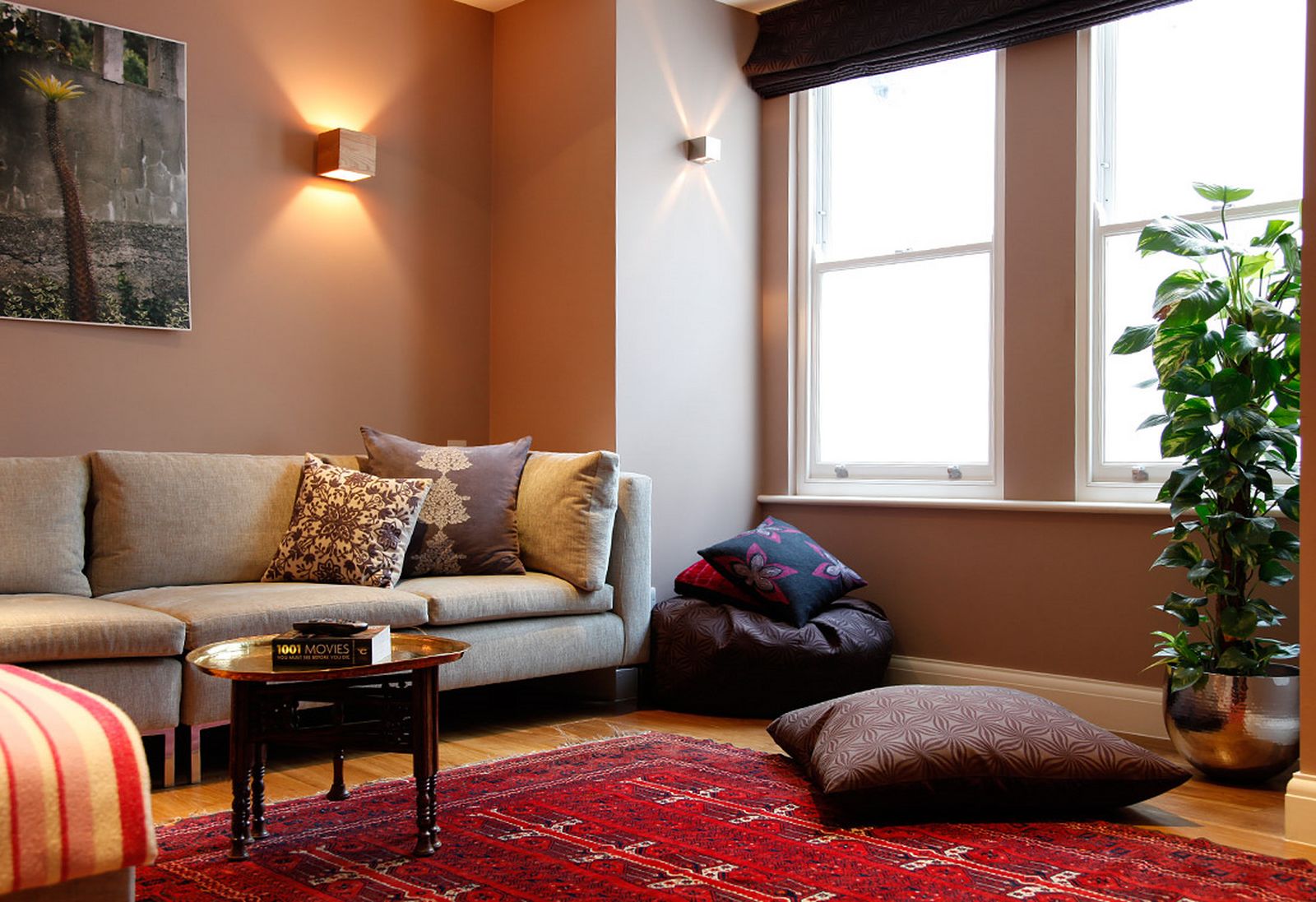
The choice of a strong component to the red color of the carpet needs to be diluted with tones and adding light that will stretch the limited area, create balance and make a positive.White walls, ceiling, curtains, sconces or table lamp, flower pots, textiles furniture covers - what you need. When combining two dark and bright tones of light should be a lot, but this does not mean that it can be used in everything: then the question of the relevance of bright accents will arise.

In addition to black brown, chocolate tones, this color goes well with dark gray and warm light shades (for example, beige, cream color).
Where to lay?
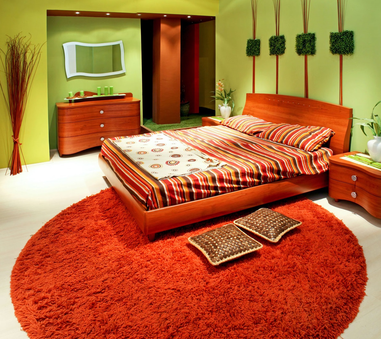
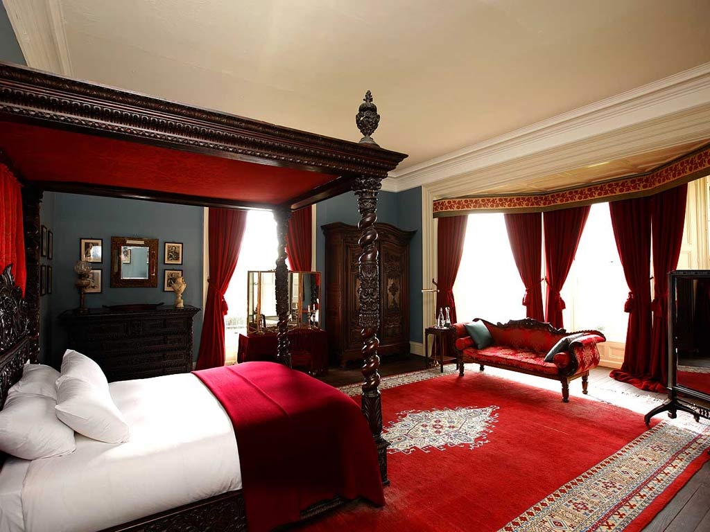
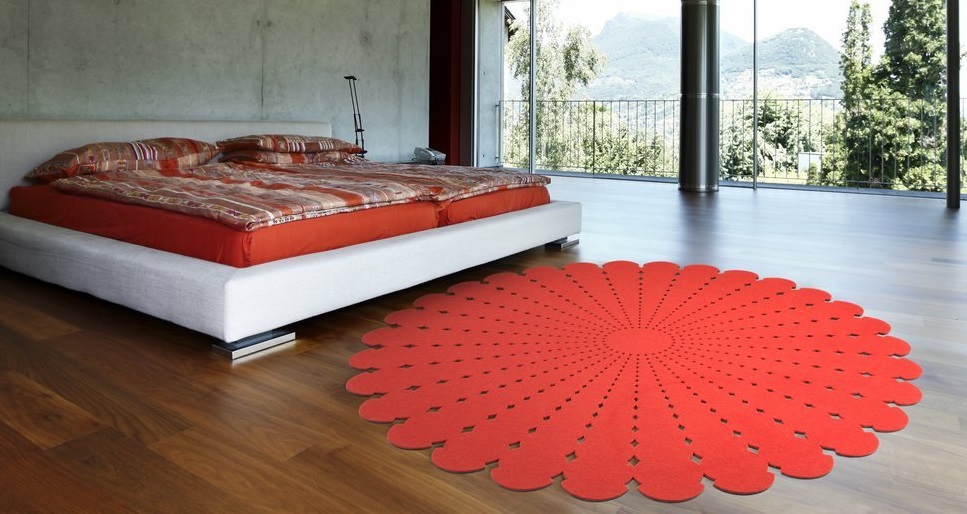
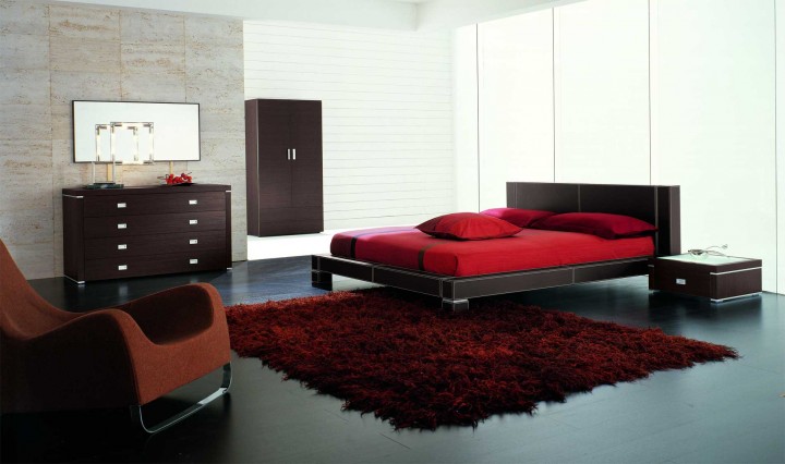
Do not “delight” the bedroom with a red carpet: in a special, intimate room, you need peace and relaxation, and this is possible with the use of pastel shades of the color palette, some classic and more soothing colors.
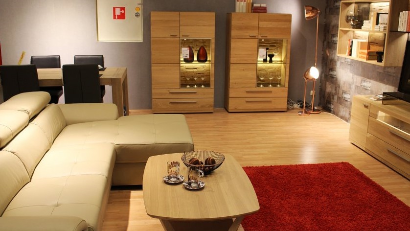
Since the red tone is set to work, it is advisable to lay such a carpet in the office.
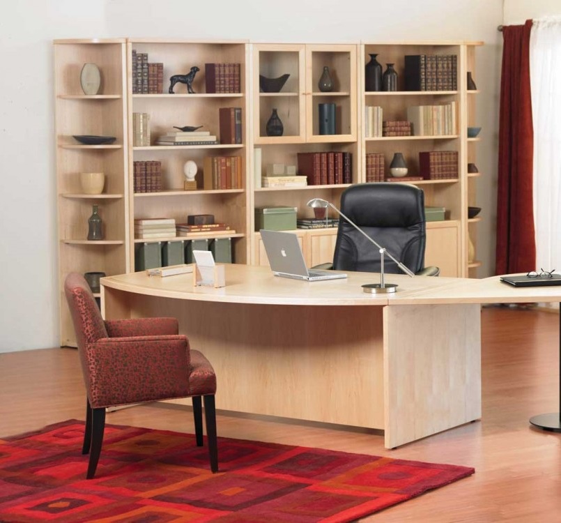
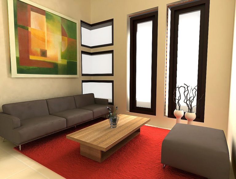
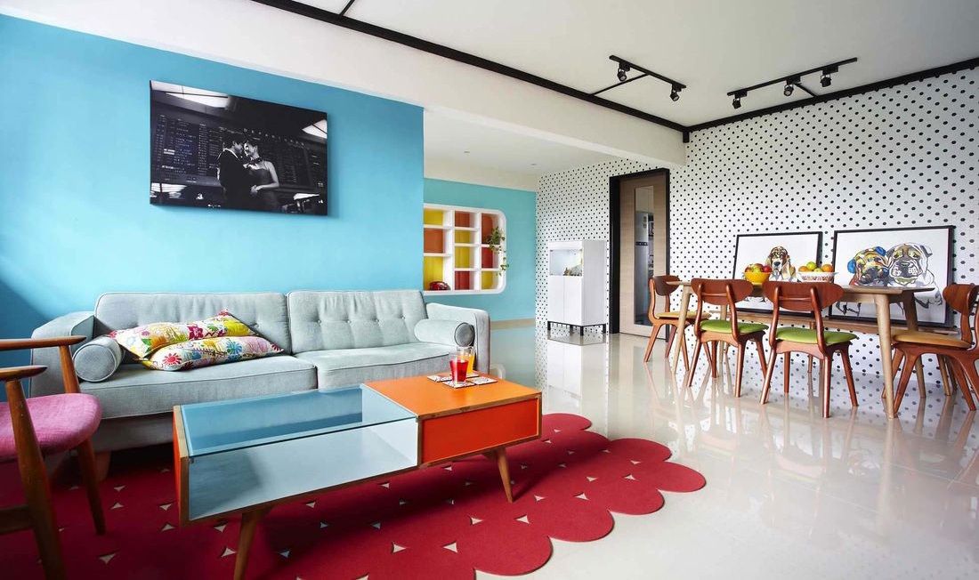
It will not look worse in the hallway, corridor, living room. For the children's room, it is not suitable.
Interior layout subtleties
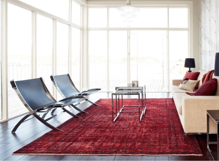
Since the task of the red carpet is not only to create comfort and provide warmth to the legs, but also to harmoniously blend with the general idea of the design, it should be borne in mind: bright color provides a minimum of small objects.It perfectly zones the room, depending on the model adds to the style of the room additional color and texture uniqueness.
Ligament options may be several:
- to the color of the furniture elements, located near the carpet (complete coincidence of the shade is not allowed);
- to the drawing of the accent zone of a wall or other vertical surface (for example, in a picture);
- to the texture of decorative pillows, poufs, furniture upholstery;
- available in the interior of small spots of a similar tonal group.
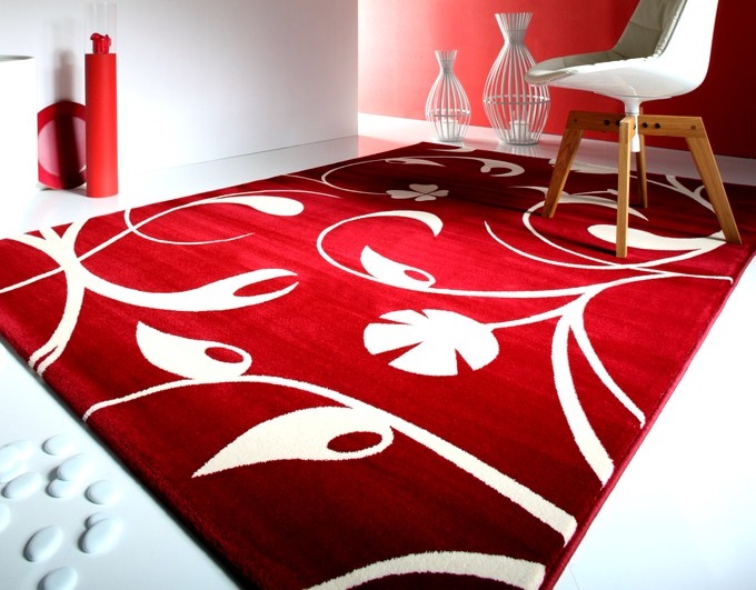
Choosing a red carpet with a print should be borne in mind: not every shade needs support. Basically, one color is enough, maximum two.
Materials, shape and size
Models are made from different raw materials. The most popular types of fibers today are wool, cotton, viscose, nylon, polyester, polypropylene. Synthetic products are more durable, can imitate high-quality wool carpets, practical, unpretentious in the care, but are exposed to sunlight. Natural counterparts create a relaxing atmosphere, are an excellent floor covering, are quite pleasant to the touch, keep warm, but are more capricious in maintenance and cost much more than synthetic carpets.

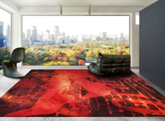
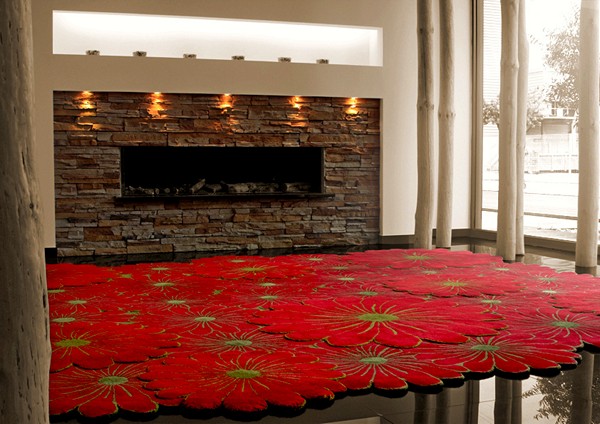
Red carpet is appropriate in the style of classicism, modern, baroque, minimalism, African, Gothic, Indian, art deco, pop art. In each of them, it looks different and differs in its own, special pattern, which can be a highlight of the general idea.
The size and shape of the red and red-blue carpet depend on the characteristics of the particular room for which it is selected. This may be a small option, a peculiar island of one zone, a large canvas of carpet, a model of medium size.
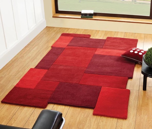
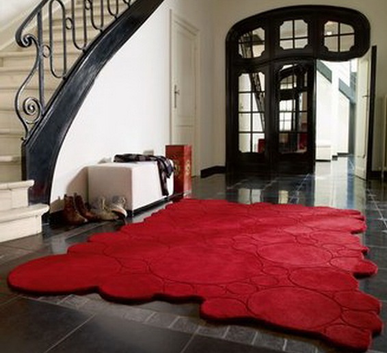
Thanks to the creative development of trademarks today you can choose a product in the form of a rectangle, square, oval, circle or non-standard silhouette with special outlines.
Important nuances
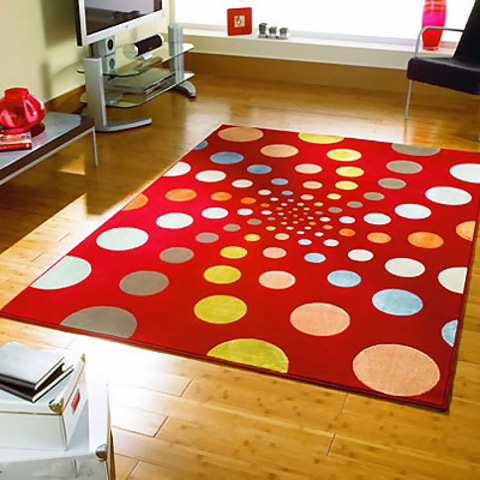
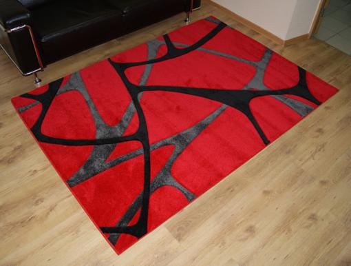
Patterns of carpets in red are varied. If you really want the interior to be special, choose between color or texture. The classic versions in the spirit of the Soviet times with little or no pile or with a border around the edges look simple, depriving the design of premium and taste.

Unusual and harmonious look model with a special, figured edge and print, made through the texture of the pile.This can be a pattern in the form of stripes, zigzags, waves, circles, abstraction. Motley prints in the style of national carpets can overload the overall look, because the main thing is to gently highlight the uniqueness of the carpet.
If the model has a simple pattern, it will help a harmonious combination, and it’s good if the carpet does not have clearly defined borders in the form of a patterned edge: this way it will not hint at the limited space of the room.
In the presence of a strip it is worth considering: frequent strokes cause ripples in the eyes. This carpet will quickly get bored.
In the video below you can see interesting options for the placement of carpets and carpet paths and in various modern interiors.