Design and combination of wallpaper in the interior
Now manufacturers are a huge number of different types of wallpaper, which differ in their color, pattern and texture. And in order to diversify the interior, many resort to combining wallpaper. It is important to know the rules of combination of textures and types of different combinations.
Combination methods
In order to properly combine the materials, it is better to choose wallpaper companions. They will make a beautiful combination, and even make fashionable zoning. In this case, you can use both versions of two paired colors, and the layout of three types of wallpaper.
Today there are several different ways to combine, that allow you to combine in the same interior wallpaper of different colors and textures:
- The first way is the spectrum. It involves a combination of wallpaper of several different shades that come in the same color scheme. So, you can combine sand and gold, beige and coffee, blue and blue, emerald green and light green.
Such combinations look very harmonious. Wallpapers will perfectly complement each other. Thus, it will be possible to decorate each separate surface of the wall with wallpaper of different color.
- Balancing method. It is characterized by a combination of two types of wallpaper. And the main one in this case will be a wall covering made in one calm color scheme without patterns and colorful drawings. Complement this coverage with bright saturated wallpaper with a motley pattern and an unusual ornament. But at the same time, the background of the wallpaper with the patterns and the drawings themselves are selected to match the color of the monochromatic coating. It is better if they are made in the same color scheme.
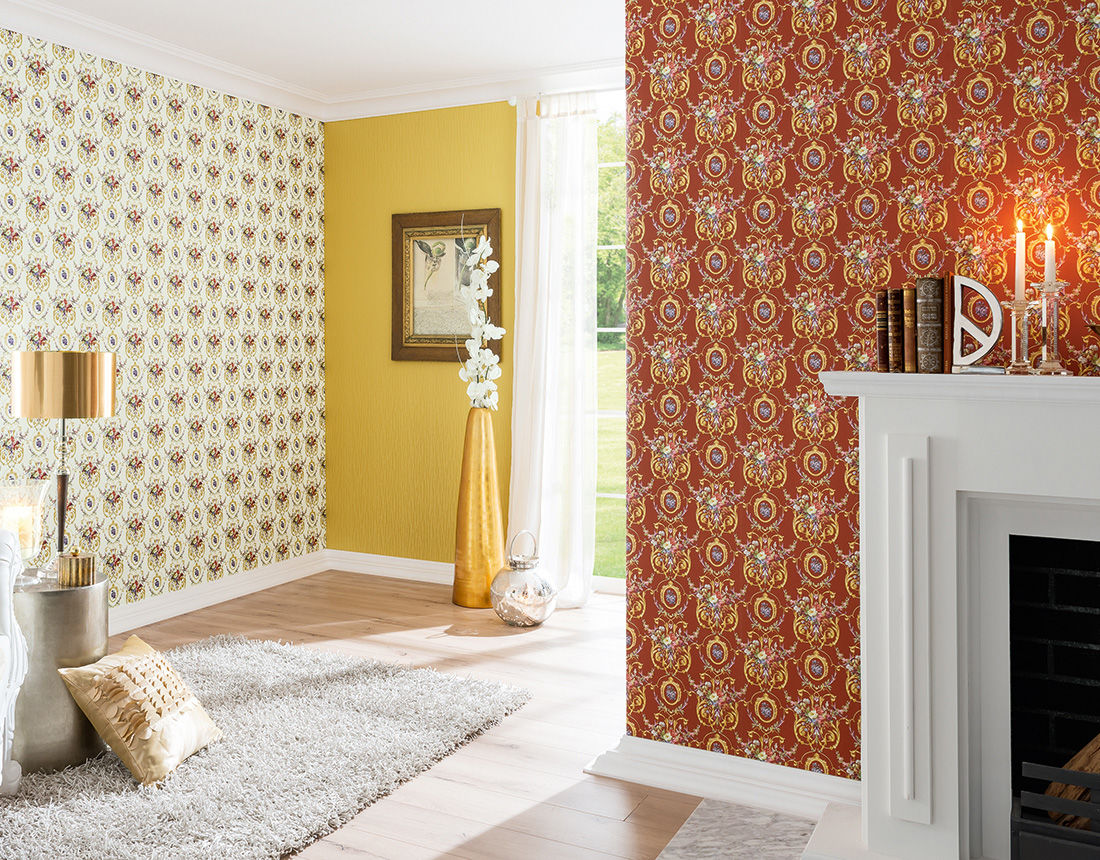
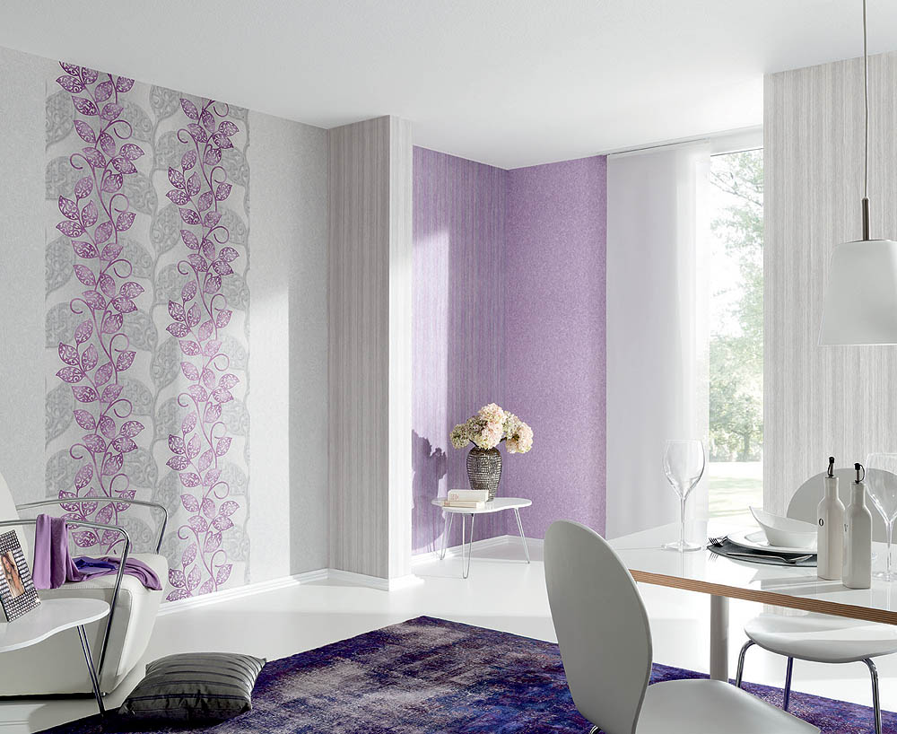
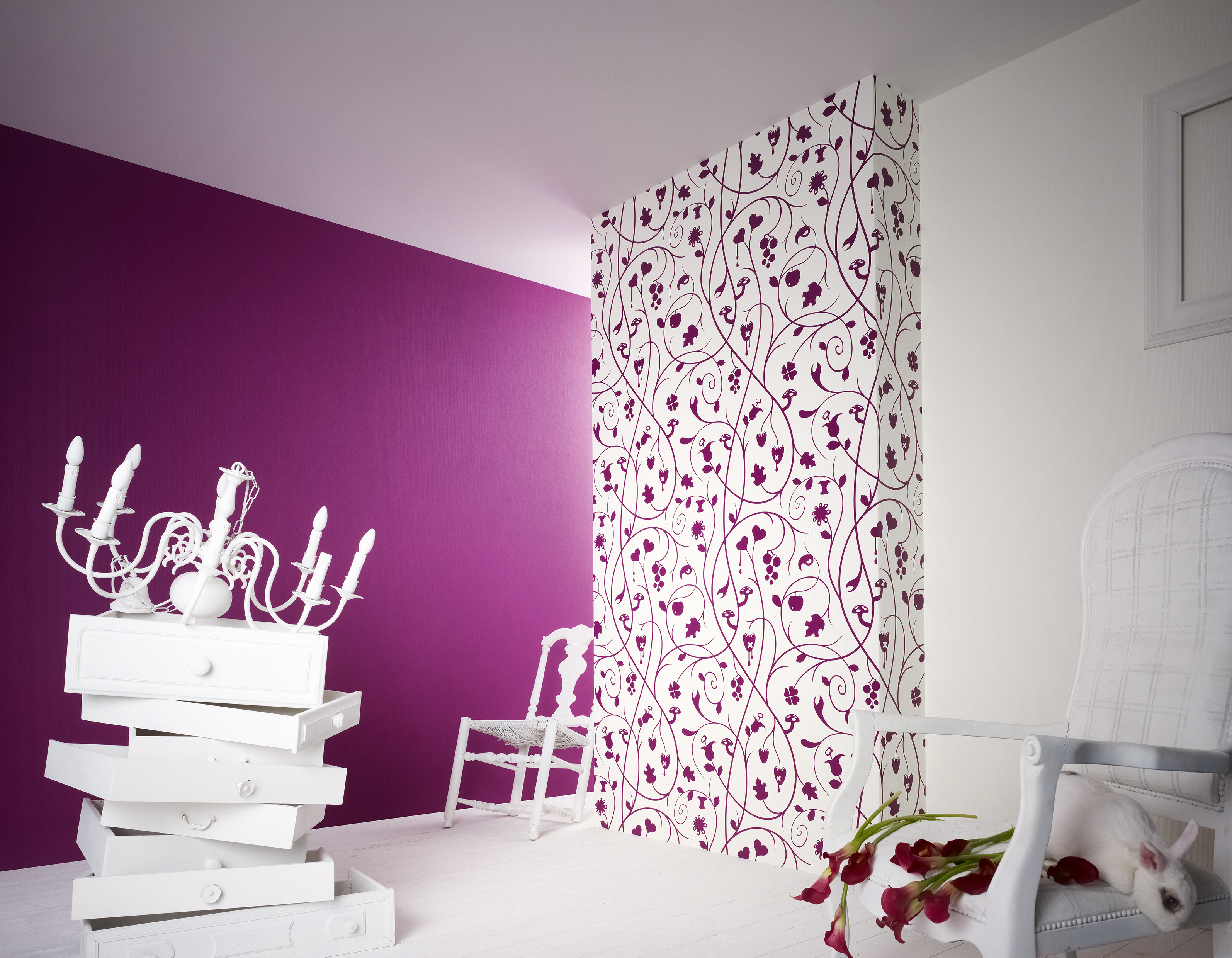
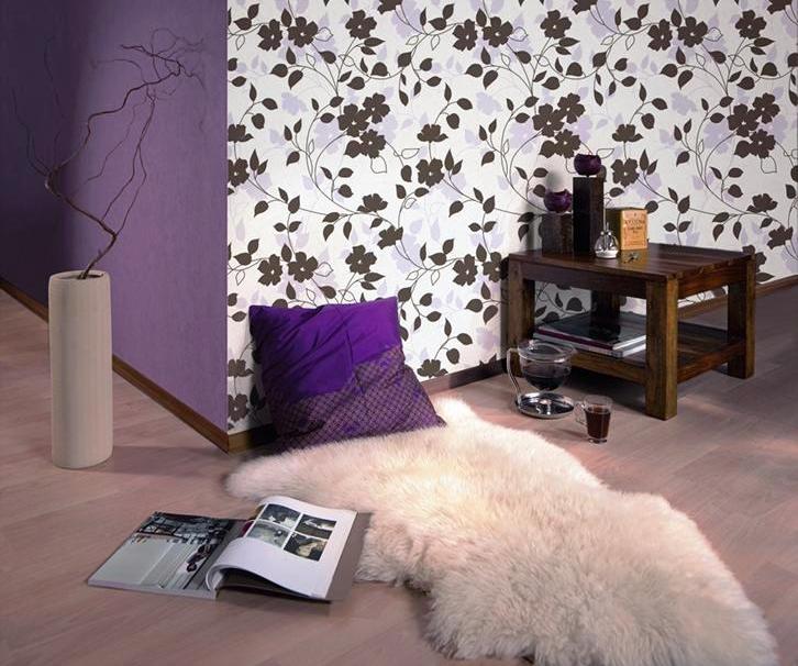
- Way of contrast. It offers a selection of wallpapers of opposite colors. One color should be active, bright, the second - passive, calm. The second color should smooth out the saturation of the first and complement it. In general, this method allows you to very harmoniously arrange the wall.
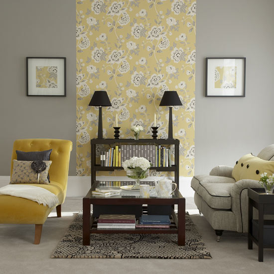
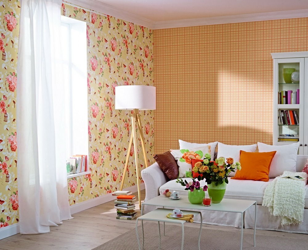
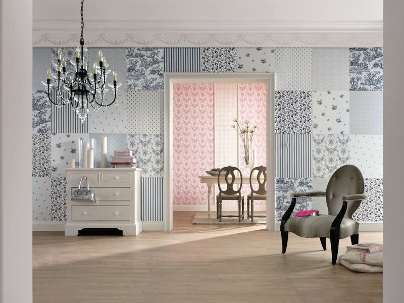
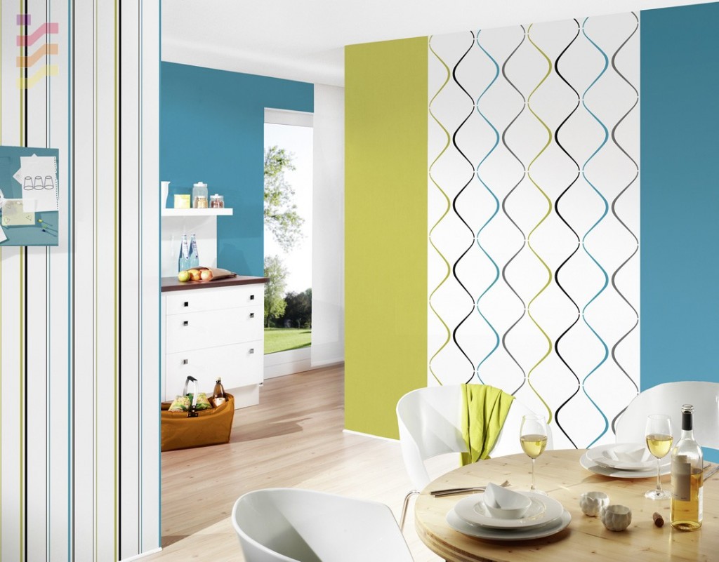
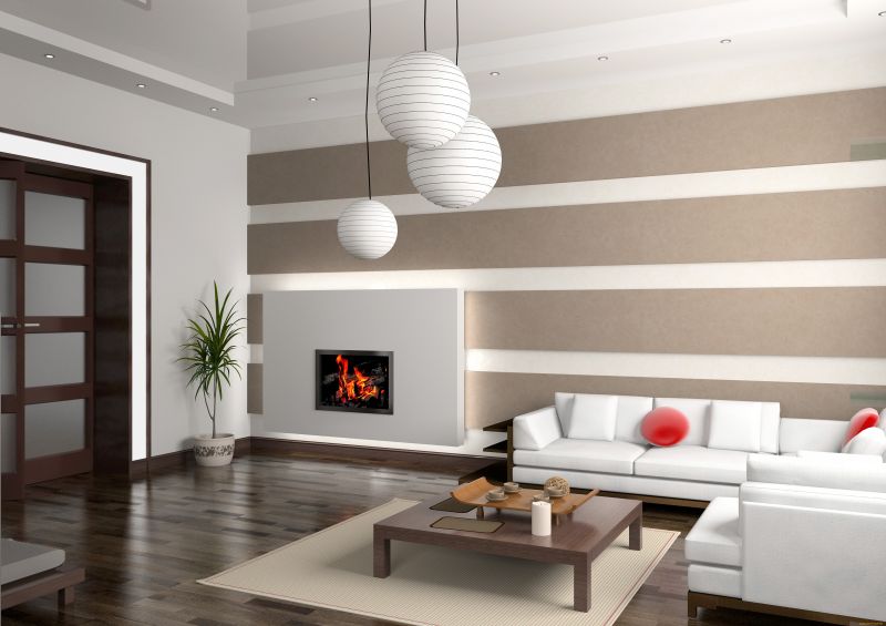
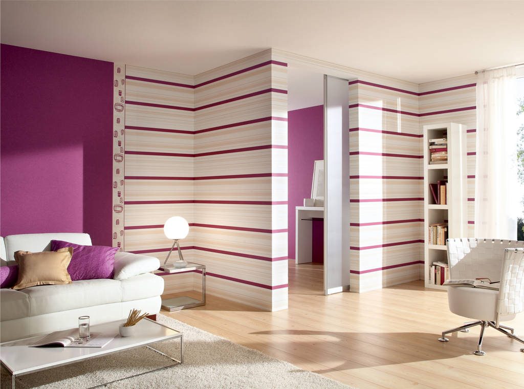
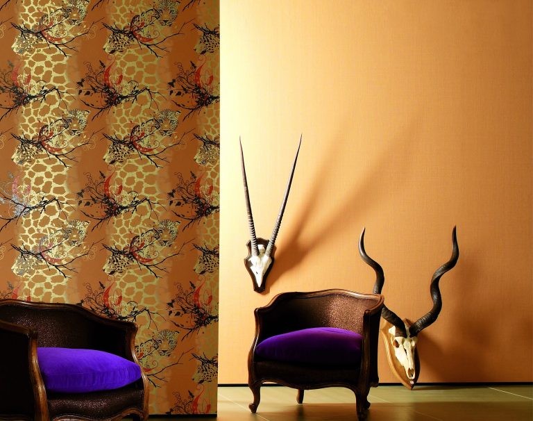
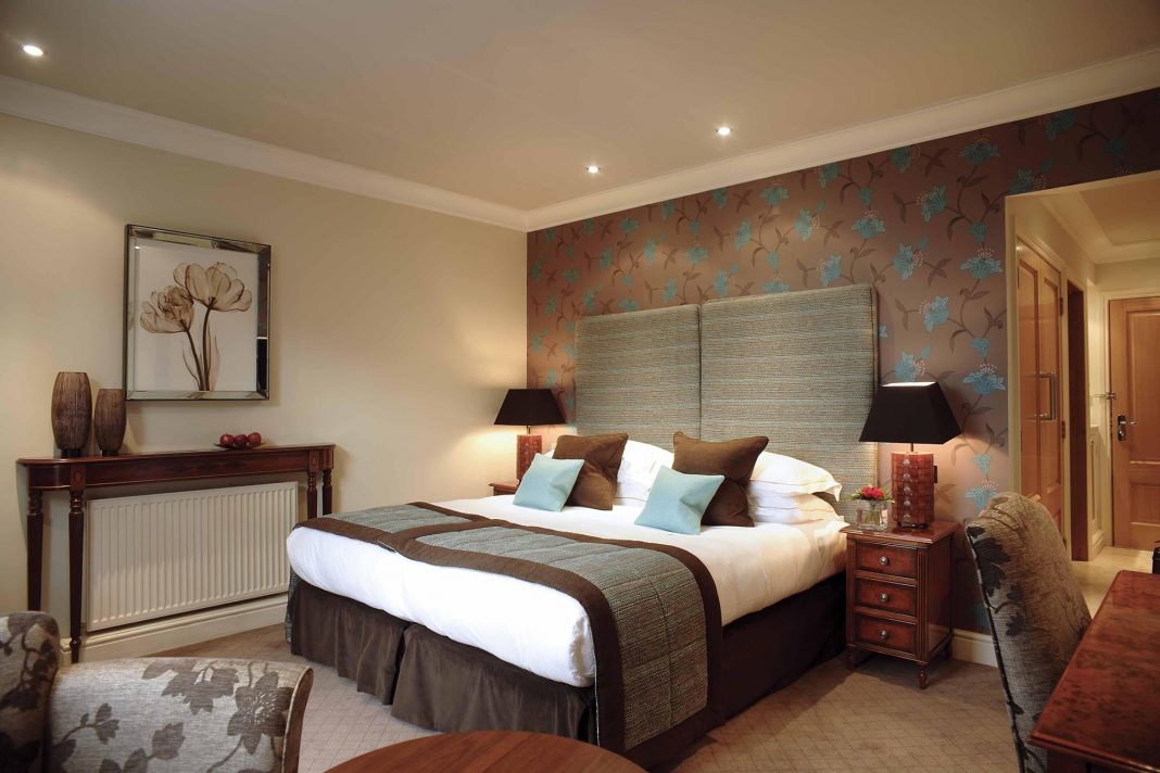
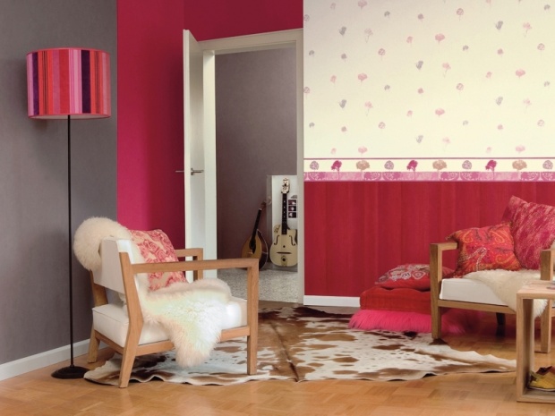
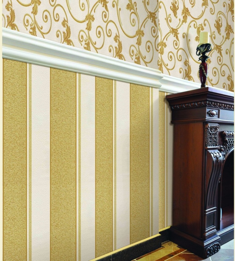
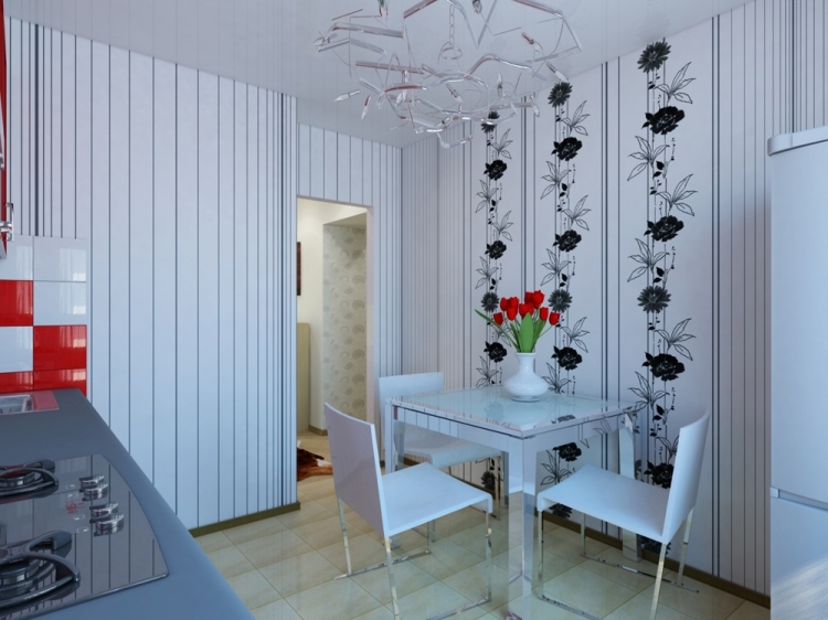
- Separation of the wall. In this case, both horizontal and vertical combination is applied. You can use different types of wallpaper on one wall, making the upper part, for example, plain wallpaper, and the bottom - a coating with pictures. Vertical wall separation is also very popular. It is very often used when zoning spacious rooms or studio apartments. So you can select different functional zones and make several small zones from one large room.
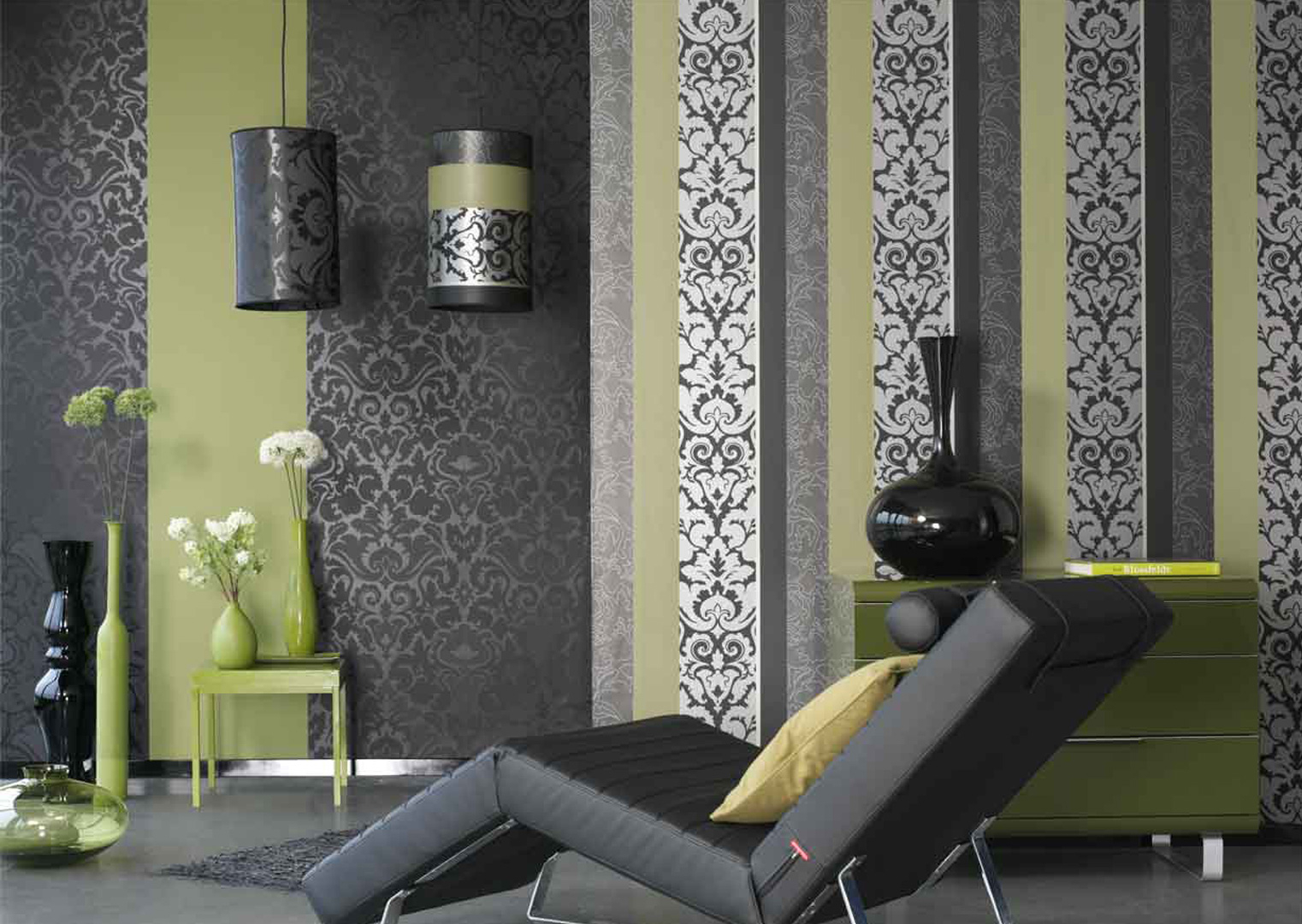
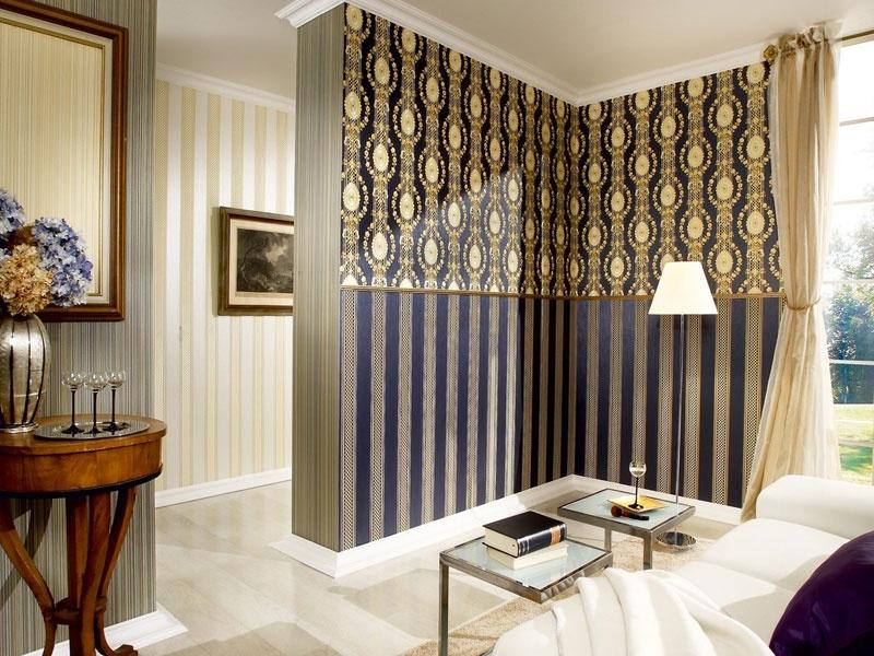
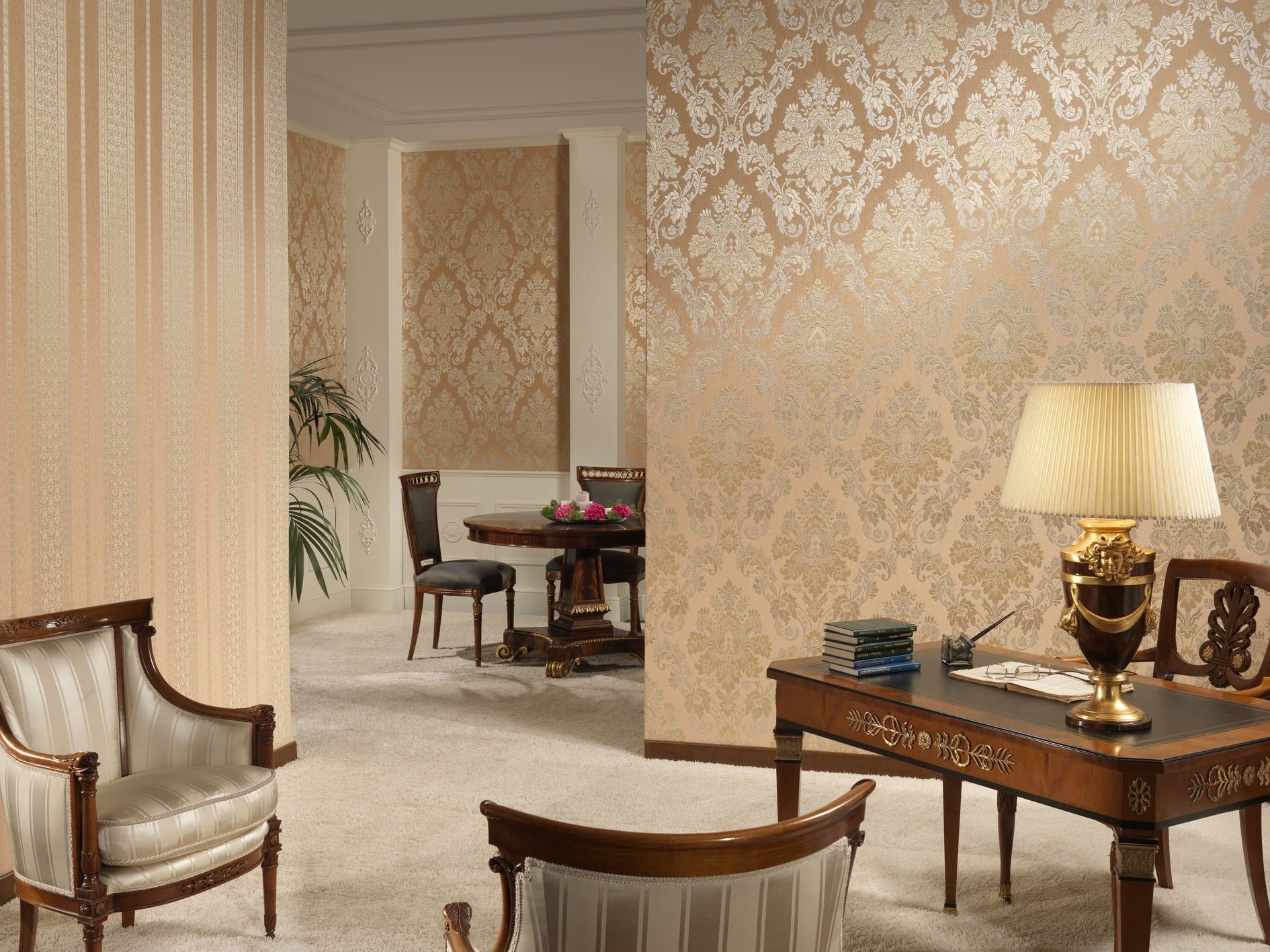
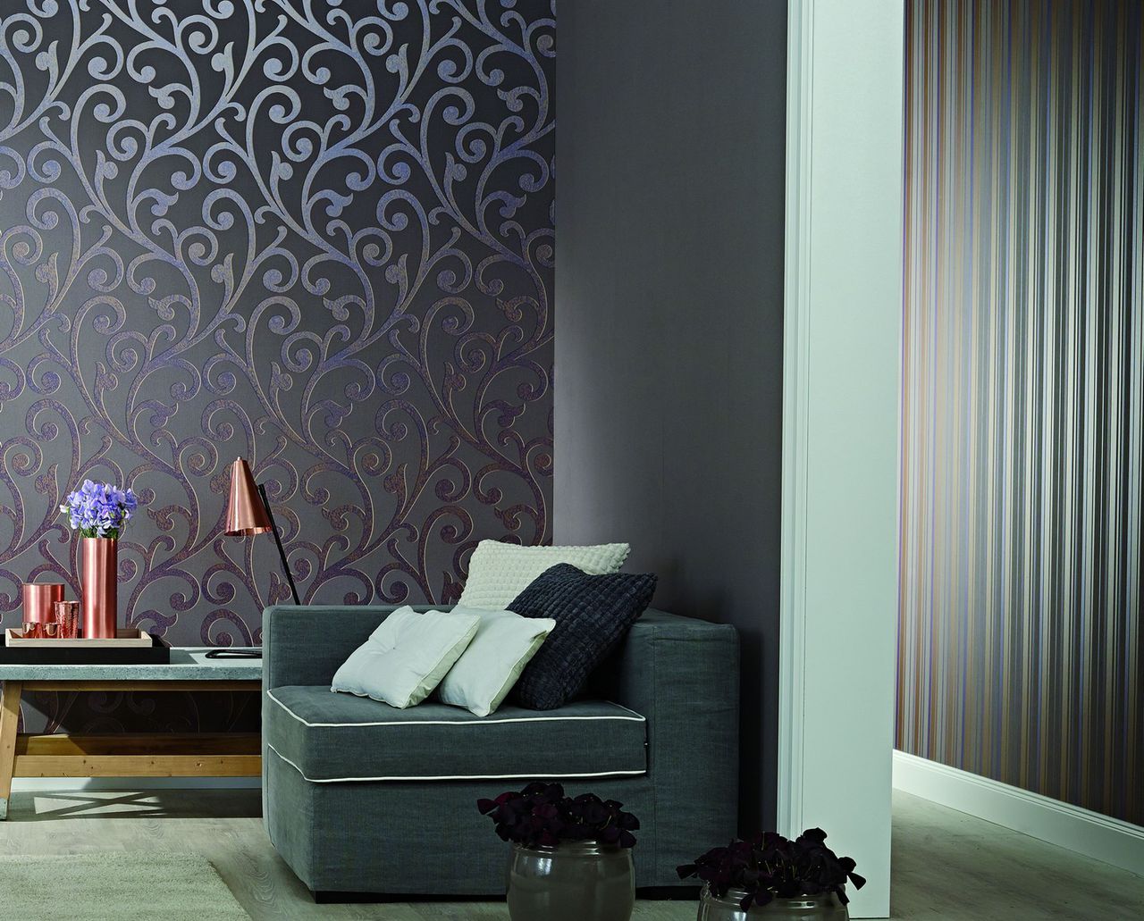
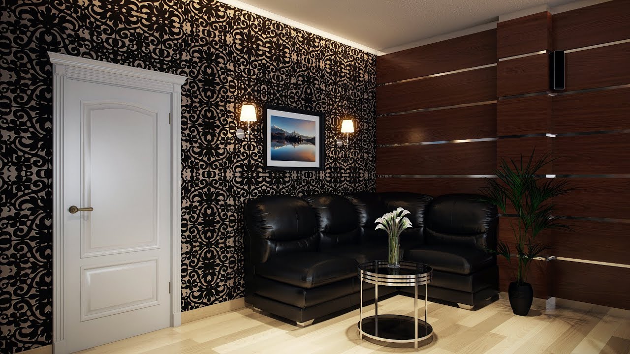
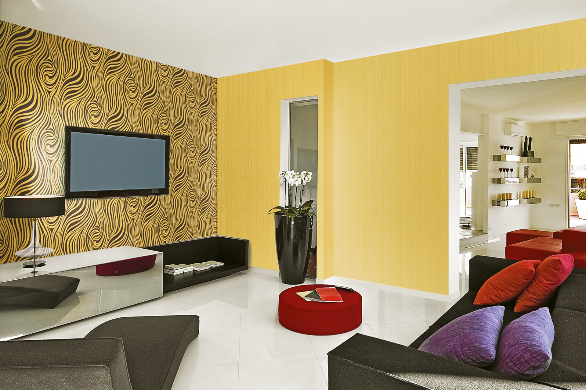
- The combination of textures. This method is also very popular. Some combine coatings that have different textures. But at the same time, if this method is used, then most often the colors of the wallpaper are selected as close as possible in hue. So you can add accents and make the interior more interesting. This combination technique will make the interior more interesting and spectacular.
If you use these methods correctly and select them, depending on the interior of the room and the size of the room, then you can play with the light, as well as with the dimensions of the room. So you can make the room visually wider in contrast or pull it out.
- Combination by inserts. Thus, they often try to diversify the wall in case the main background is already selected. You choose inserts from rather dense wallpapers and decorate walls with them. Inserts can be cut in the shape of a square, rectangle, oval, rhombus. In this case, everything will be limited only by your imagination. Inserts can be simply pasted on the wall, and you can close their edges with borders or slats. Thus, you can extend the life of such a design and the edges of the wallpaper will not bully.
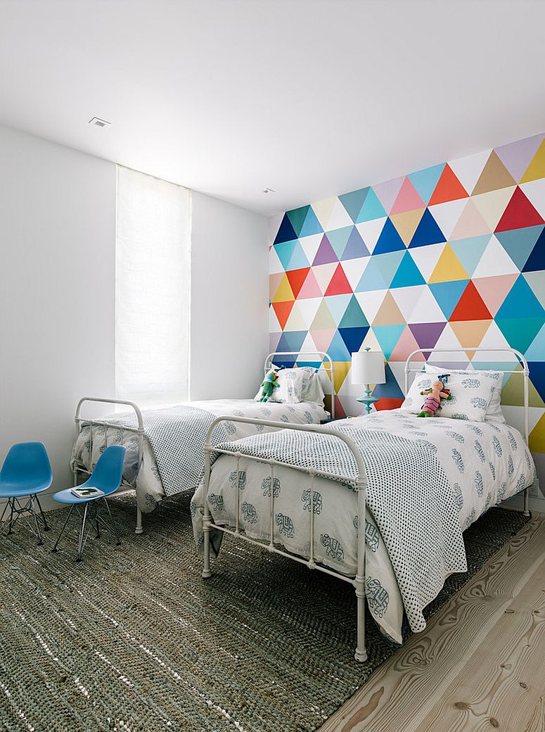
- The way bulk inserts. This method is very often used in zoning. Such inserts take up more space on the wall than ordinary ones. In this way, it is possible in the same room to allocate a working area, bedroom, playroom, if it is a child. The room is divided into sectors, the first of which is characterized by bright and saturated colors, and the second - more calm. Moreover, one of these two sectors should be voluminous.
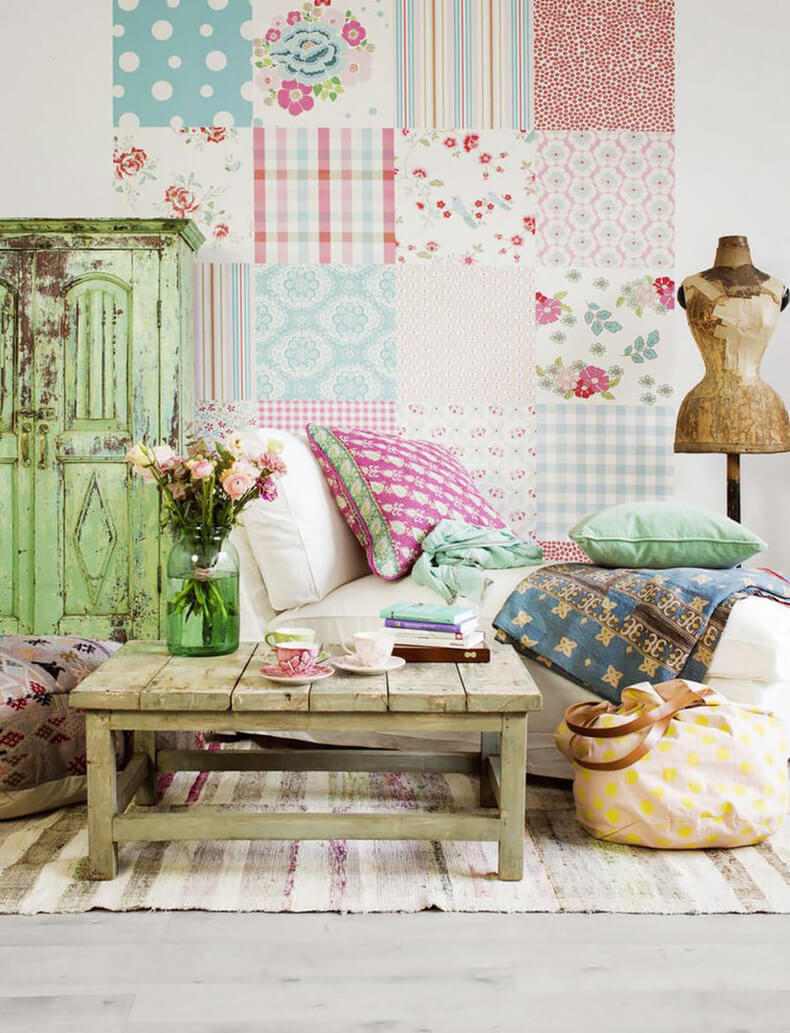
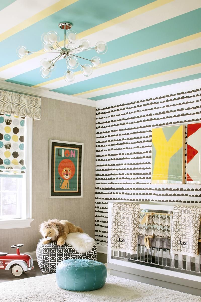
- Combining patches. This method is most suitable for children's rooms. In addition, it can be used by those who love an unusual bright interior and is open to all experiments. You can cut patches of small size from all your existing wallpapers that are left over from repairs. But all these patches should have at least one common shade or a general texture.Flap inserts can be glued overlap each other or end-to-end.
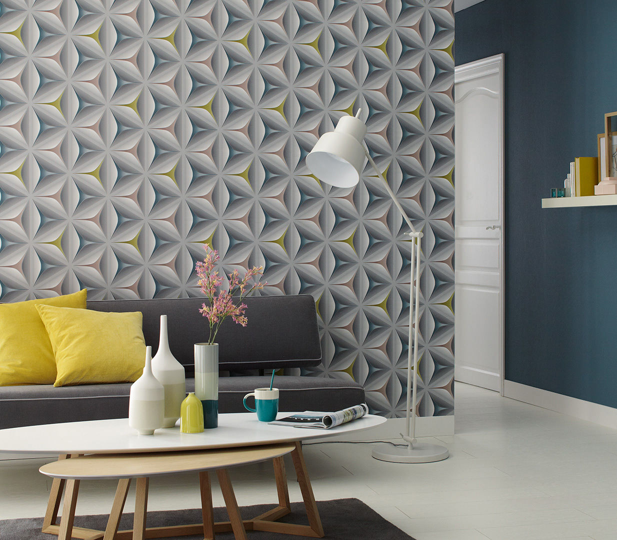
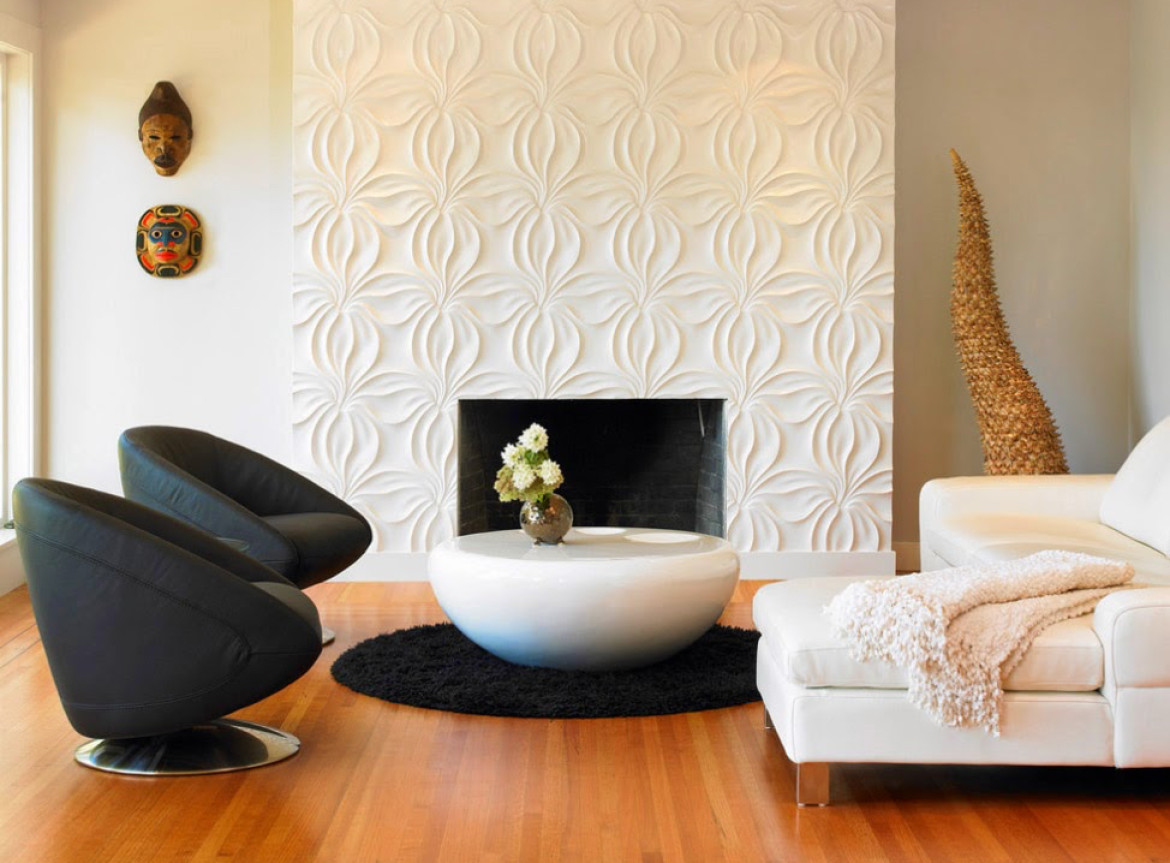
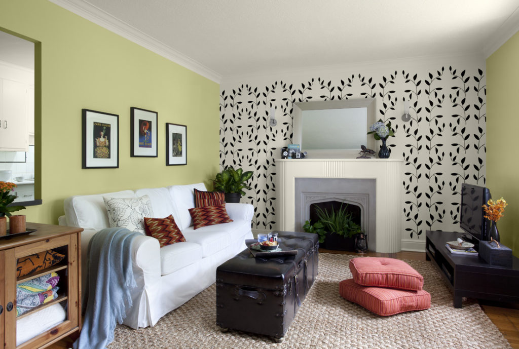
- Combination by highlighting protrusions. In some apartments, the wallpaper allows you to somehow decorate existing niches and ledges. After all, not all apartments such features of the walls look elegant, but, on the contrary, are a lack of interior. But this disadvantage can be easily brightened up and make it a big plus interior. As a rule, a niche or overhang is pasted over with brighter contrasting wallpaper, as compared to the background. And for their design often use wallpaper with a volumetric texture or an unusual pattern.
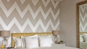
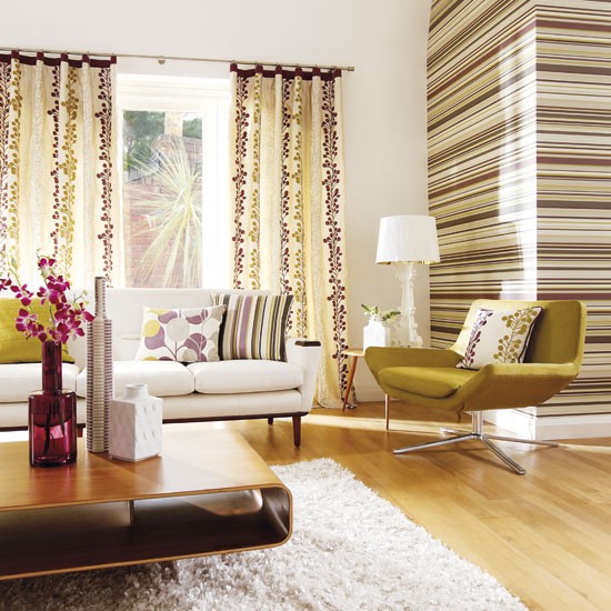
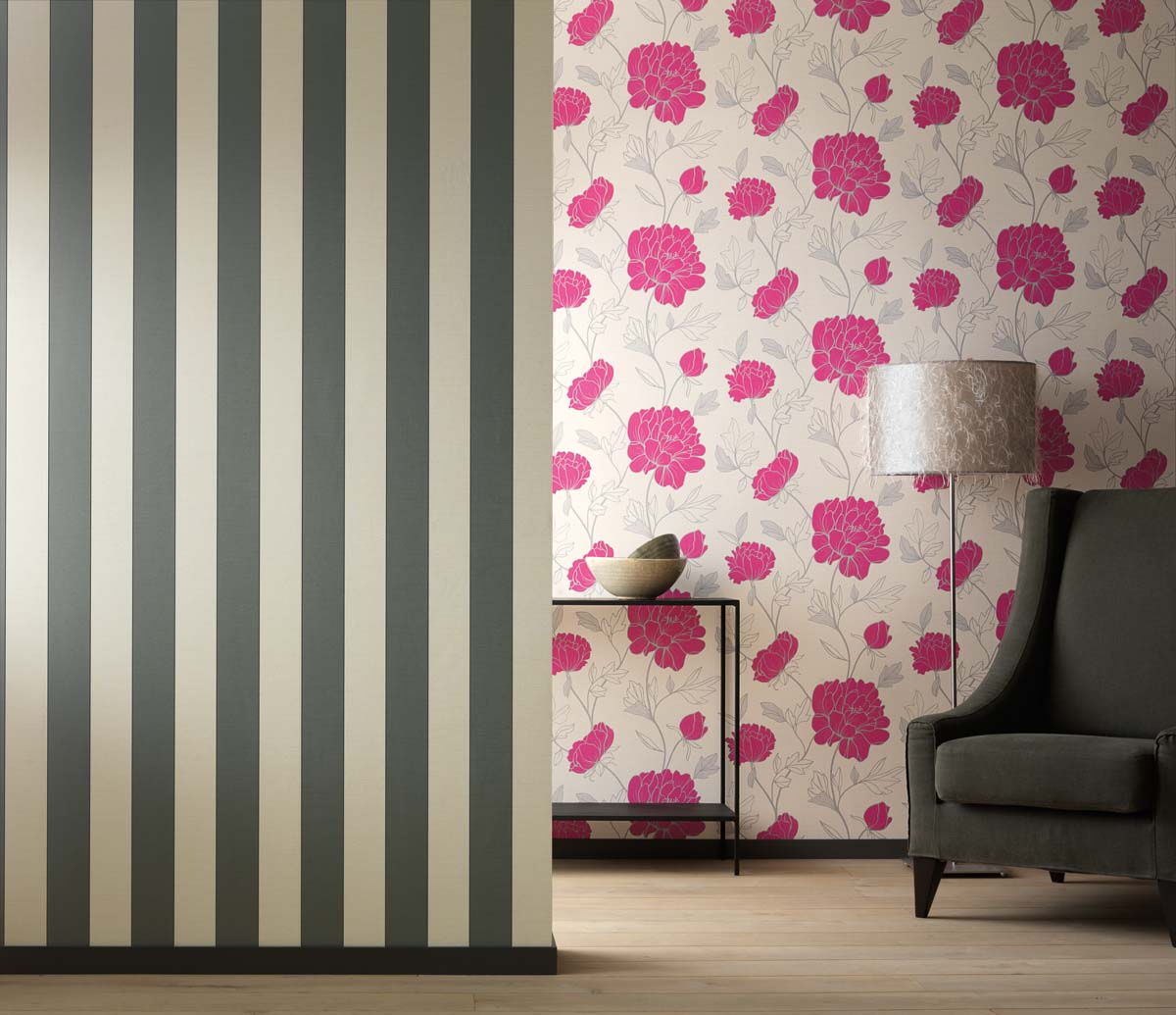
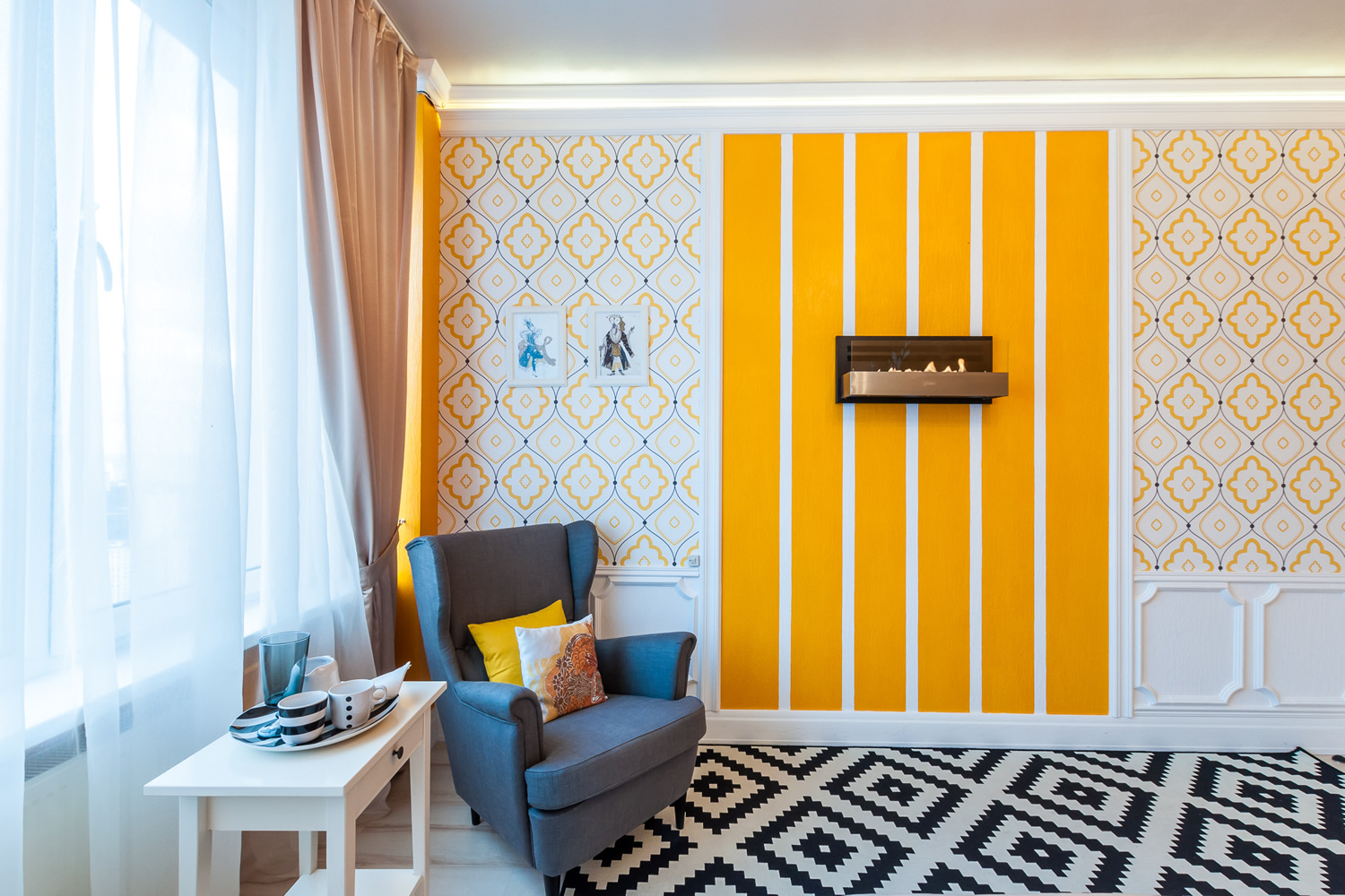
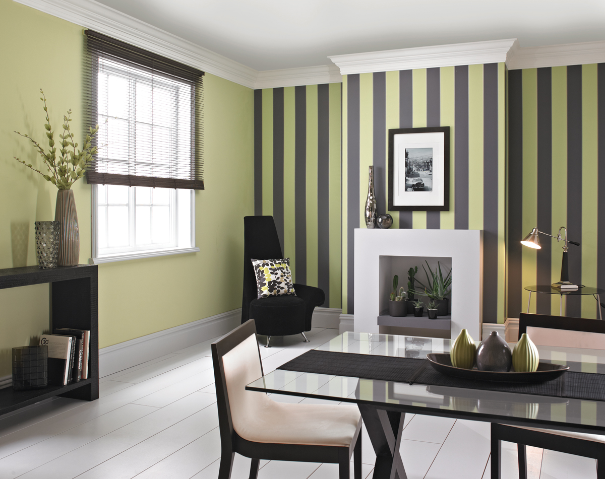
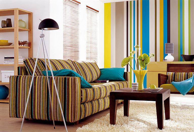
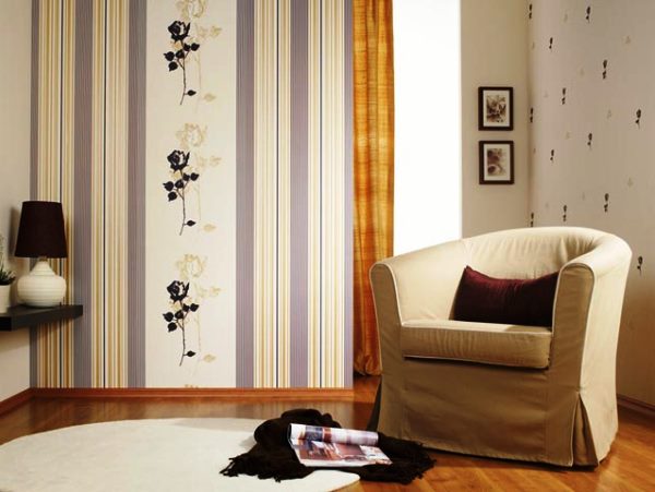
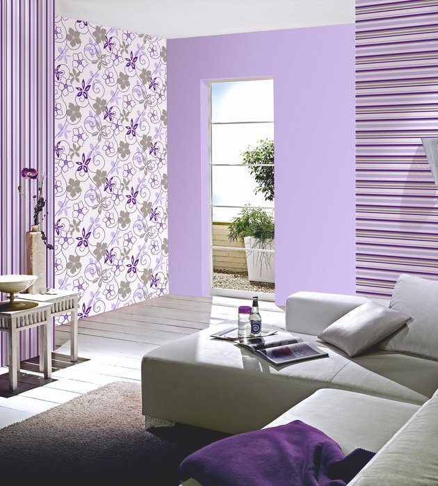
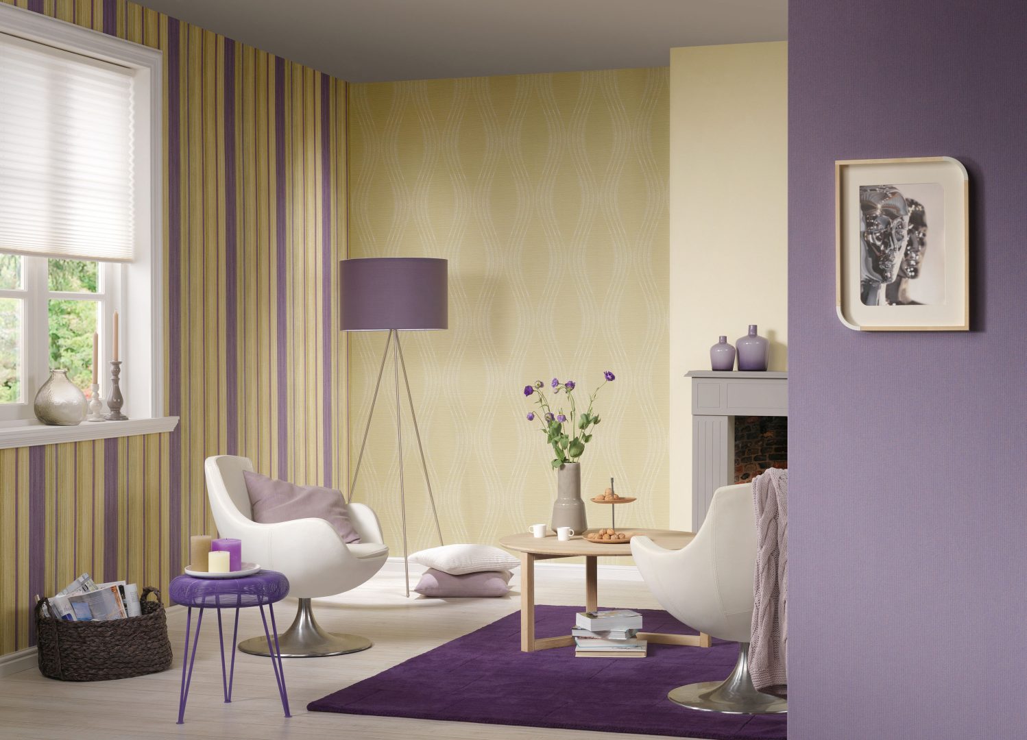
- Combining small vertical stripes. This design technique allows you to change the dimensions of the room. It involves the frequent alternation of strips of wall coverings of different colors. Thus, choosing the right colors and patterns, you can make the interior more spectacular and elegant. In this case, acquire the same width of the rolls or cut into strips wallpaper. The bands alternate either one after two, or one through one, or two through two. One wall can be made monophonic, and on the other one can alternate four or six different canvases at once.
In addition, in this case, the color gamut can be completely contrasted. So you can pull the room up and sideways. And you can use not only monochrome shades, but also bright coverings with an ornament.
Possible combinations
According to the materials
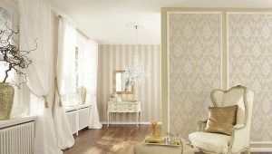
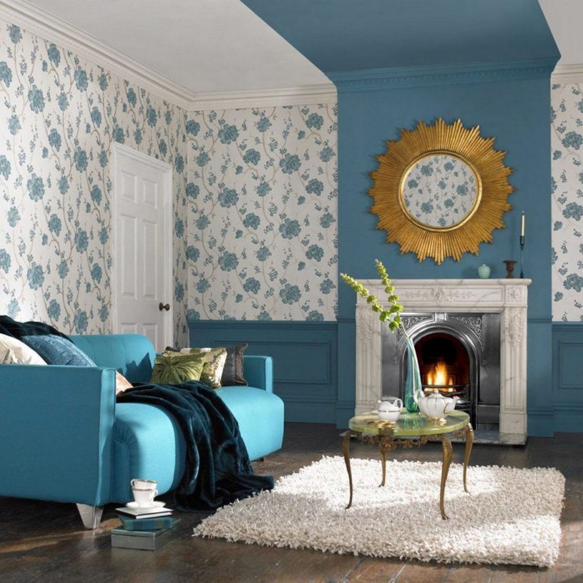
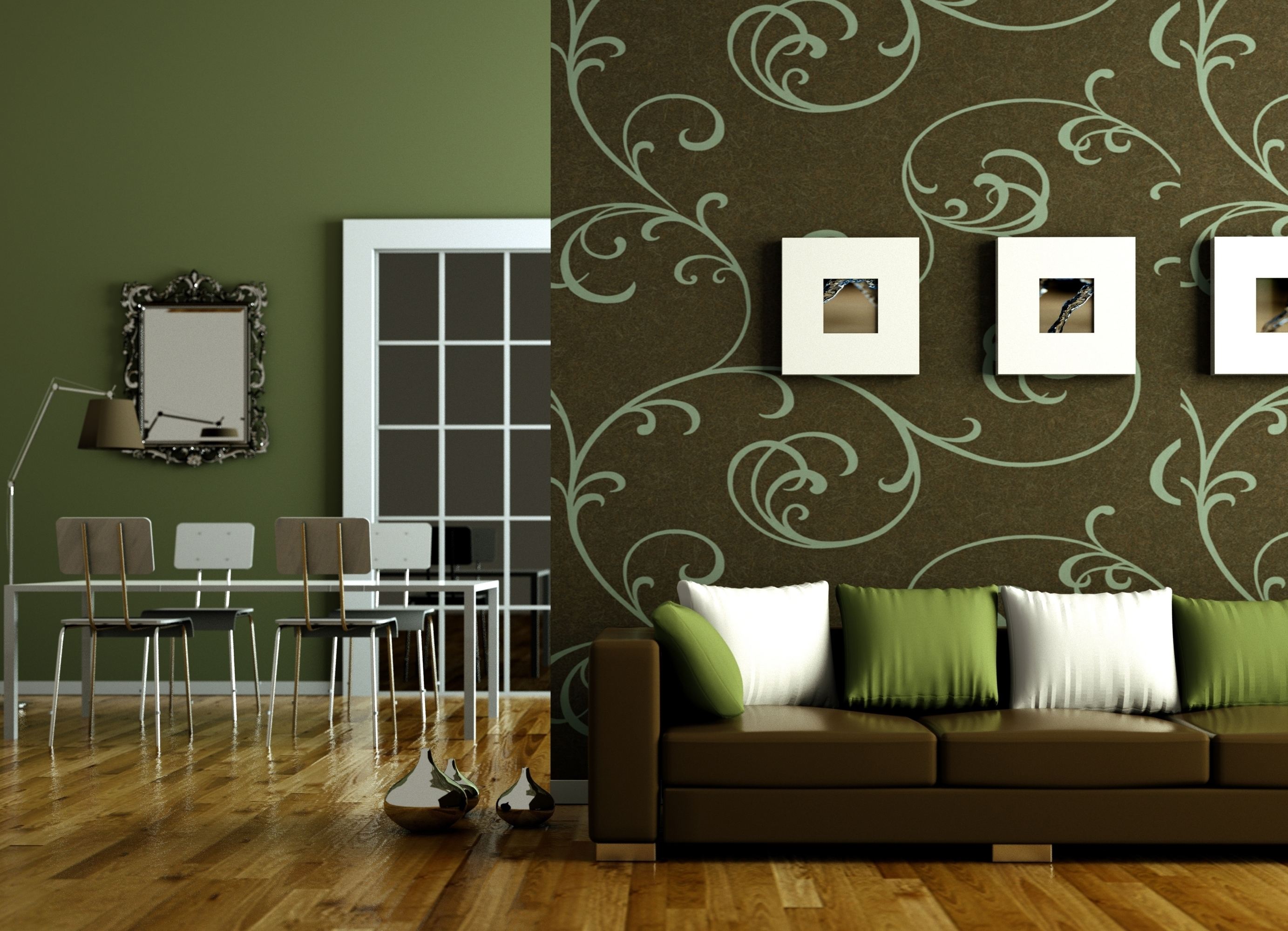
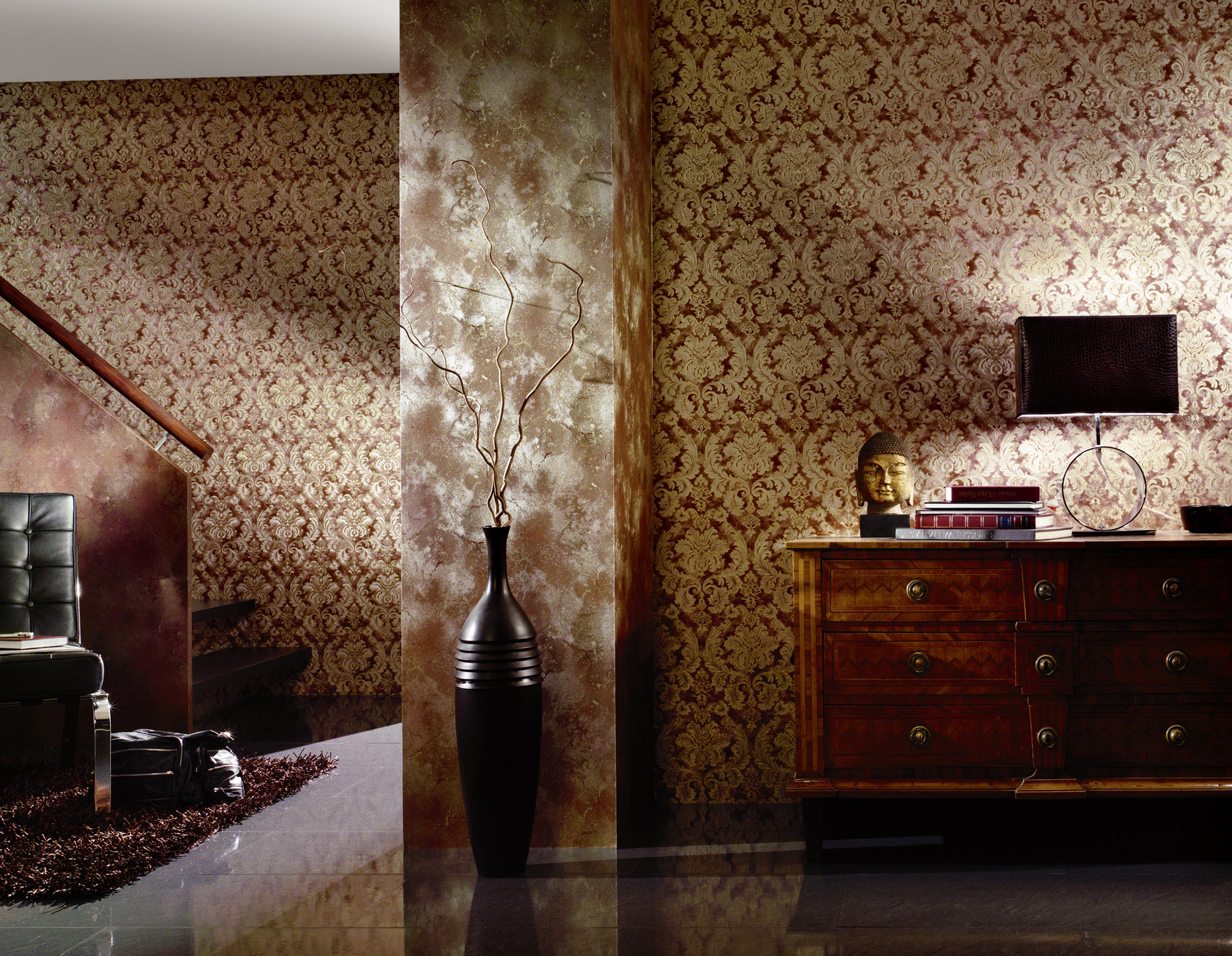
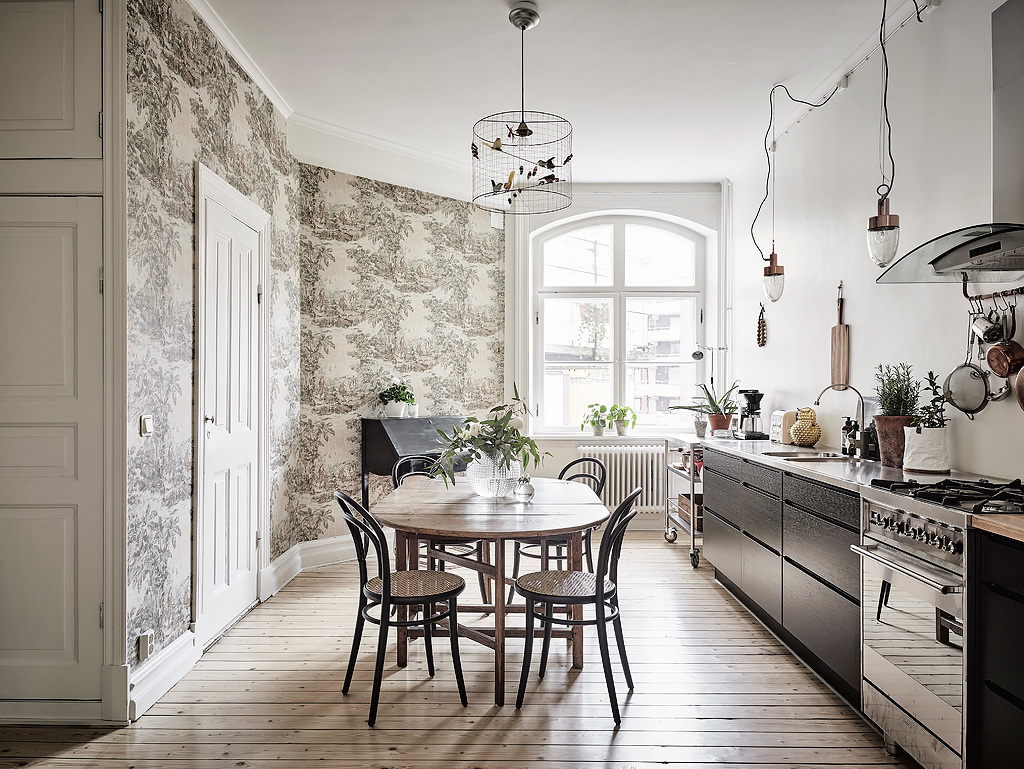
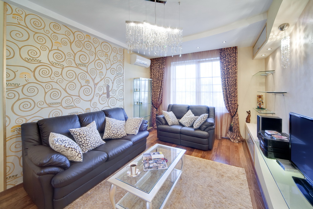
Wallpapers can be combined both among themselves and with other finishing materials. You can choose different models for painting, you can use a combination of ordinary walls, wallpaper pasted, with paint. It looks good combination of pastel wallpaper with wood and fabric. No less common is combination of decorative plaster and wallpaper. Also very often used facing stone for finishing one of the accent walls in combination with wallpaper.
In size
The layout of the wallpaper in size is quite complicated. For example, at the corners of the room you can make narrower segments of wallpaper, and on wide walls - wider. Also, dimensions should be considered in the horizontal combination. The combination of wallpaper above and below should be 3: 2, that is, the lower band should always be narrower than the upper one.
By colors
The combination of wallpaper by color is a very difficult task.It is important to know a few rules. Initially, you need to decide on one basic, basic shade, which will be present not only on the walls, but also in interior items. It should be chosen from several primary colors, which include: red, orange, yellow, blue, green, purple, white, black. The base also often use light options such as beige, peach, taupe and even soft sand.
The simplest is a combination of two adjacent shades from one color scale. It looks very discreet and calm. A more complex combination of several colors, which are also similar in color, in this case it is important to correctly observe the transition from color to color.
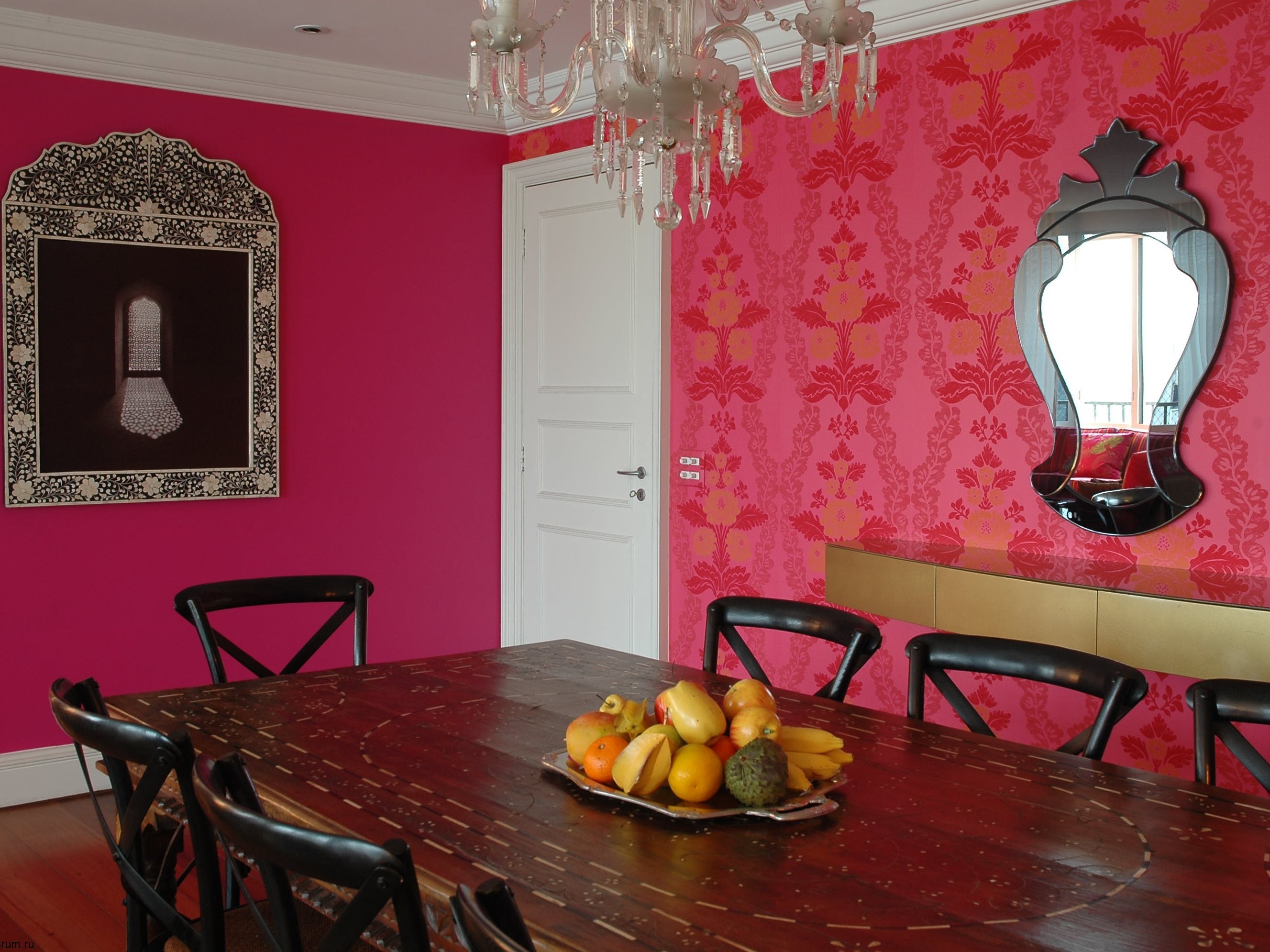
More unusual and bold is the combination of shades of contrasting colors. In this case, you can choose diametrically opposite tones in the palette and combine them both within different walls and within the same surface. The main thing, Primary color should be combined with furniture, and with other coatings.
If you have a small room in size, then in this case it is better to purchase colored wallpapers in bright colors and give preference to the simplest and most relaxed combination.If you have a large room in size, then you can choose a brighter contrasting combination.
If your room is decorated in dark shades, then it is better to shade them with opposite light tones.
But if the interior of the room is designed in soothing colors, then you can choose a color that is close in color, but a brighter contrasting color. Properly selected color will emphasize all the advantages of the room and its interior. He must divert attention from all the shortcomings of the room.
If you decided to combine two bright shades of wallpaper, then you should stick a calmer color between them, which will ensure the transition from one color to another and become their background. Each color in the interior is combined with a certain shade:
- Beige is perfect for white wallpaper. Such a combination can bring comfort and harmony to any room and make the interior brighter and more peaceful. But if you complement it with a darker color, choosing burgundy wallpaper, the room will look pretty strict, but the interior will become more refined.
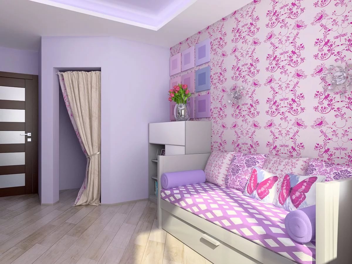
- Pink color is most often used for finishing nurseries and bedrooms. It is often combined with light shades.The combination with white, brown, and also lilac color is popular. Pink and beige look as harmonious as pink with blue. In this case, try not to get bright cold shades of wallpaper in combination with this color.
- Peach color looks great in combination with beige, golden and even blue tint of wallpaper. The beige color makes the room warmer and more comfortable, and the stay in it is more pleasant.
- Brown wallpaper is usually purchased to combine with beige, yellow and gold. The combination of brown with scarlet color looks very bright and unusual.
- Violet shade interestingly combined with blue, white and silver option. Such wallpaper can be a highlight of the interior.
- Blue wallpapers are perfectly combined with white and brown, as well as many other tones that are included in pastel colors. Thus you can beautifully decorate the nursery and make the interior more delicate and elegant.
Common mistakes
Among the mistakes that are often encountered when combining, The most common are the following:
- Use different in thickness wallpaper.With this combination, the walls look inaccurate, because defects are visible in the joints. For this you have to additionally hide them and fix, otherwise the walls will look very ugly.
- Combining different types of patterns. Some use completely different prints in the same room, for example, geometric and floral. This combination is unacceptable because it violates the harmony in the interior.
- The use of different quality coatings. This is another common mistake that emphasizes the low quality level of one of the coatings. Do not try to save on those wallpapers that you collect pokleit on a smaller wall area. It is better if you buy models from the same collection of the same quality.
- Errors in the horizontal combination. Many people confuse the design of the lower and upper parts of the walls with a horizontal combination of wallpaper. It is important that the bottom of the wallpaper were with a large pattern, and at the top - with a small one. Otherwise, you can visually narrow the room and make it tasteless interior.
- Another mistake when combining in a horizontal way is to use a darker shade at the top of the wall.This combination is unacceptable. Light wallpaper should always be at the top, and dark - at the bottom.
- Incorrect design of the joints. Another common mistake when sticking different wallpapers. The edges of all coatings must be carefully cut and high quality glue joints. The transition should be smooth, and the contrasting combination should not highlight the joining points of two different coatings. It is necessary to maintain the level of lines and correctly carry out the markup.
Decor
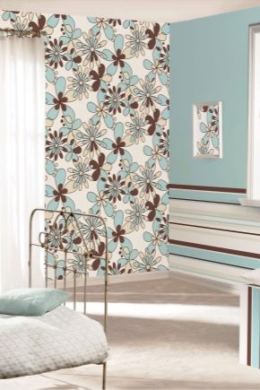
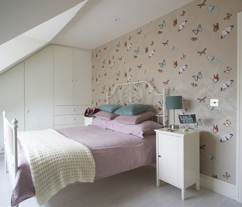
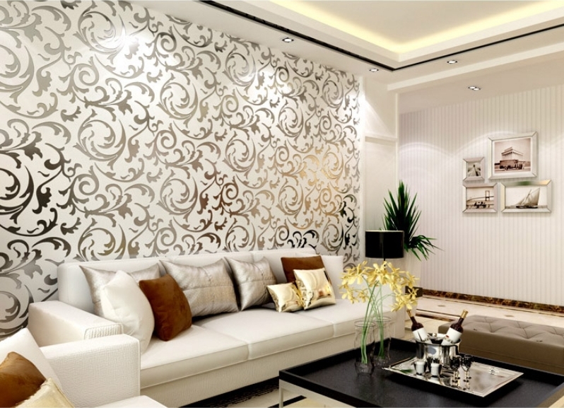
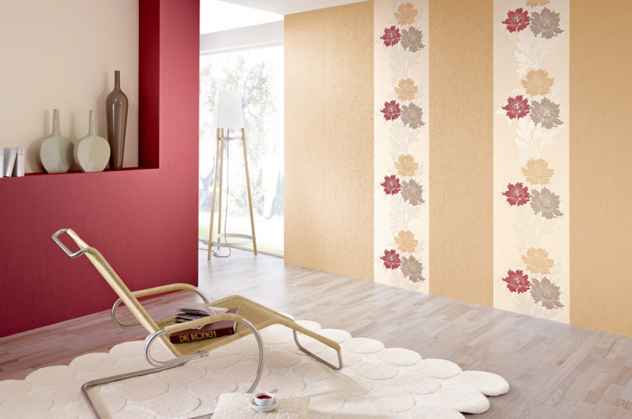
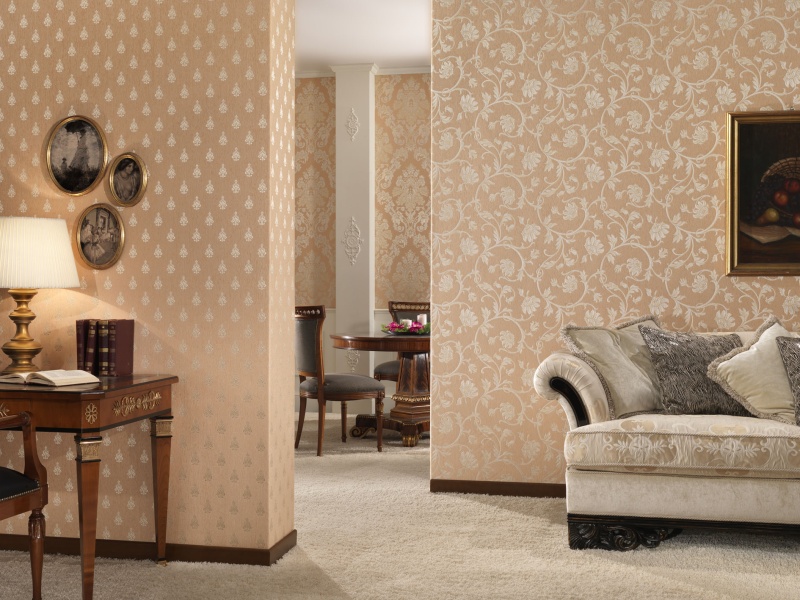
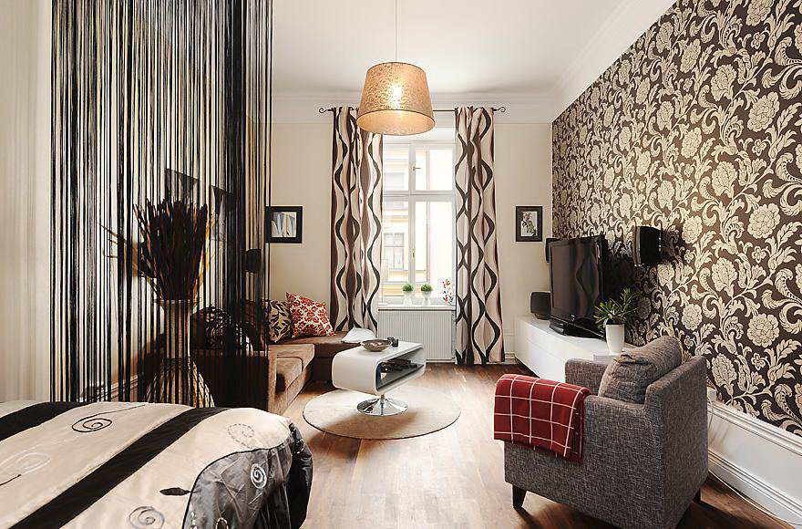
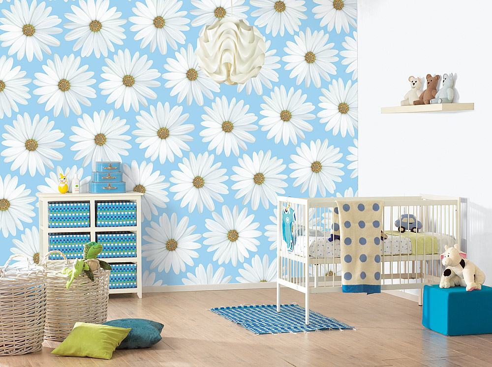
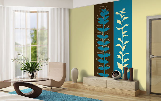
Decorative design is a very important component when combining wallpaper. As a rule, wallpaper with a pattern is much more difficult to combine than plain versions. Decorating with large flowers is very popular. At the same time combine a floral ornament in different sizes. You can choose the options that has a decor in the form of floral stripes. Floral design also looks very nice in the rooms in addition to large flowers.
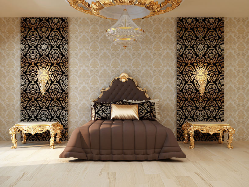
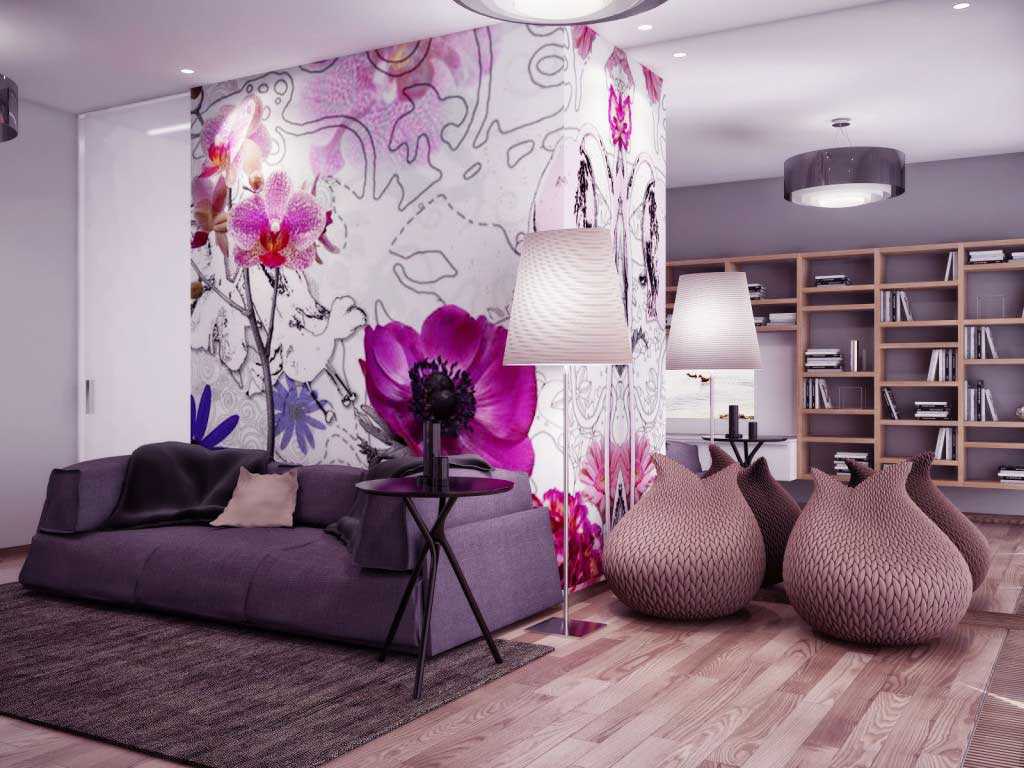
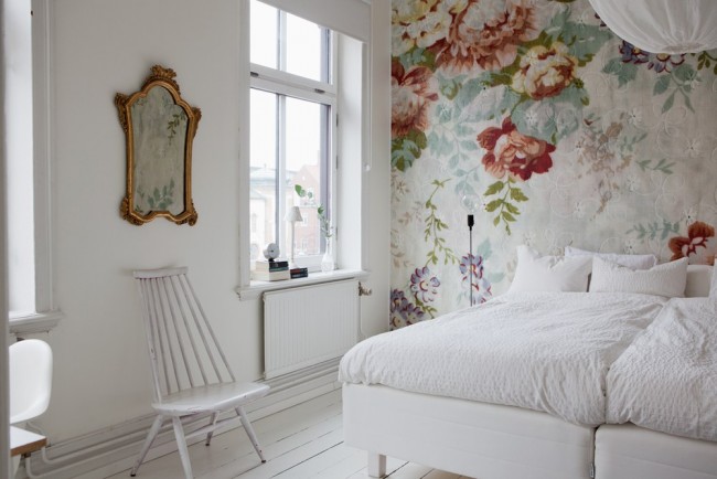
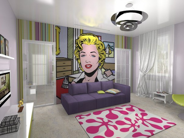
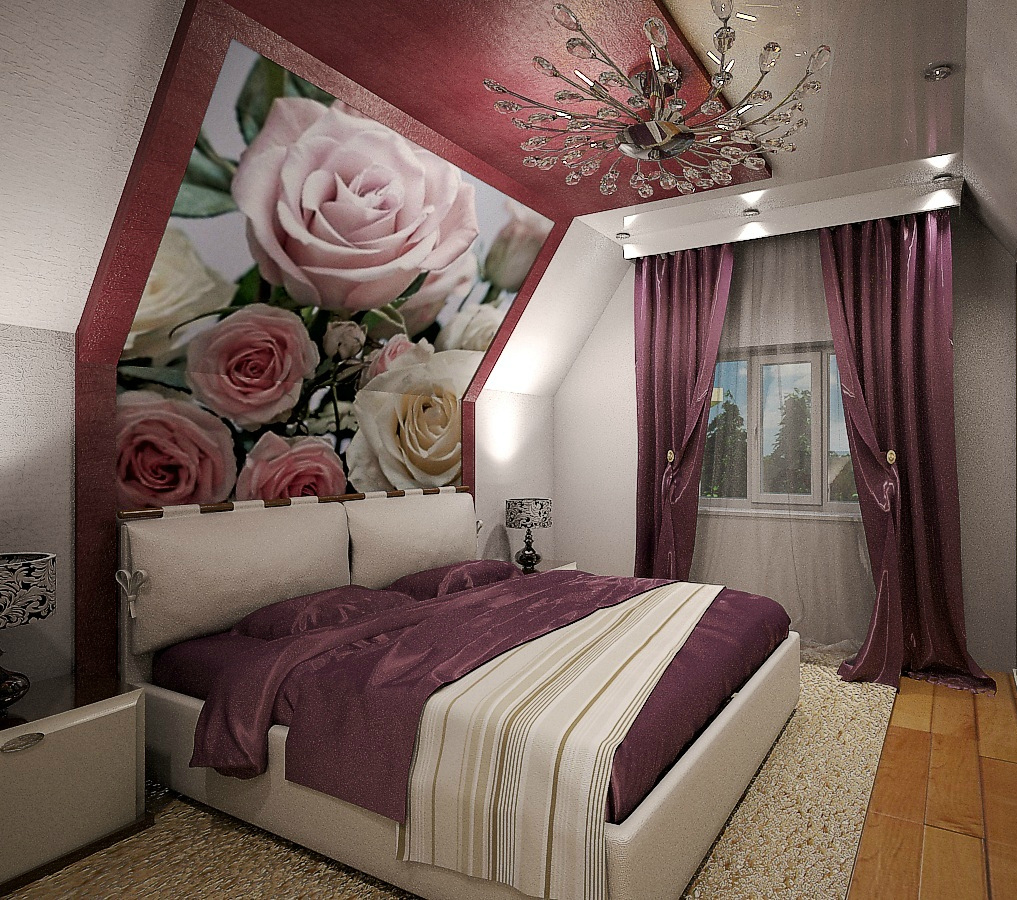
As an option, you can purchase a photo wallpaper. Finishing such wallpaper implies an emphasis on one wall. It will show a large pattern or picture. Wall decoration with monograms is also very popular.
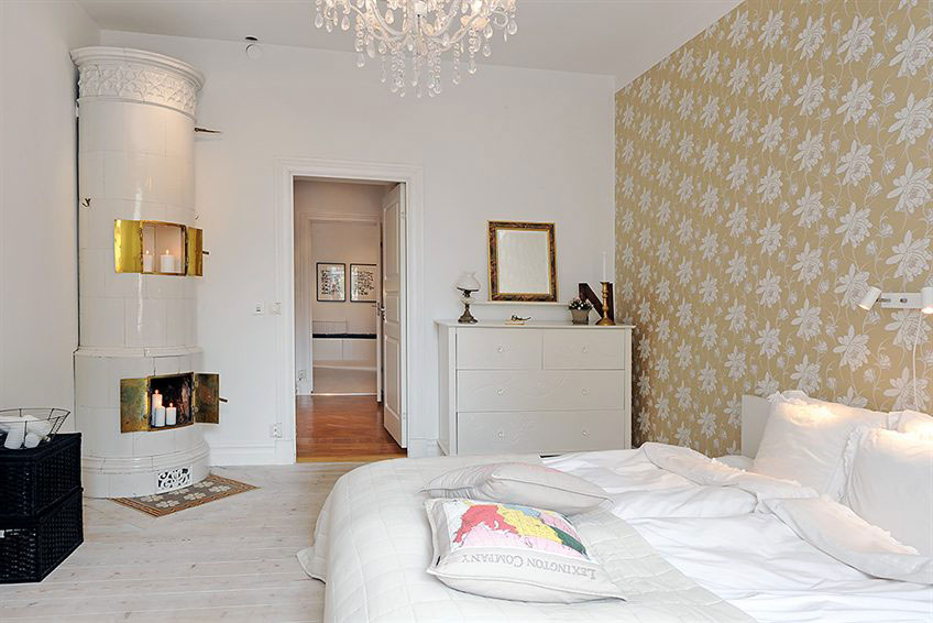
Monochrome classic wallpapers with such patterns look very elegant and are often used to design classic interiors.
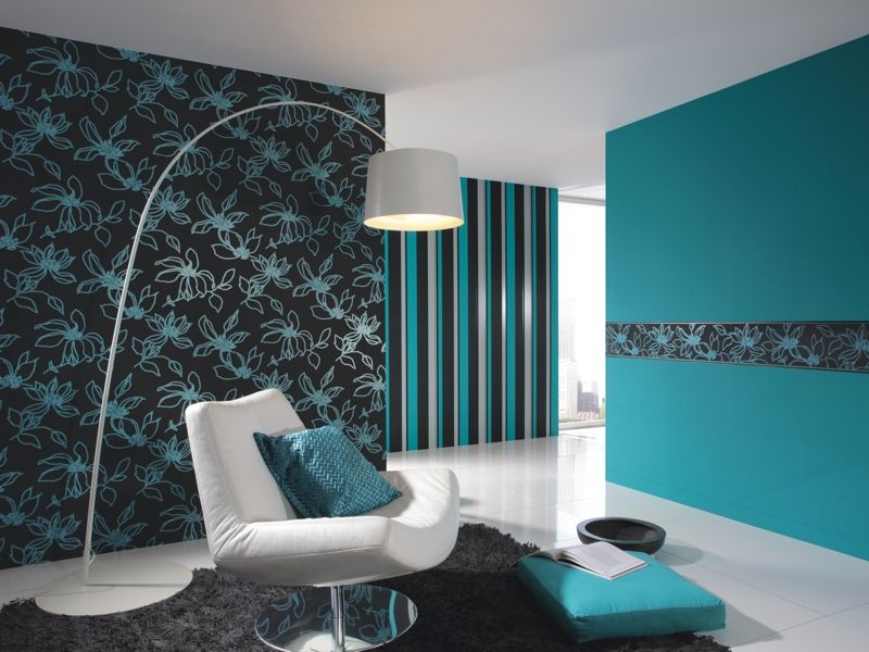
It is now customary to combine wallpaper with abstract patterns and coverings with a geometric print. Two types of pattern should be harmoniously combined in color scheme, each of them should support the other. This can be paired wallpaper partners.
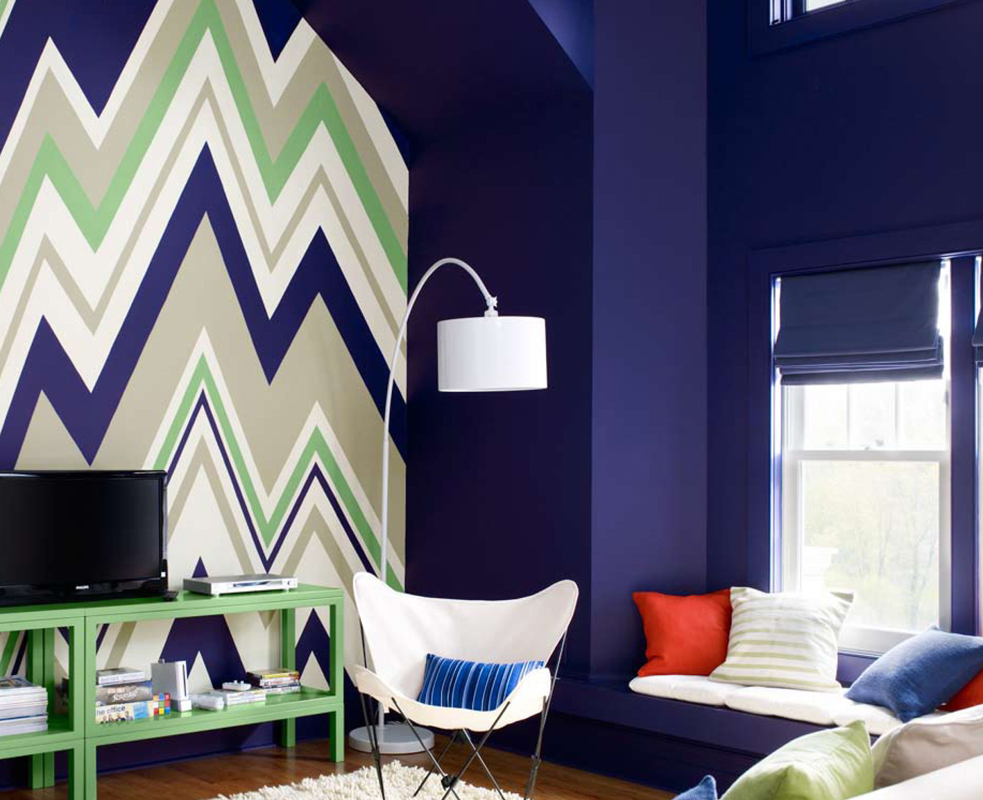
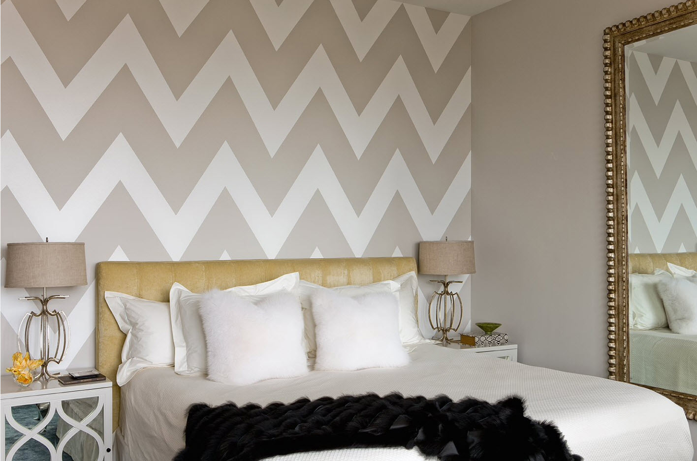
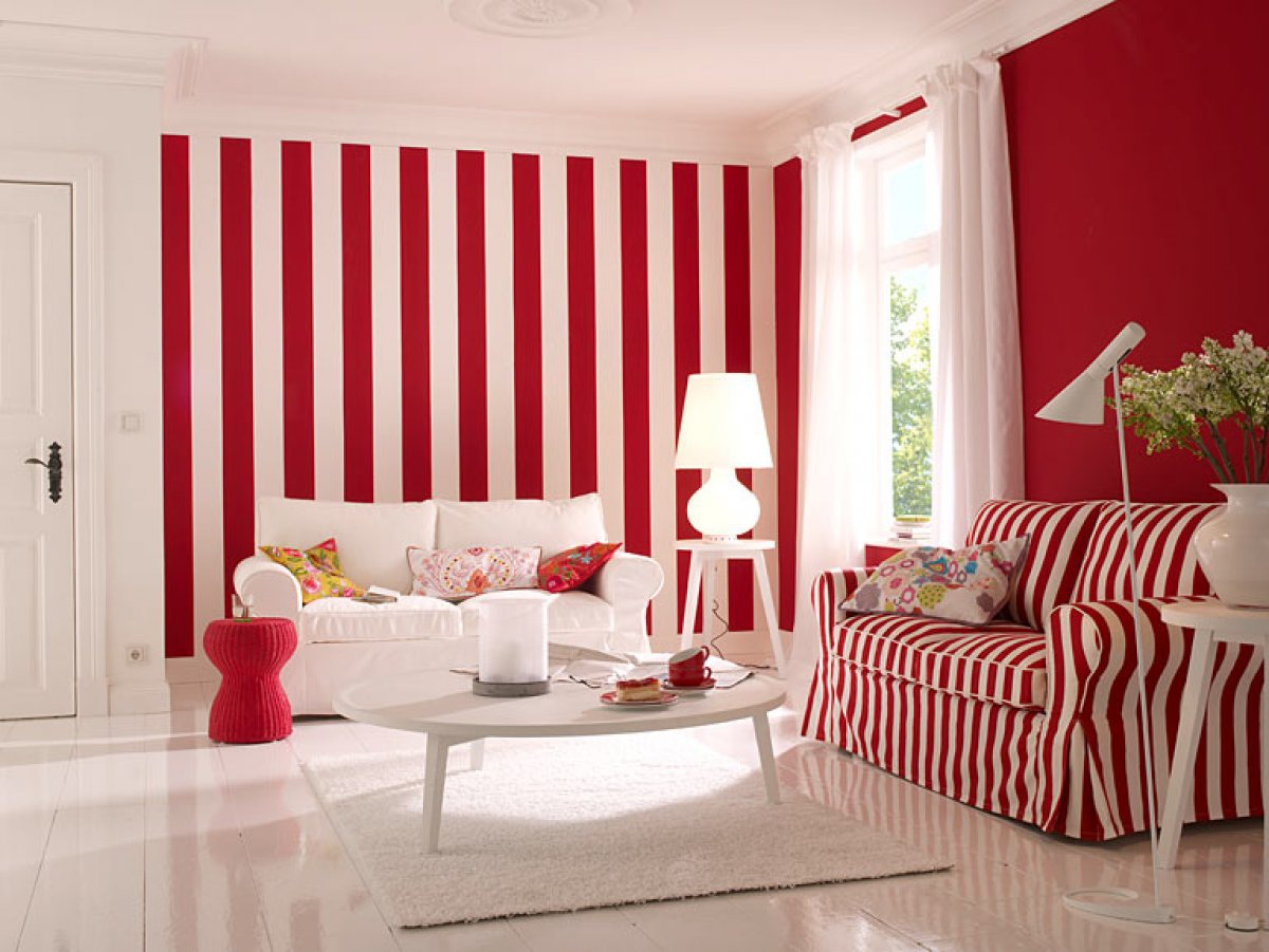
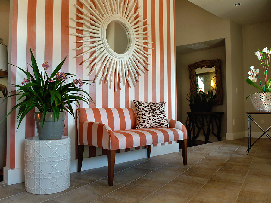
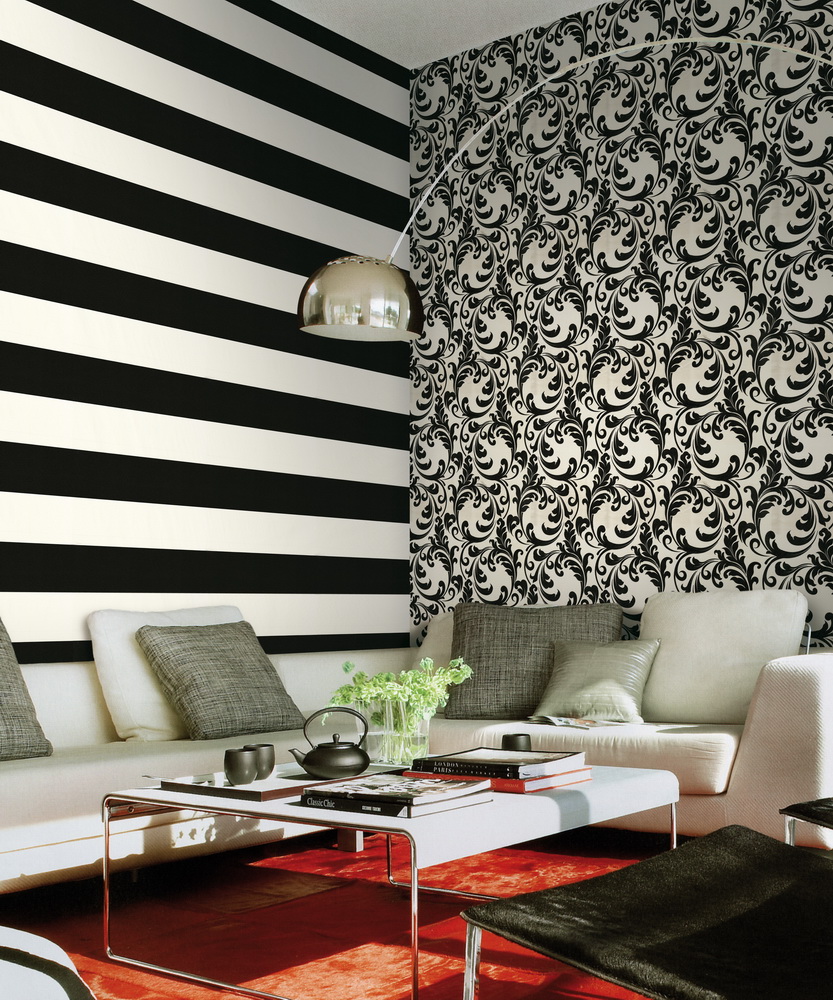
Striped decor looks very bright. In this case, choose contrasting color combinations. They allow zoning and make the room more interesting. The most juicy is the combination of red and white. These bands are perfect for decoration of modern interior.
As for the vertical stripes, then they allow you to visually pull the room up and expand it. Some even transfer the pattern from the walls to the ceiling, which seems to be a continuation of one of the accent walls. This combination is a very unusual decorative move that will surprise your guests.
Design Ideas
Very interesting is the design of the walls in wide strips of bright contrasting wallpapers opposite each other. Thus, you can vary the design and reduce the length of the room - the corridor. In order to, on the contrary, expand the rectangular room, it is better to stick the wallpaper asymmetrically.It is better to glue a wide strip of such a wall covering in the middle to a longer wall, and narrow double strips of wallpaper to glue to the adjacent wall. In this case, the total base coverage should be monotonous on all walls.
The interior looks interesting alternating wallpaper. Two long walls are pasted over with plain wallpaper, and two short walls - with a combination of a primary color in a strip with a contrasting one. Most often this uses a combination of white and black, as well as red and white. Pasting half in the interior should be used very carefully.
In order to make the interior more relaxed, it is better to put together thin strips that will belong to the same color scheme. This design of the walls will be more measured and soft.
For modern interiors you can use combination of narrow contrast bands. This is a bright and stylish solution. In order to design the interior in different styles, a different combination of bands is used. So, in an interior in the style of a classic, they prefer to place the stripes vertically, while using shades related to pastel colors, such as light pink, beige, pale brown
For a vintage style also use more delicate shades and coffee options. The brightest is the style pop Art. It is a combination of strips of wallpaper in contrasting colors, such as white, red, yellow, green and others.
Modern examples and options
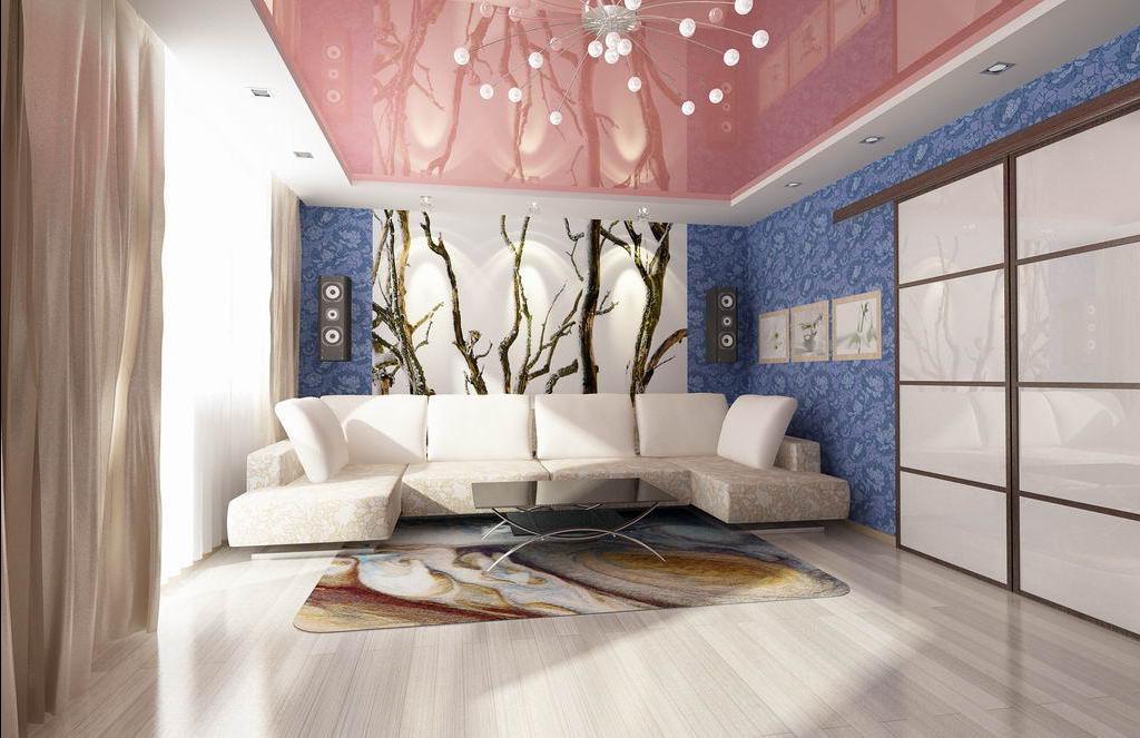
In rooms with different purposes and with different interiors, different rules of wallpaper combination are used. For example, in the attic, wall covering often flows smoothly into the ceiling. So, for the design of the hall is better to use the method of zoning. It allows you to divide a large spacious room into several functional areas for work, rest and meeting guests.
For this most often use the vertical method of combining wallpaper. Also, when you decorate this room, you need to choose one background color of a calm shade, and use the second one in order to place accents. In the hall, it is also permissible to use photo wallpapers, but it is better to glue them only on a shorter wall in the recreation area.
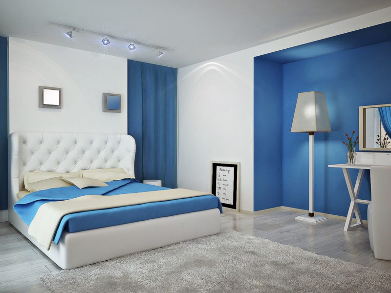
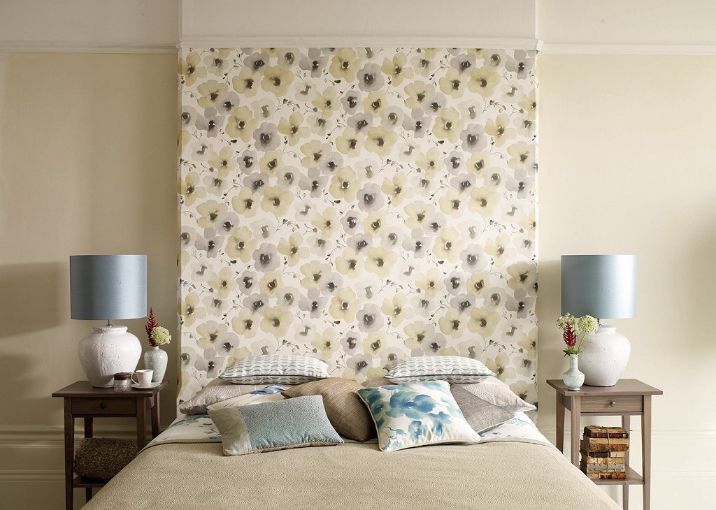
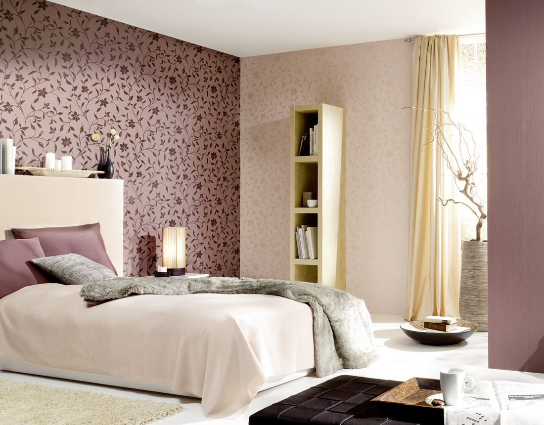
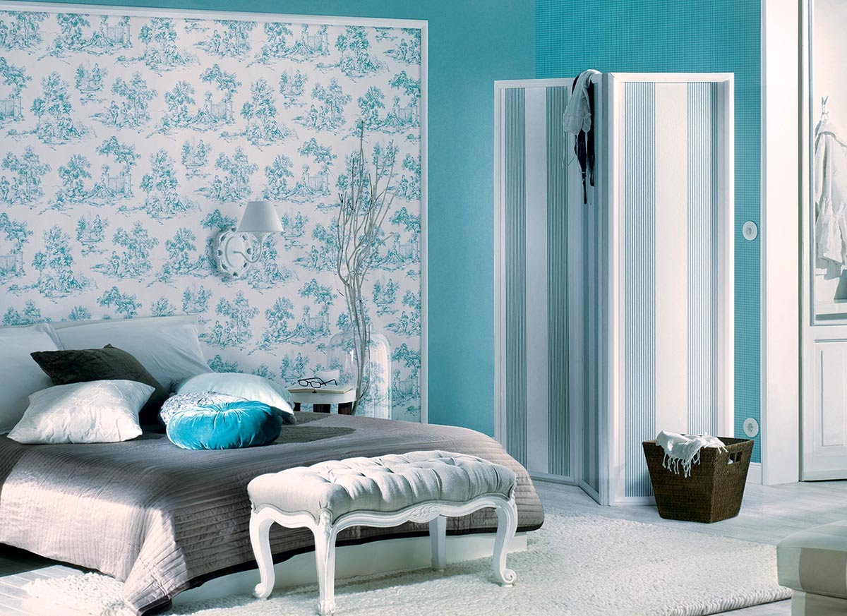
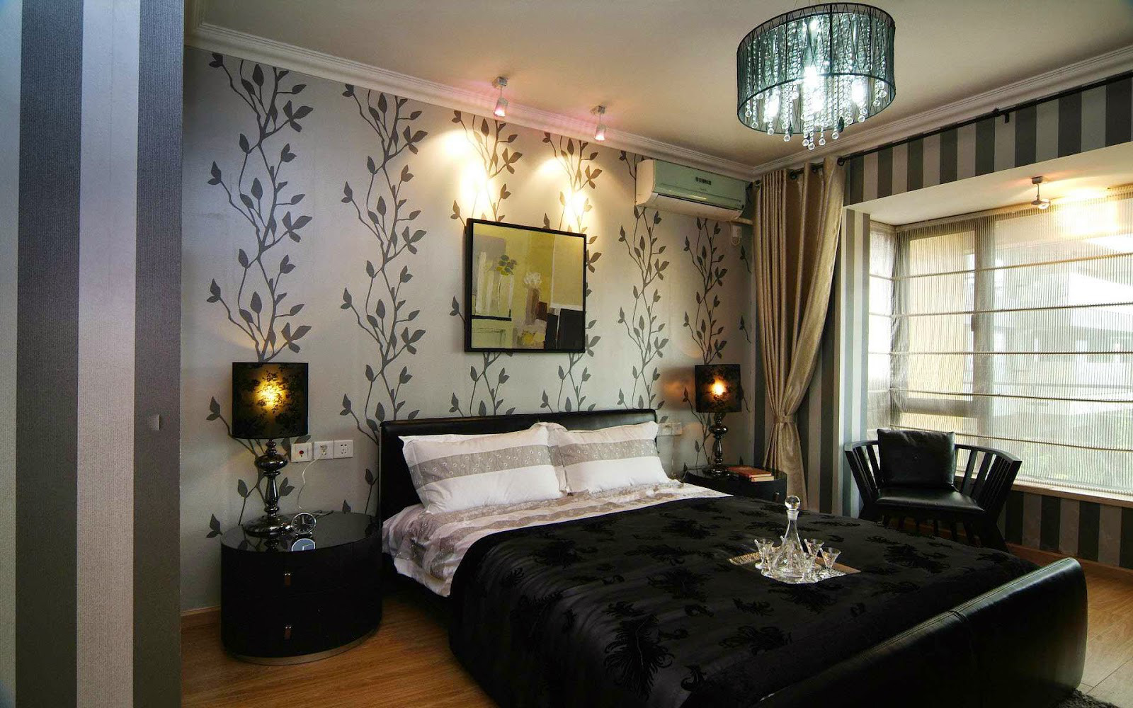
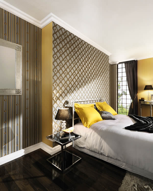
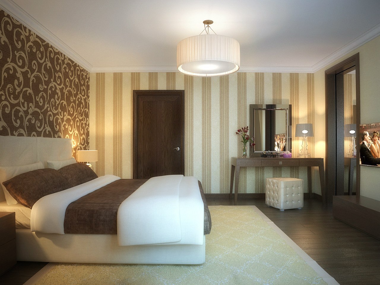
In the bedroom, the combination should be the most harmonious and restrained. Try to get bright wallpaper that blends well with each other. and belong to the same color scheme.Perfect combination of beige with brown or olive with terracotta. A horizontal combination is perfect for the bedroom. In this case, you can give preference to light wallpaper with monograms on the upper part of the walls and darker wallpaper on the bottom.
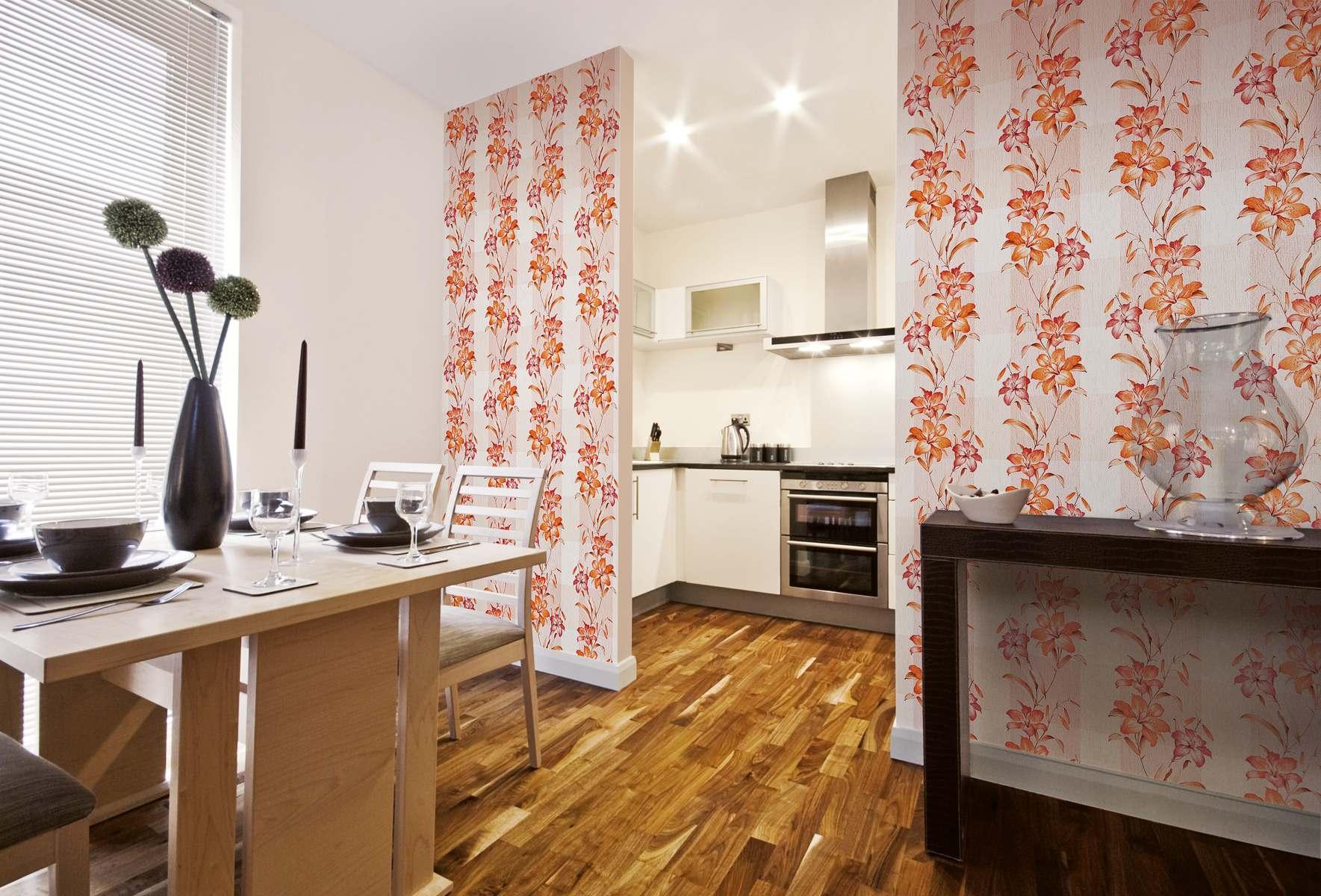
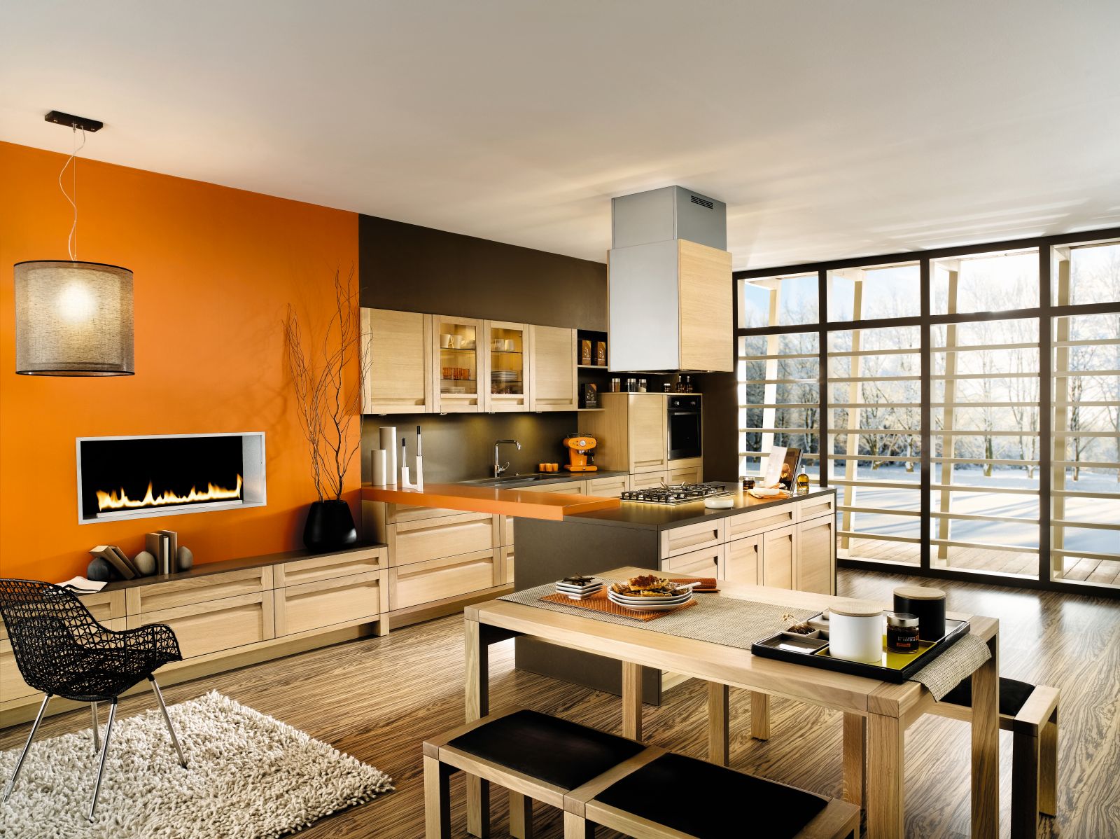
For the kitchen, you can use brighter and more juicy combinations, especially for spacious rooms. So, most often for such a room use yellow, green, olive, blue, orange hue.
But for small kitchens it is better to use light-colored wall coverings with a small pattern.
On how to properly combine the wallpaper in the apartment, see the following video.