Bright floor tiles: creating a harmonious interior
Bright floor tiles look great in any interior. Today, this coating is used along with parquet, laminate and linoleum. With this tile you can achieve interesting color combinations and patterns.
In order for it to fit organically into the room, you need to make a design project in advance and select the most successful combinations.
Special features
Bright tiles can harmoniously look in almost any room in your home. If you choose this option as a floor covering, it is worth considering a number of nuances. This floor will be cold: choose a tile for living rooms is, if you plan to do with the floor heating or used to walk in slippers. Tile is often slippery, it can create traumatic situations.
Ceramic tiles are fragile and can crack if you accidentally drop something on it.
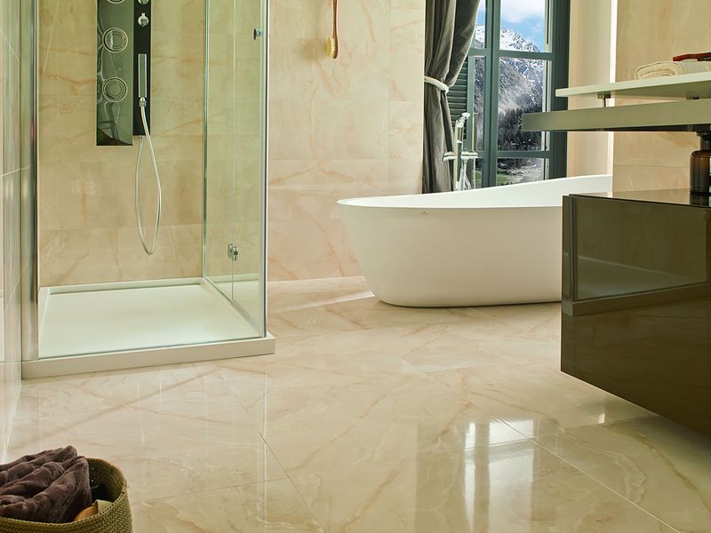
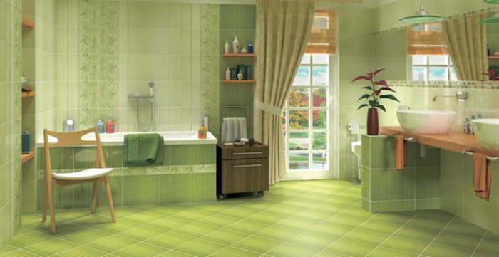
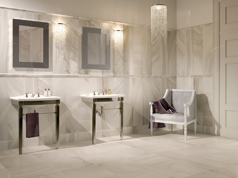
Most often bright floor tiles adorn the bathrooms. This is a practical solution, such a coating is not afraid of moisture, and also easy to wash. The design of this facing in a bathroom can be the most various. Since the bathroom is a small non-residential space, bright colors and contrasting combinations are acceptable along with light tiles.
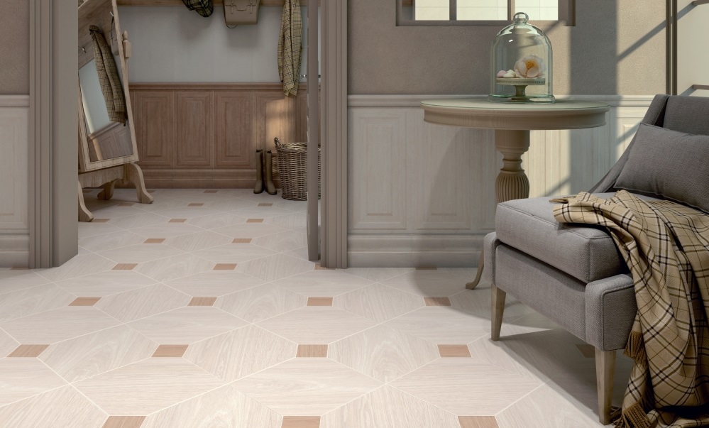
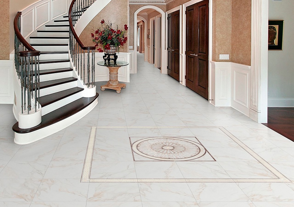
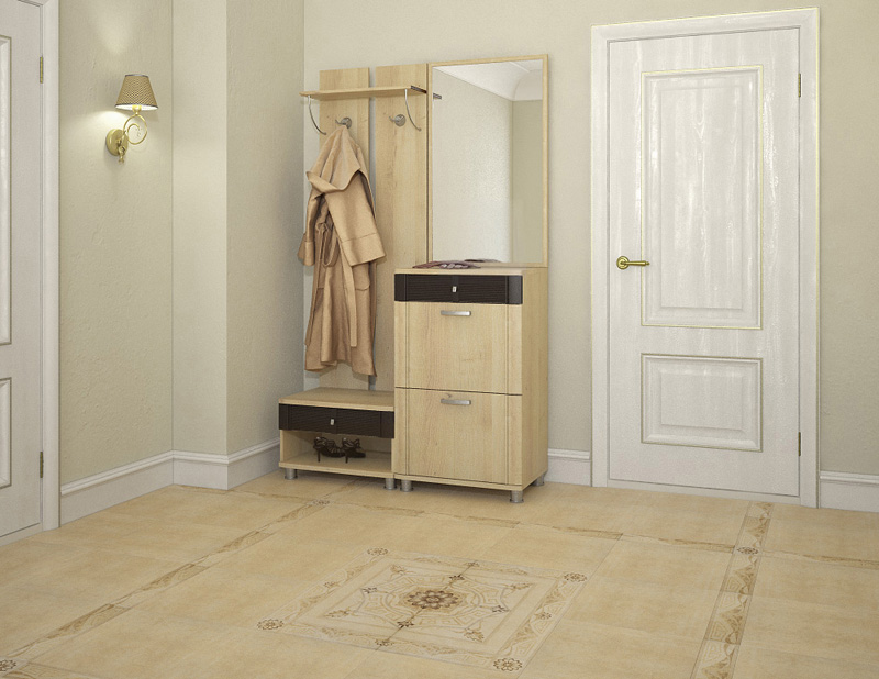
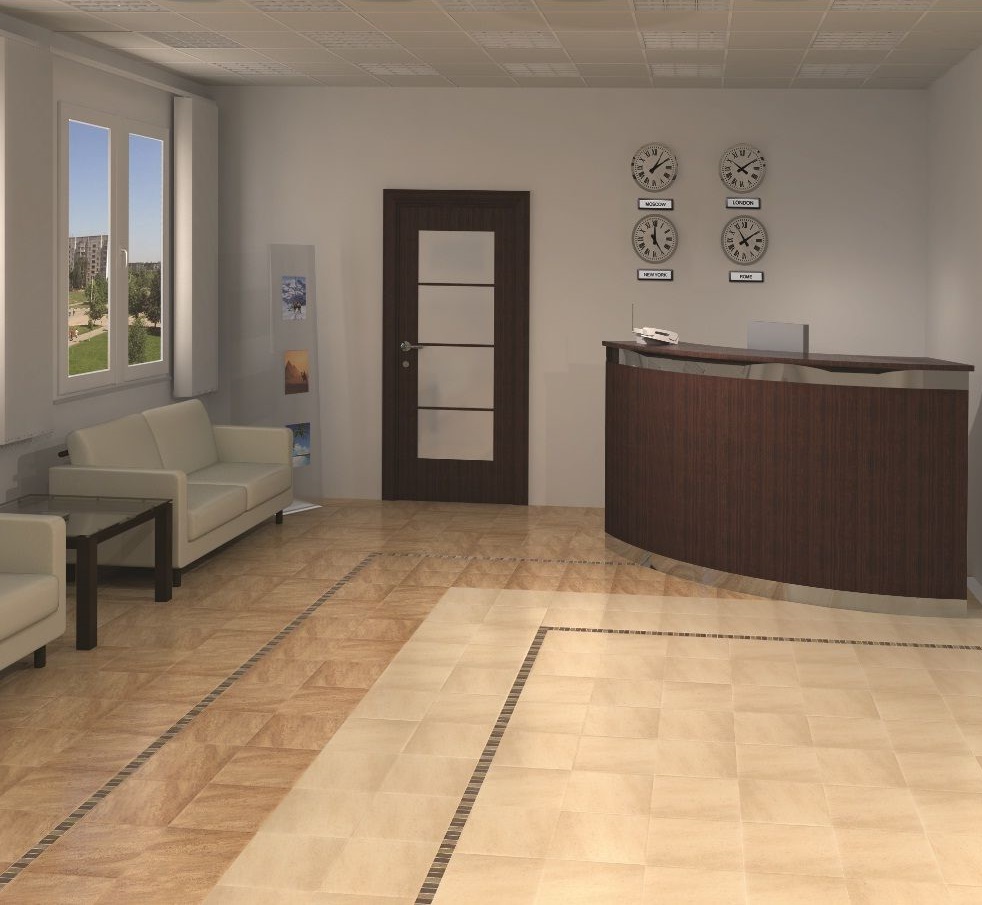
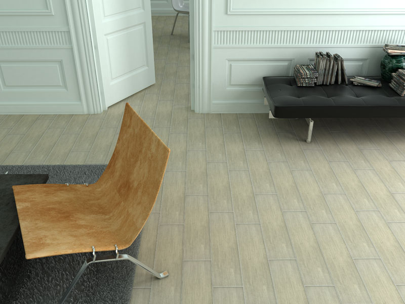
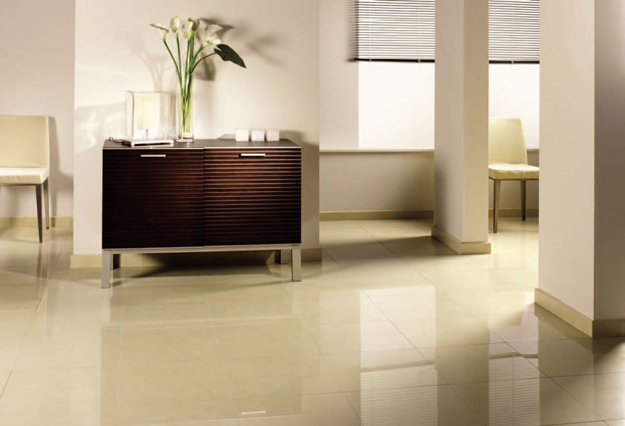
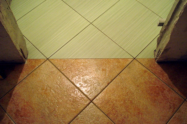
Often with such tiles decorate the floor of the hallway. Light floor in the hallway makes the space visually more spacious. It will be combined with almost any furniture and wall color. More often for the hallway pick up the tile with a matte texture of the surface.
This floor slips less, dirt is less visible on the matte surface, which is an important factor for the hallway.
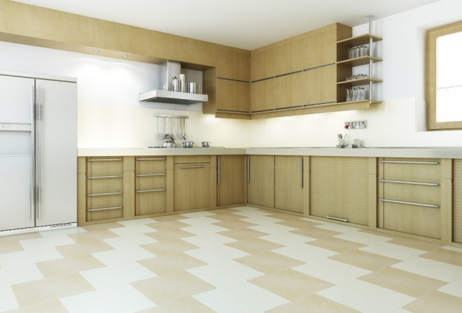
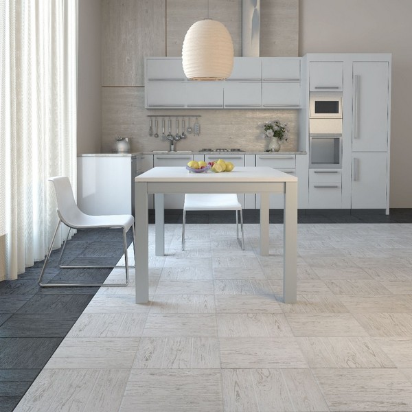
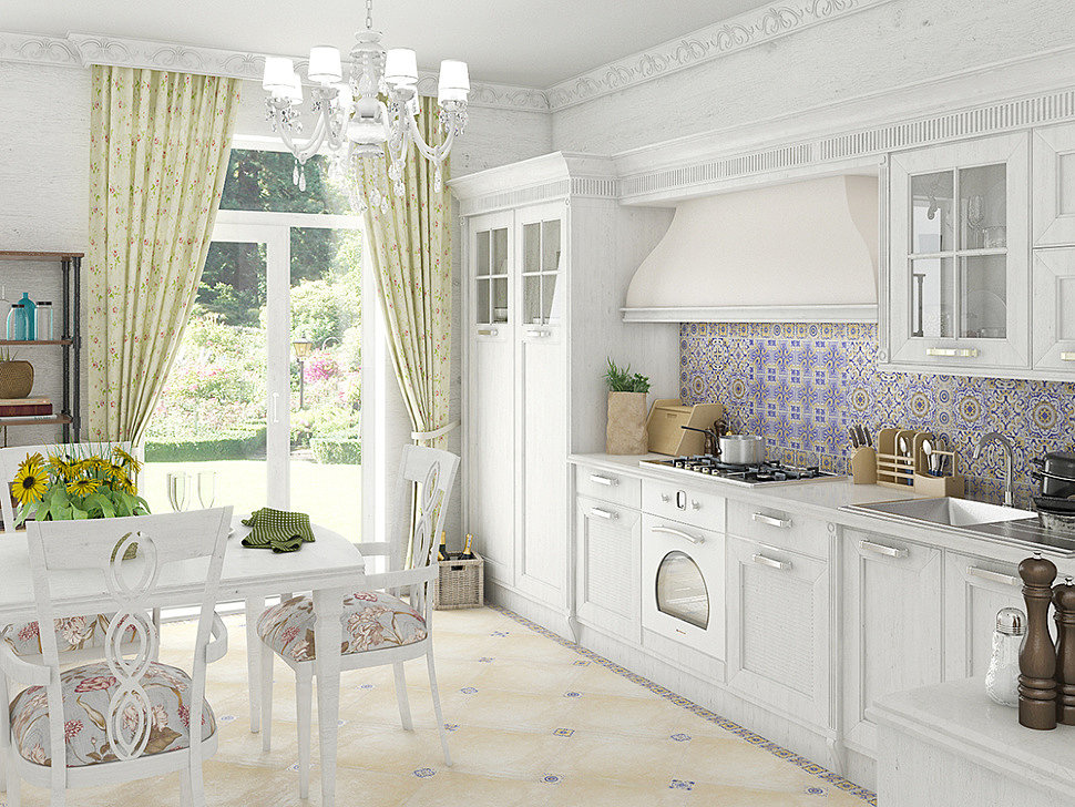
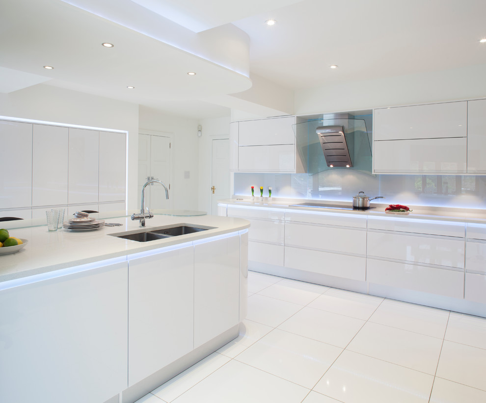
Floor light tiles are perfect for the kitchen. In this case, it is worth considering matte and glossy options. The bright and brilliant texture of the tiles will make the kitchen visually spacious and stylish. It is especially interesting to look varieties with contrasting inserts, for example, in the form of carpet. So you can beat the zone of greater cross.
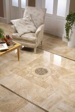
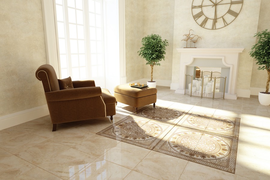
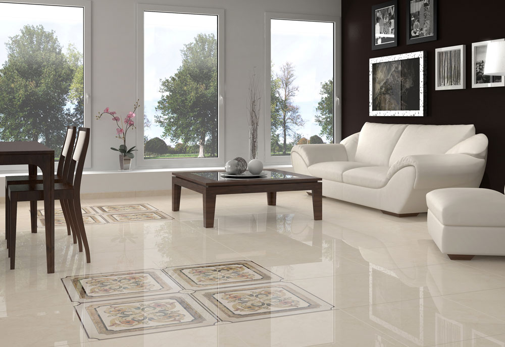
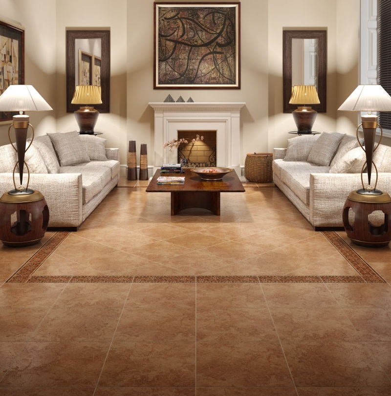
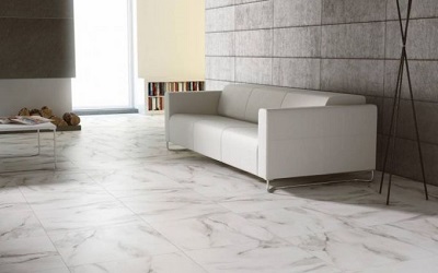
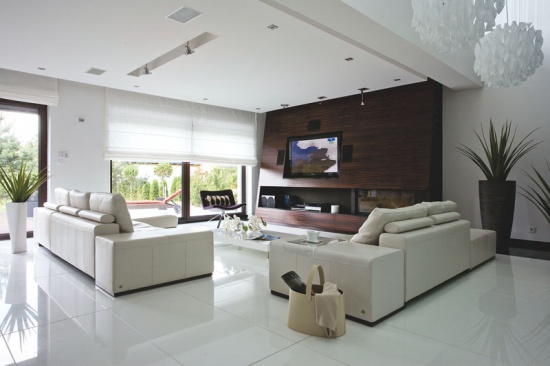
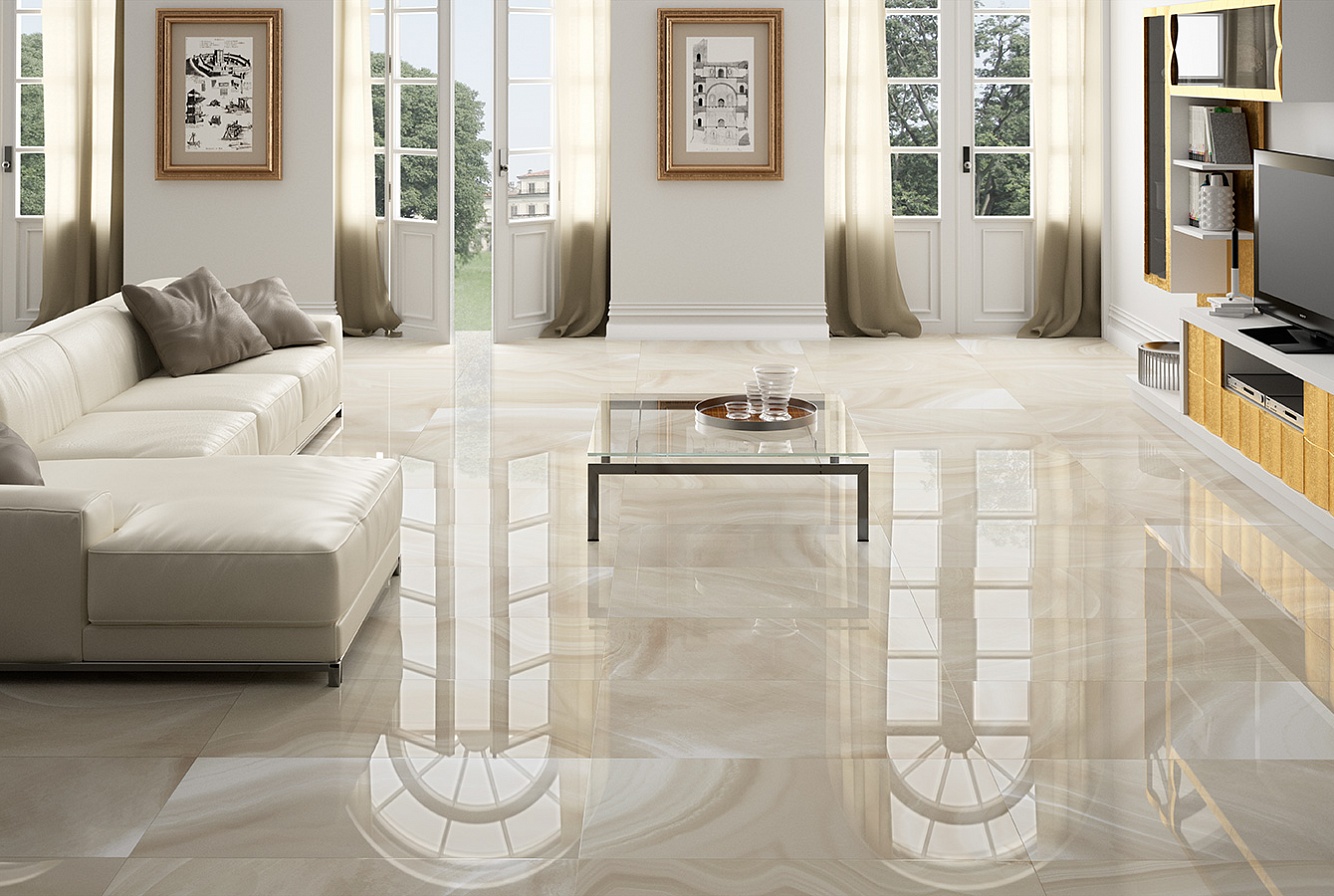
Sometimes the ceramic coating is chosen for the decoration of the living room.Such a floor can look stylish and interesting. For example, from a light tile you can lay out patterns, diversify a monophonic finishing canvas of the floor. With the help of tiles of different shades you can distinguish a large living room into several zones (for example, you can use several pastel colors).
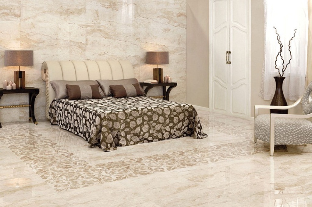
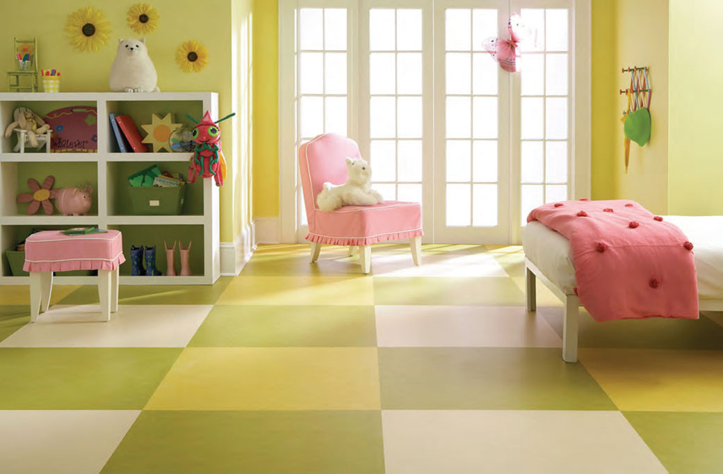
Much less often tiles lay the floor in the bedroom or in the nursery. If you make heating, you can tile the floor of any room in the house. For each room, you can choose your own design of ceramics, although all the options can be combined by means of the main color or pattern. You can use glossy, matte surface options.
To the interior of the apartment looked harmonious, you can finish the tiles with a companion.
Color spectrum
The light tile is various, in a palette many colors are presented. If you have conceived a certain decor of the walls and the purchase of concrete furniture, you can choose a tile for them specifically by choosing a variant with a related tone or texture. Consider the possible interesting colors of light tiles.
Beige
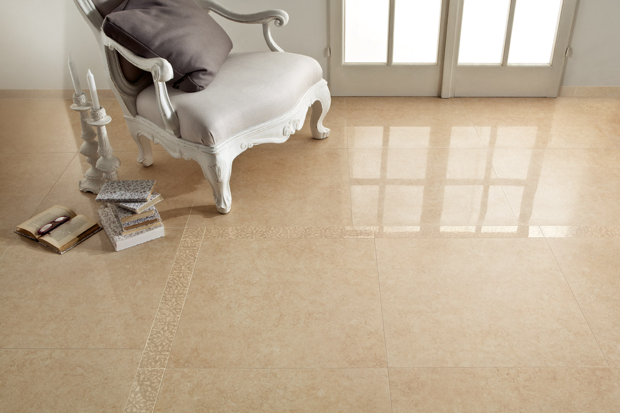
Models in warm beige tones are ideal for almost any room.Especially often it is used in the finishing of the hallway and hall. Restrained warm shades allow you to create the necessary comfort in the house, while they look universally, fit any design. Preferring cold tones, it is worth considering: if the windows of the room face the north side, this background of the floor can make the interior dull. If you want to choose a cold shade (for example, sand), it is worth considering a nuance: for a sophisticated look, an abundance of details in the interior of the room is unacceptable. It harmoniously looks in a bright room, combined with bright colors of the color palette in the form of decor, furniture upholstery, curtain textiles.
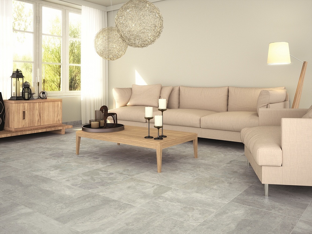
Light gray
Light gray tones are suitable for a modern interior. Often this tile is used for laying in the bathroom or in the kitchen. In living rooms, it is necessary to diversify the gray color of the fragments with brighter or darker elements of the decor so that the interior does not look boring. It is better to choose warm gray tones: they look interesting and make the interior cozy. Combine gray tiles with natural colors (olive, peach, terracotta and cherry tones will do).
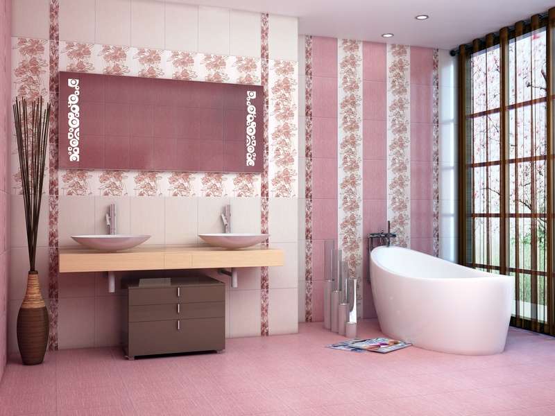
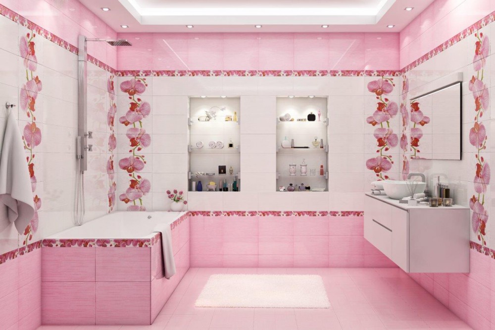
Light pink
Pastel pink shades are perfect for flooring classic interiors, modern styles and Provence. Shades can be very different. It looks interesting combination of several pastel colors (for example, light crimson, lilac, pale pink). You can make a smooth transition from light tone to dark color: this design will be a highlight of the interior, will allow you to unobtrusively divide the space into separate functional areas.
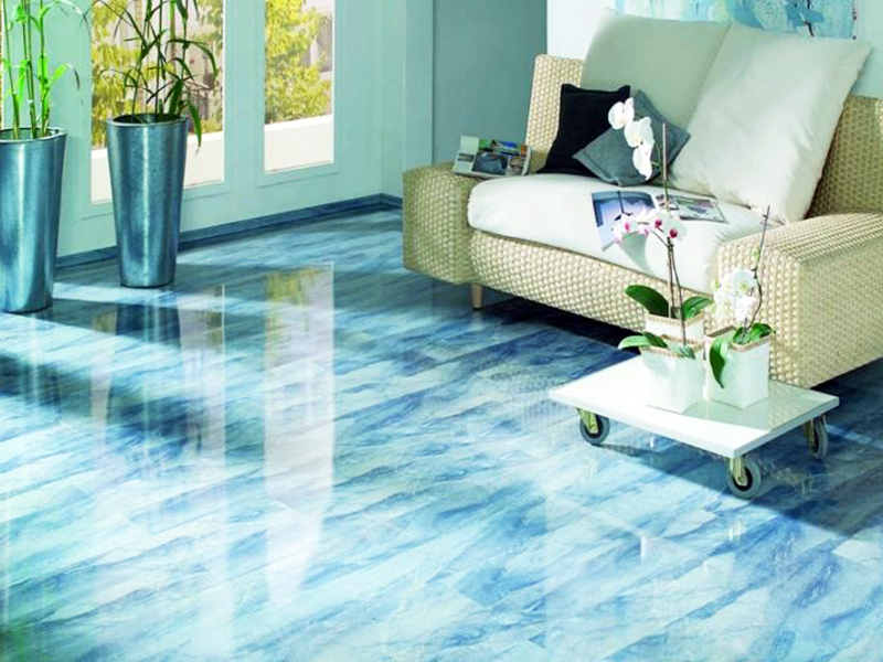
Blue and light green
Blue and greenish tones are more commonly used in bathrooms. It is appropriate that they will look in the living room, hallway, in the kitchen. They should not be combined with bright red or orange contrasts, but you can combine such a tile with a counterpart of beige color, which is a soft contrast.
Milk and ivory
Since the use of white tiles for flooring is impractical, tiles of a milky and ivory color are often chosen for lining. It is important to take into account: the finishing of such tiles should be performed as accurately as possible. All flaws in the installation and uneven floors with milky or white-gray tiles will be noticeable.

Design options
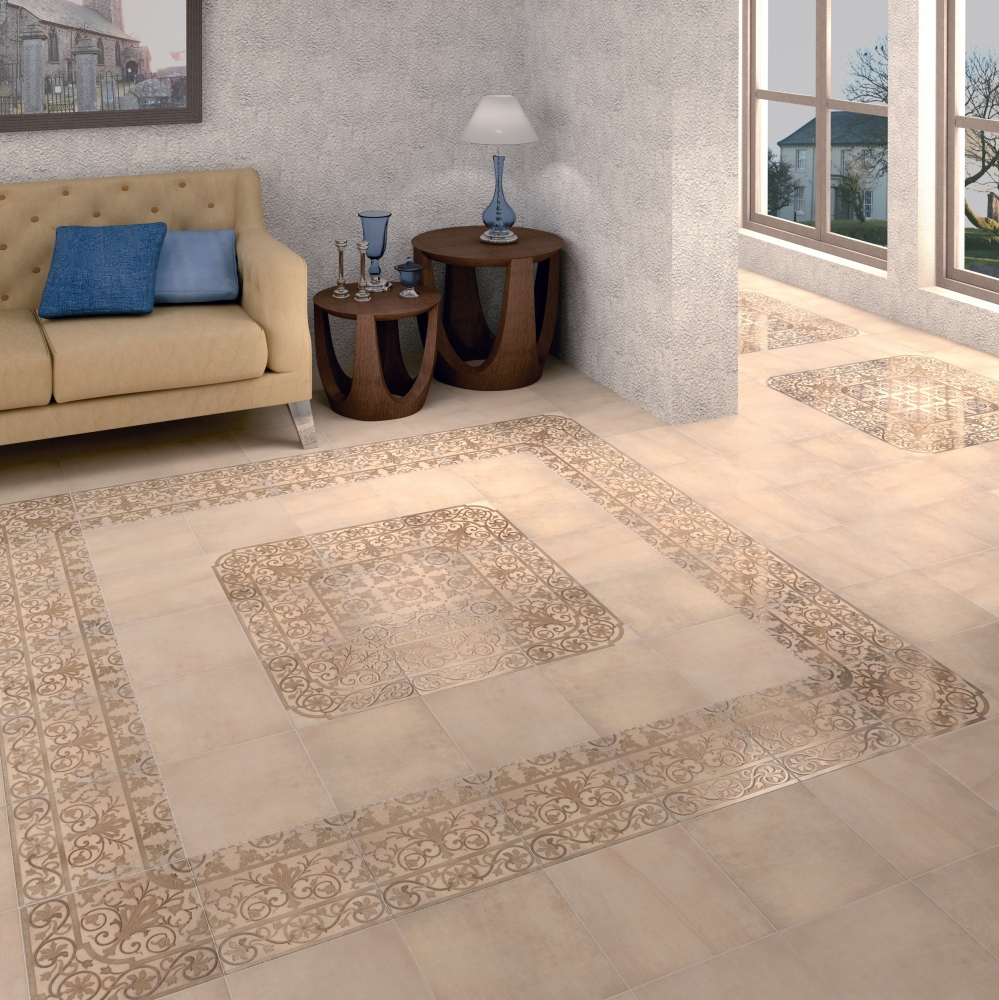
You can lay out the floor the same monochromatic tile or consider more interesting options. For small premises it is recommended to lay the floor with one-color glossy light tiles: this way you can visually expand the space. If you have a spacious bathroom, living room, kitchen or hallway, you can think of more interesting design options. For example, you can combine such a finish with contrasting inserts, framed borders.

The alternation of light tiles of similar shades in the center of attention of the floor design. For example, you can put it in a checkerboard pattern. In order for this option to look good, the entire tile must be identical in texture (glossy or matte). Colors should be as close as possible in order to create a smooth transition effect from afar. For such a design fit beige and light brown, khaki and olive, light gray and ivory. In more complex versions, you can try a combination of three colors.
With the help of a tile of several colors you can divide the room into several zones. The easiest option is to choose two different colors of tiles and lay out half of the room in one color, half in another.If you have a bright modern design, you can choose a contrasting color. For more conservative projects it is worth choosing, for example, light brown with terracotta or beige with yellow.

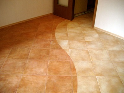
Now it is fashionable to make smooth gradient transitions on the floor. With their help, you can divide the room into zones. Smooth color transitions can serve as a transition from one space to another (for example, from the bathroom to the hallway, from the hallway to the living room). Sometimes for the gradient take one color, different saturation: for example, light pink, dark pink and red. But do not forget that the light shade of the tile should dominate.
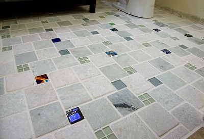
In many interiors it will be interesting to look at a mosaic of tiles. Now produce tiles of different shapes and sizes to create unique patterns. You can lay out painted squares and rectangles of different colors in a mosaic in a circle, make an ornament around the perimeter of the room or arrange the entire floor in this way. Most often they use floral ornaments typical of traditional interiors, however, it will be interesting to look at an abstract pattern.
Interesting solutions
Whatever tile you choose for decorating your house or apartment, it is important that it fit into the overall design concept. First you should decide on the style of the interior.It will depend on it shades, texture and placement of tiles. You can pick up an interesting texture for classic style and baroque. These are the light monophonic options close to white. In combination with painted tiles they make up the original patterns. For neoclassicism, pastel colors (pink, yellow, blue, green) are permissible.


Interesting tile in light shades looks in the style of Provence. Select for the floor should be matte varieties of cladding with a simple design. Such a design will emphasize light wooden furniture and will create an atmosphere of refined simplicity in the French province in the house. Often for this style choose ivory, beige or warm pink.

In the modern interior (for example, high-tech style) light finish looks stylish. However, in this case, you need to choose a warm color and matte texture. Modern interiors are concise, so in living rooms it is important to take into account the ease of perception of the material. Difficult designs and a combination of finishing with a motley scale are inadmissible.
In the interiors of an eclectic style, almost any experiments are possible.However, it is not necessary to combine more than three shades of floor material. If you choose a bright tone for the floor, it is better to balance it with a reserved companion. For example, bleached brown is in harmony with beige and light gray, caramel is combined with beige.
How to lay the floor tile with your own hands, you can learn from the video below.