Choosing the color of linoleum
Linoleum is a flooring material that, unlike parquet and laminate, has a wider range of colors, and, in contrast to tile, is softer and warmer. The coloring of the floor can be monophonic or patterned. Interior designers have a secret formula for calculating the shade for the floor, which, combined with the principles of the influence of color on the psyche, will help you choose the shade of the floor for a harmonious room design.
The effect of color on the psyche
Psychologists believe that the color of the room affects the mental perception of its inhabitants. A bedroom is a place to go to sleep, where a transition to a state of relaxation occurs, when the brain enters a “sleeping” mode and the psyche becomes more suggestible, the contemplation of colors this moment has a special effect on the subconscious mind. Therefore, the color of the bedroom affects the person's emotions.
The living room is a place for communication, its interior should promote openness. Color can affect the friendliness of the interlocutors.The color on which the eye falls every day can form an emotional background.
The influence of colors on the psyche and different:
- Red excites the nervous system, forcing a person to act. Red-orange bedroom can cause a surge of excitement in men. This bedroom should be well decorated, oriental style is best suited. The red bedroom can only be soft, then it will be associated with a temptation for a man, if the color is too straightforward, he will prefer to go in for sports. Such a room can not be done in the main bedroom, because the red pressure on the psyche and causes nervousness.
- Blue calms mental activity, helps to sleep, but reduces appetite, it is good for the bedroom and the nursery.
- Gray adjusts to mental work;

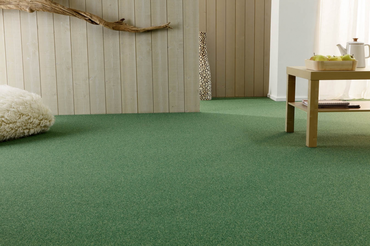
- Herbal green promotes proper rest, relieves fatigue, dark green soothes;
- White color clears the head of unnecessary information, a long stay in the white room allows you to change the mind, in this room new ideas and a different look at familiar things arise;
- Fuchsia and shades of pink activate the imagination, which is useful for children and creative people, they allow you to relax not only physically, but also emotionally.
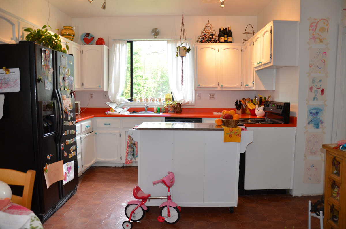
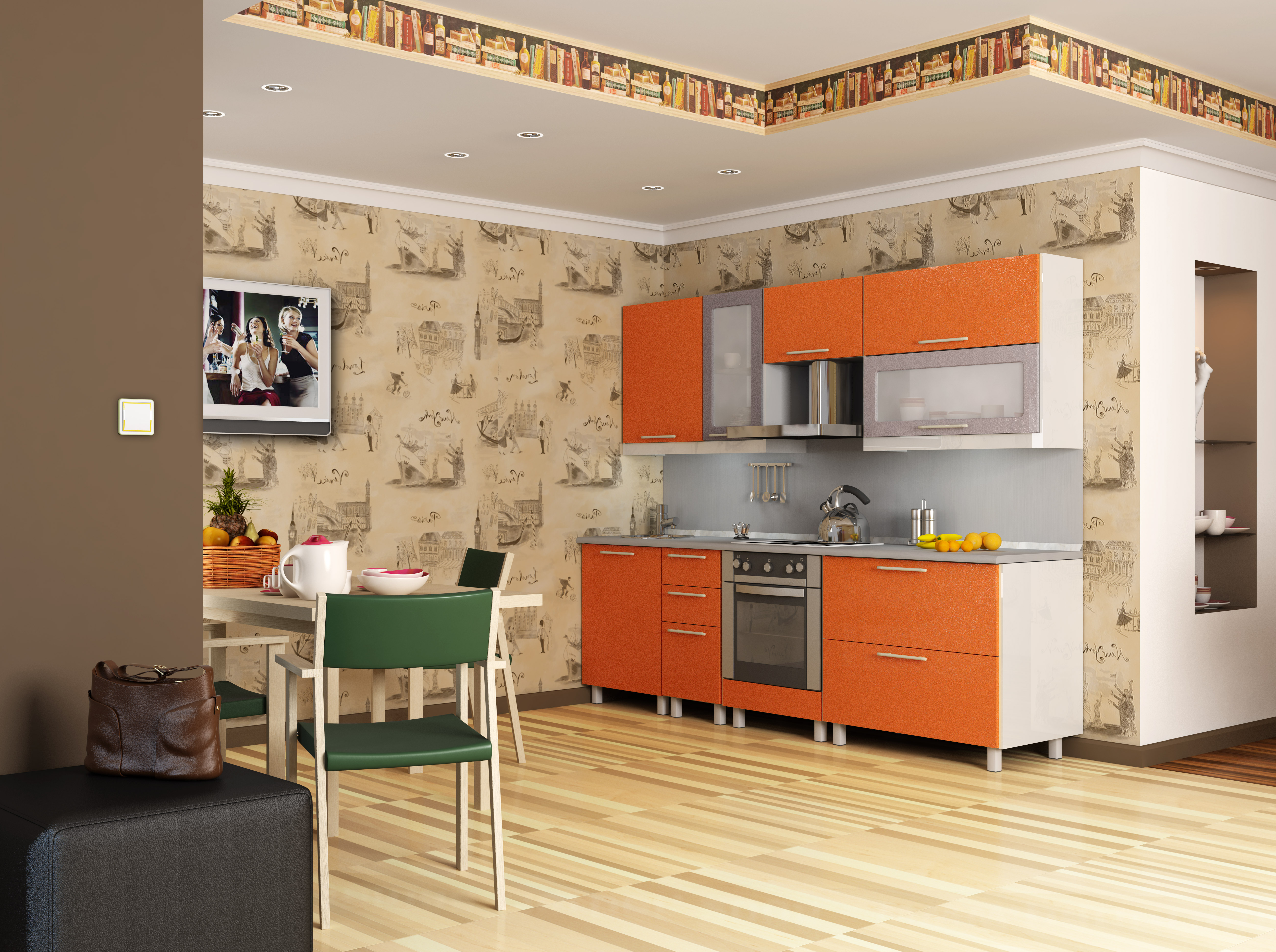
- Orange charges with emotion, excites appetite, but do not be afraid that you overeat, because appetite grows only to healthy food, this is due to the fact that this color is associated with the sun and causes an unconscious desire to feed on the gifts of nature. That is why it is good for the interior of the kitchen.
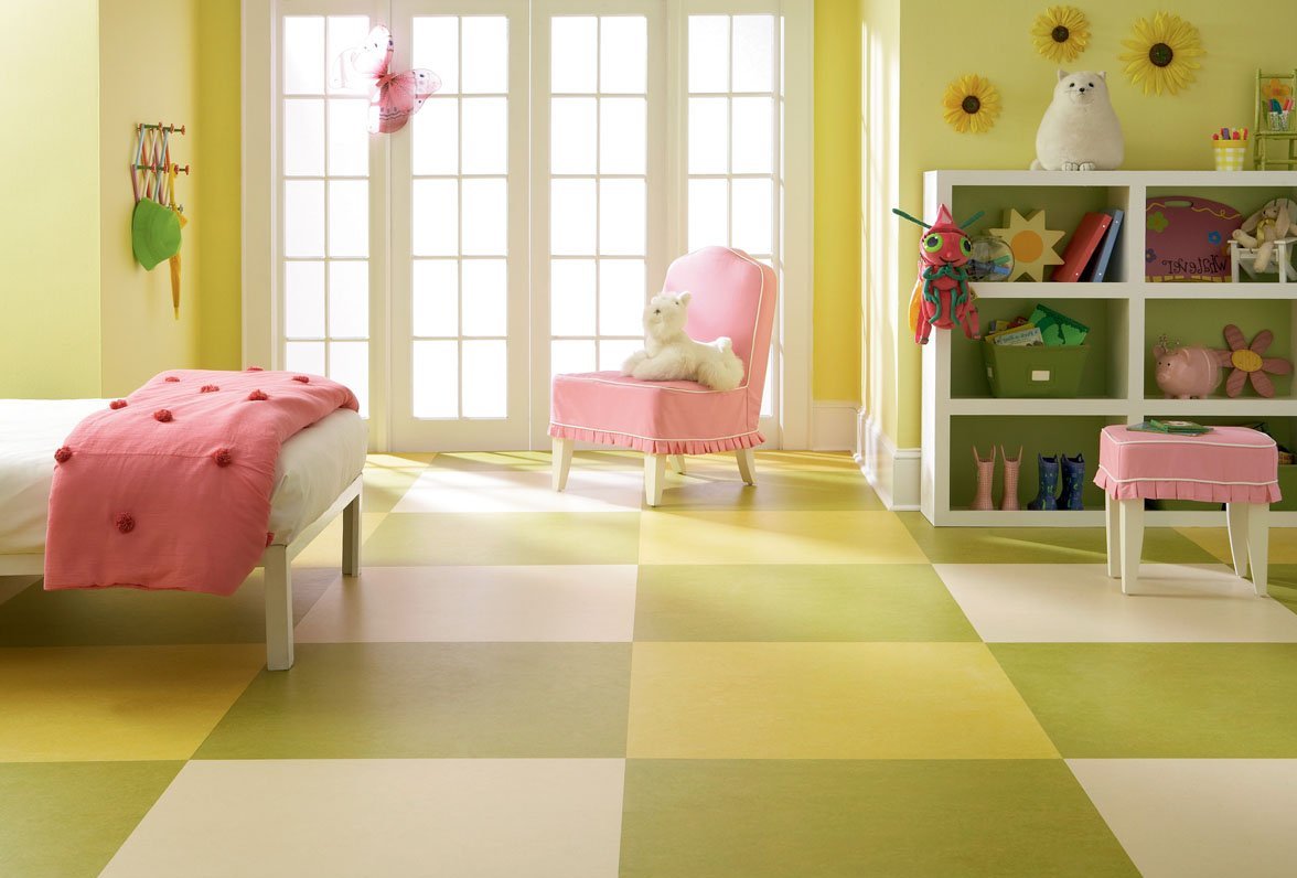
- Yellow can compensate for the lack of sunlight and creates an atmosphere of well-being, but in the interior of the bedroom it looks too exciting and can interfere with sleep, it is better to use it for the nursery, so that the child can have fun playing or the bathroom to feel cheerful in the morning;
- Brown adjusts to friendly communication and gives a feeling of comfort;
- Dark blue - the color of the starry sky, used in the interior of the office, it will help to concentrate and tune in to work.
- Violet helps to quickly focus on the inner world, to enter into a light trance, especially if you contemplate bright purple details against the background of a light-purple floor. The color as a floor covering will suit the room of a small area in combination with white, which gives lightness to lilac.
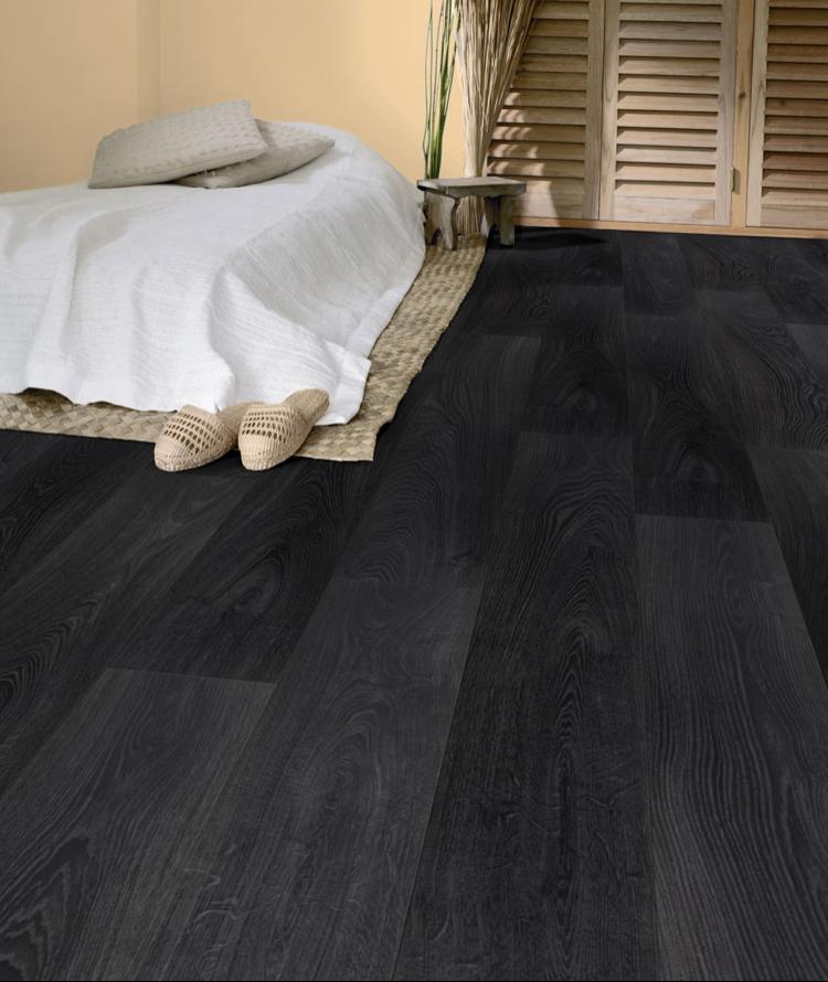
- Black color in large quantities affects depressing, it should not be used in the interior of the bedroom.
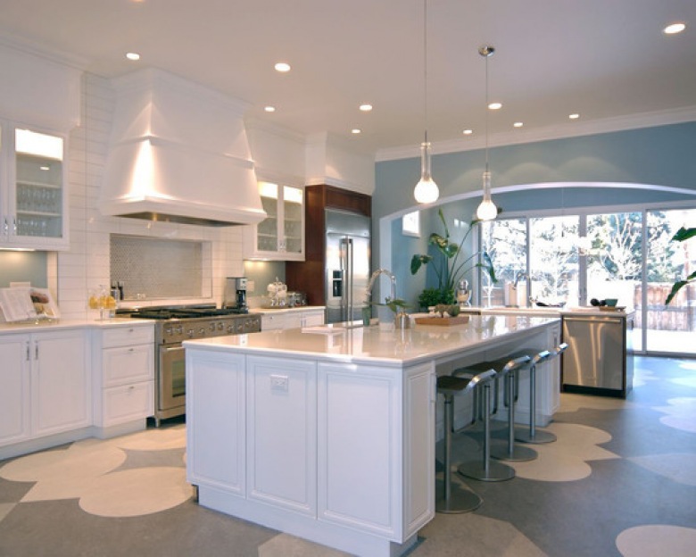
The advantages and disadvantages of light colors
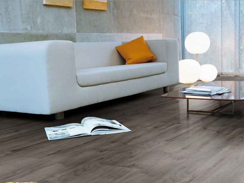
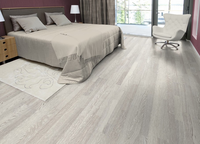
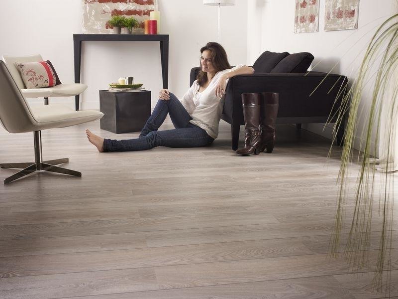
The bright shades of linoleum are white, gray and beige tones. Light floor in the room gives a state of lightness. The interior with a light floor gives a feeling of cleanliness, visually expands the space and draws attention to beautiful objects. Above the light gray and beige floor lamps look silvery shades.
They have one drawback - if such a floor is stained, the stain will be noticeable, and over time there will be traces that cannot be cleaned.
Fashionable colors
To choose the main tone of the room, you need to understand what types of fashionable colors are. There is no single standard for describing shades of flooring, each manufacturer offers its own names of patterns.
The main types of images on the surface of the material:
- monophonic;
- with pattern;
- with imitation parquet, laminate or tile.
First, consider the universal options.
You can choose these colors if you change the floor in a room that is already furnished.
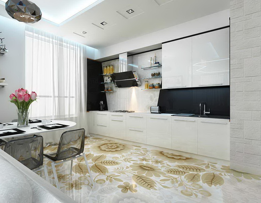
White
The advantage of white linoleum is that, complete with contrast baseboards, it gives space to geometry.Milky-white floor is suitable for dark brown furniture to create an interior in shades of coffee with cream. Beige linoleum with imitation of laminate - a good design for a room in pastel colors. On the background of light linoleum can look great any furniture.
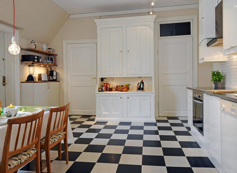
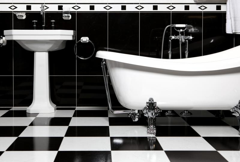
Black and white
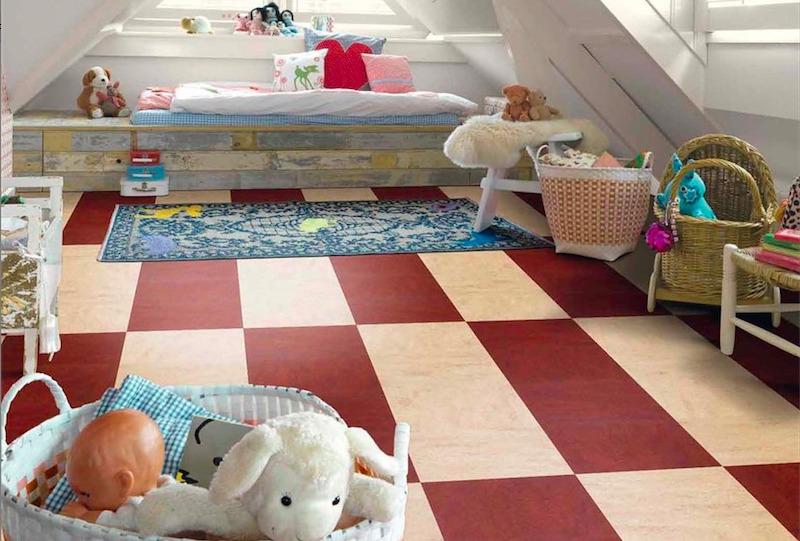
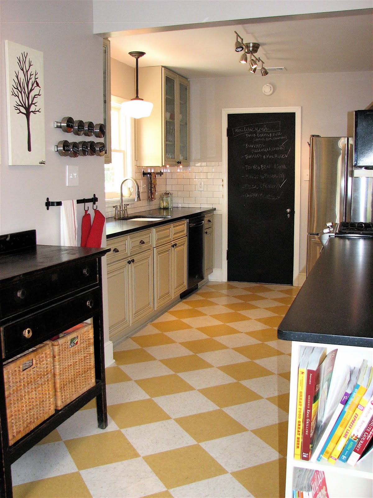
The most current version of the black and white floor is a tile in the form of a chessboard. This design is most often chosen for the kitchen in the art deco style.
Design in the form of a black and white cell can be the basis of the original design, on such floors look bright bright pieces of furniture. Black and white colors are the best solution for rooms in which there are a lot of things, because the drawing allows you to distribute objects in space, and the room does not look overloaded.
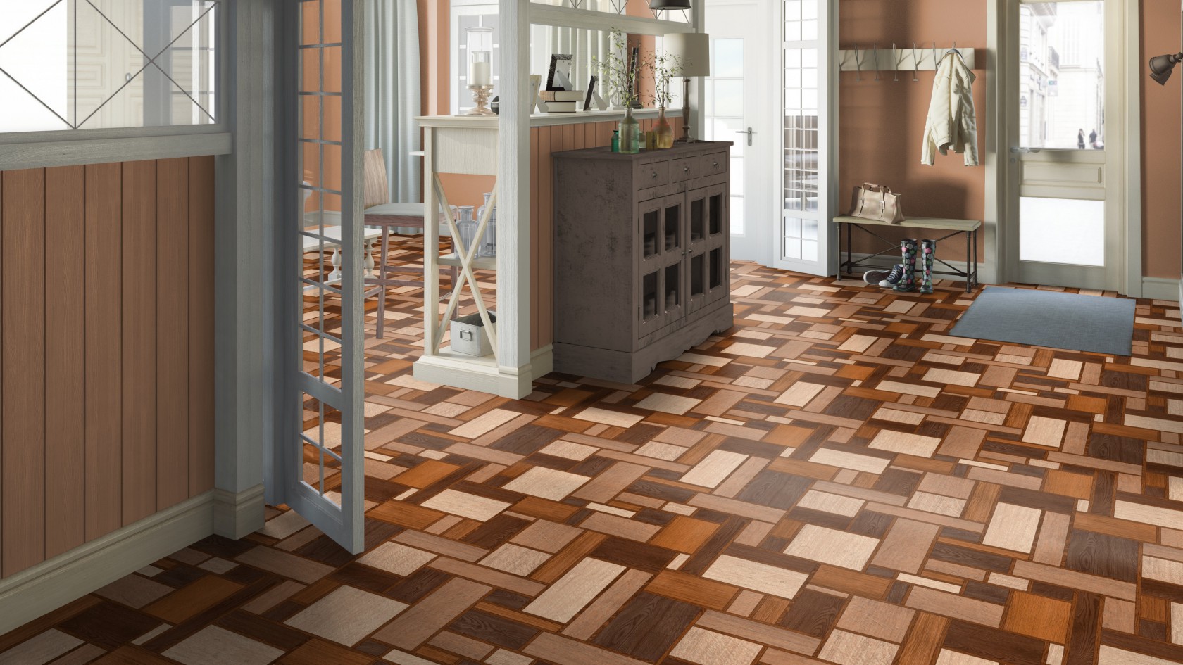
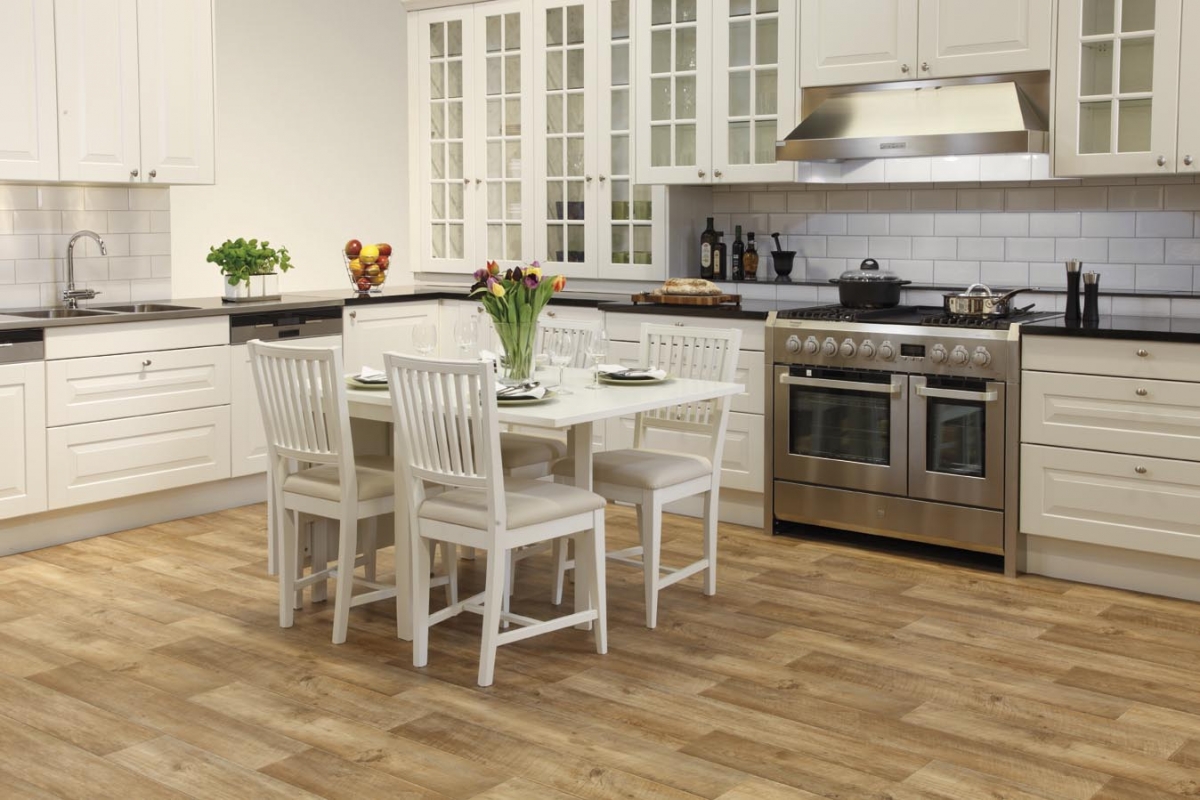
Texture Imitation
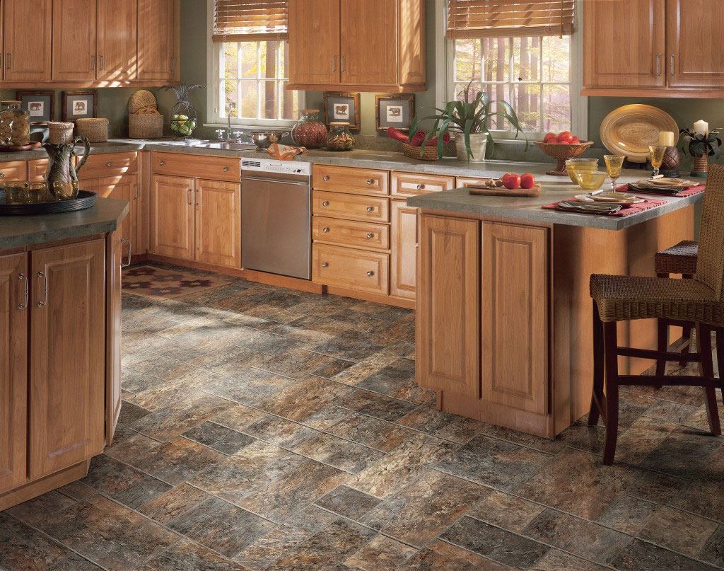
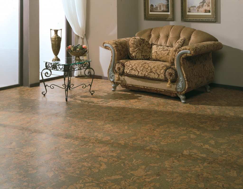
If you can not afford parquet, then an interesting solution would be textured linoleum with imitation of natural wood. There is a wide range of brown and wood tones on sale:
- under oak;
- nut;
- ash.
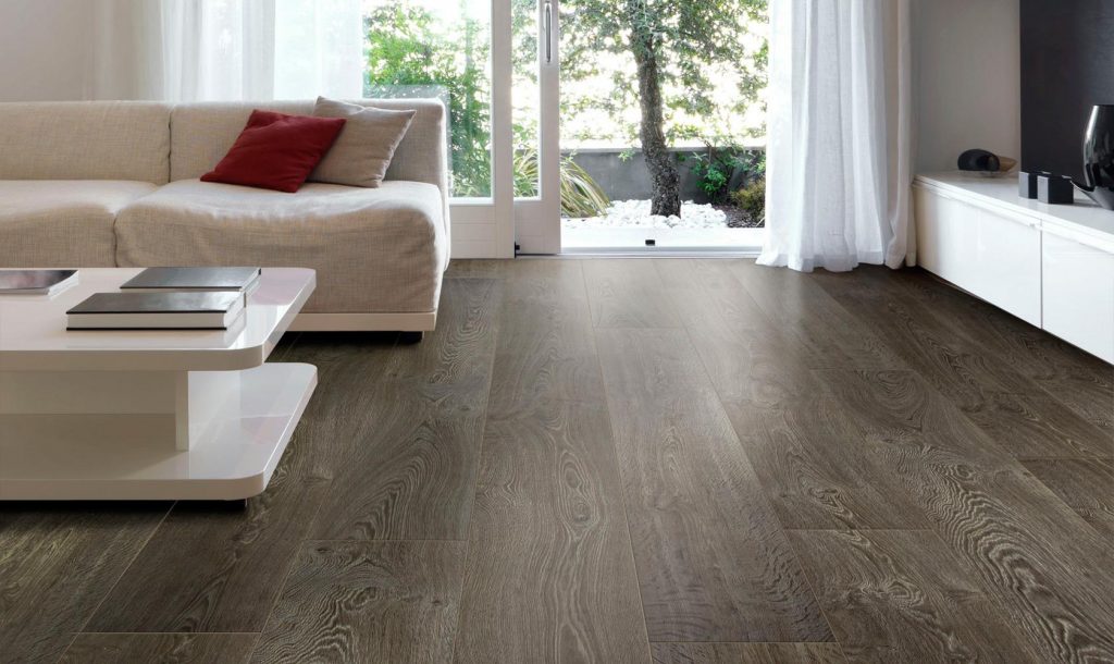
Such coatings are several times cheaper than natural parquet. Textured linoleum can be made:
- under the tree;
- tile;
- marble.
In addition, it is easy to clean, easy to fit and creates a pleasant color of the room.
Visually, linoleum is distinguished from laminate by a soft glossy sheen, a laminate either more brilliant or matte.
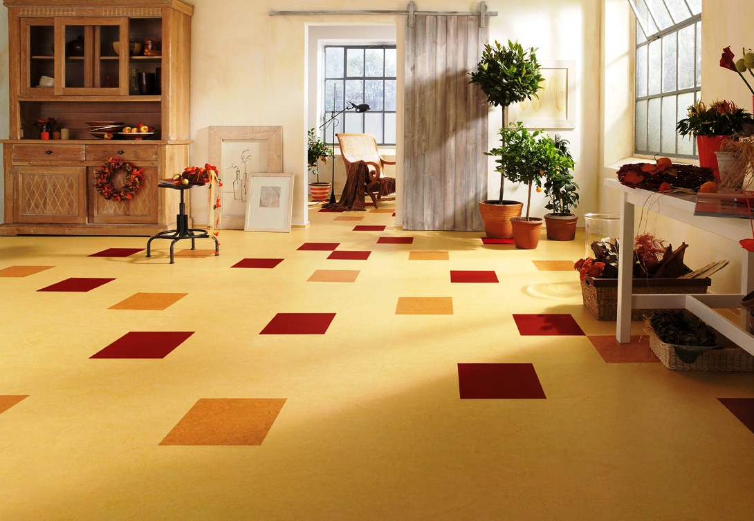
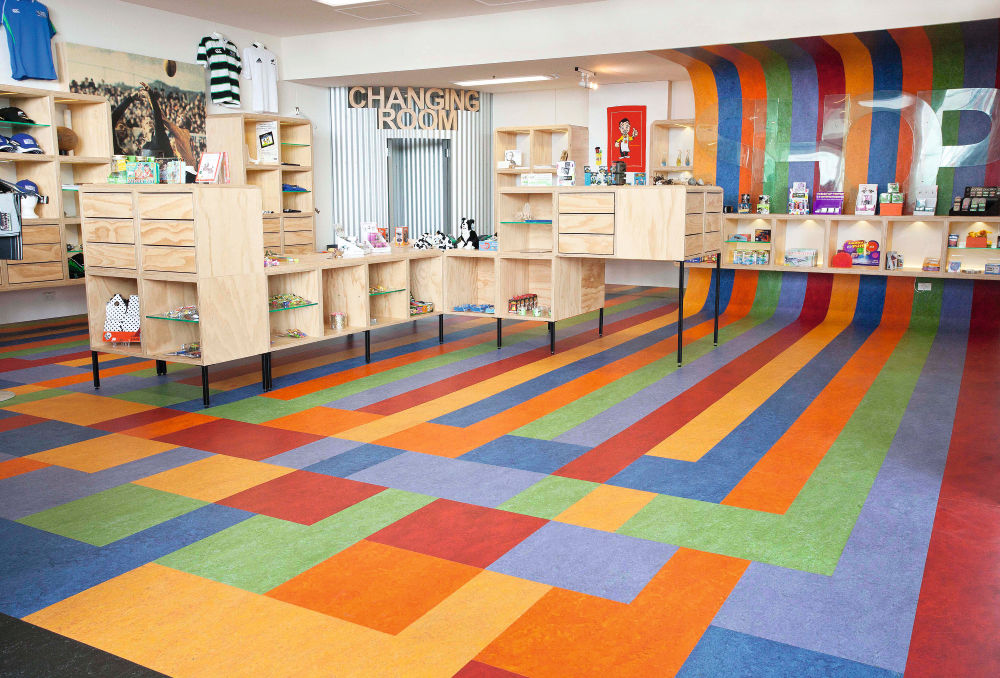
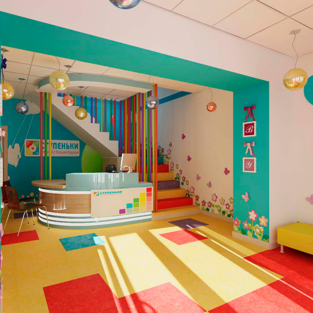
Multicolored
We will understand in what cases it is worth choosing colored linoleum:
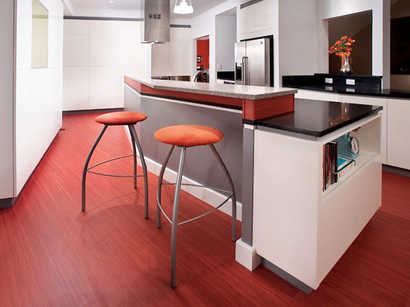
- Red complex for a harmonious design, it is a color that affects the psyche annoyingly, its use can spoil the whole impression of the repair. Therefore, take red only if it is part of a palette that you have specifically designed for design.
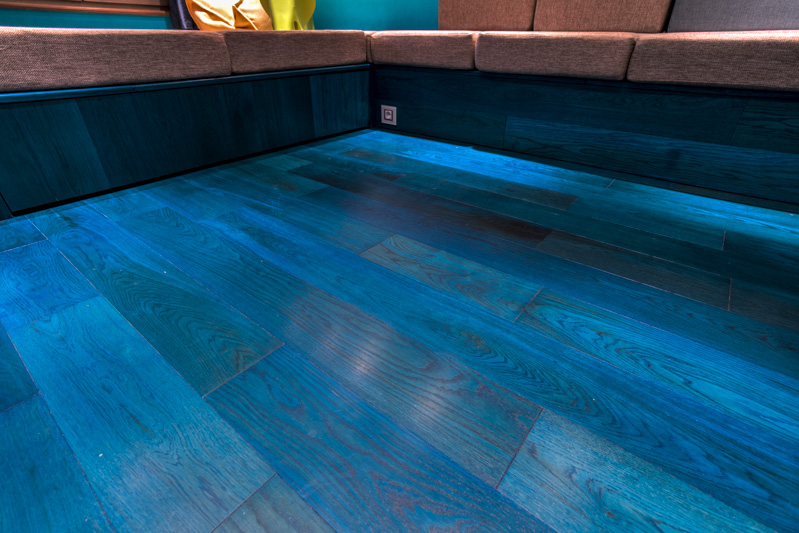
- Blue Shade coating is useful if you are doing repairs on the seascape. To search for linoleum you need the exact shade. If you are at a loss with a choice, then look for a fashionable shade "niagara". But do not take the blue cell, it looks pretty cheap.
- Blue Linoleum is suitable for the realization of ideas based on images of nature. The room, made in blue, adjusts to the dreamy mood and activates the creative resource. Such linoleum is also a good way to immerse you in the atmosphere of the beach and add energy to the room.
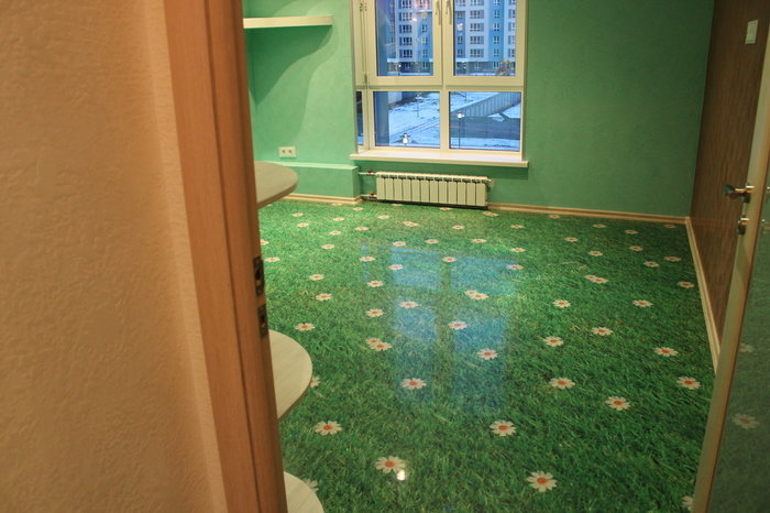
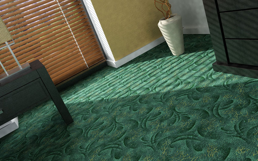
- Among green shades the most trendy option is imitation of grass, because in recent years everything natural in fashion has been in fashion. 3D drawing with grass imitation is a great choice for a bathroom complete with tiles. Washing your face early in the morning you can feel the freshness of the village meadow. Grass linoleum is the perfect decoration for a room made in a forest color with photo murals depicting a forest. To arrange color accents, you can put a dark green rug with a long nap, imitating moss.
- Purple Linoleum does not apply to universal colors. It can not be acquired simply because it wanted, because such a complex color can spoil the whole idea of design. You can choose a purple coating only with a printout of the exact shade in your hands. A similar design element may suit the taste of a young girl or child. Purple goes well with pink.
If the bedroom has a bed with a wooden headboard or with an iron frame, then choose plain linoleum, if you have a sofa with a fabric upholstery, then you can choose a shade with a textured pattern.
How to combine shades?
If you hire a master for repair, who owns the technical side of the case,but can not create an artistic image of the room, the room will look like a cheap hotel - simple, clean, but completely tasteless. A real interior designer, rather than a simple designer, creates the idea of an interior design with a painting. This solution can be implemented only by a designer with a delicate sense of taste. Combine the colors in the interior of the picture and you can yourself.
Step-by-step instructions on how to do this:
- Find an image that suits your mood for the room, it can be a picture or a photo of nature and even food.
- Use the color palettes to determine the primary colors in the picture.
- Write the approximate amount of color in percent.
- For yourself, decide which items are easier for you to buy in a particular color.
- You can not go wrong if you take the darkest shade for the floor. In some cases, you can take a beige or gray shade, if it is in the palette. However, do not take a bright color for the floor. Bright colors in your palette will be useful for arranging color accents.
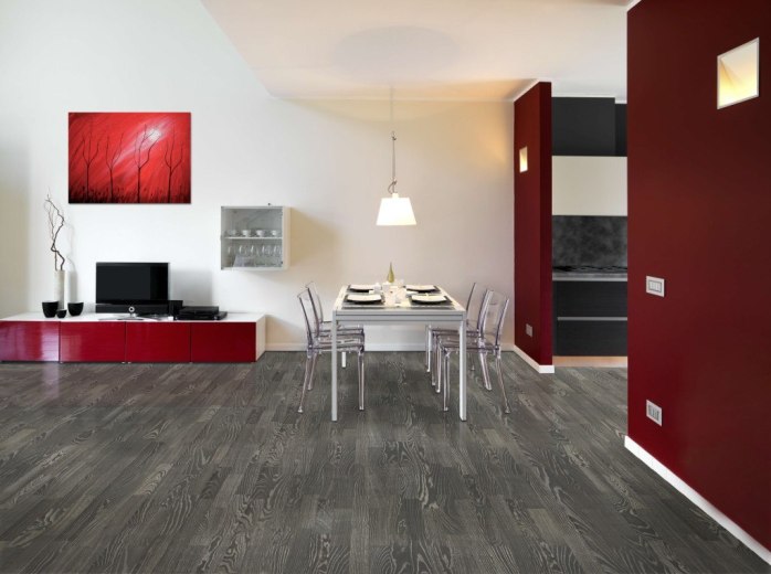
Masters of repair claim that the main rule of color combinations in the interior is not to do the plinth, wall and floor covering of the same color.If you make the baseboard and the floor in bright colors, the room will lose shape. If you do the same in dark colors, it will look too gloomy, the room will become smaller, it will be uncomfortable in it. Ideally, the plinth, walls and floor should be contrasted, it emphasizes the shape of the room. So feel free to pick up the plinth to the door, and the floor and walls do the same color.
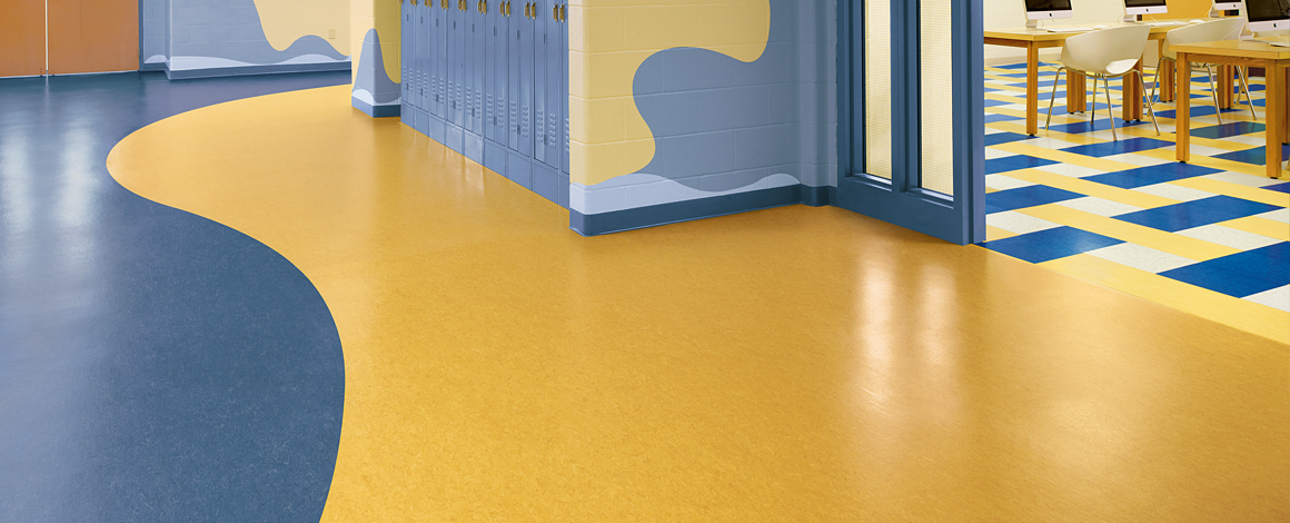
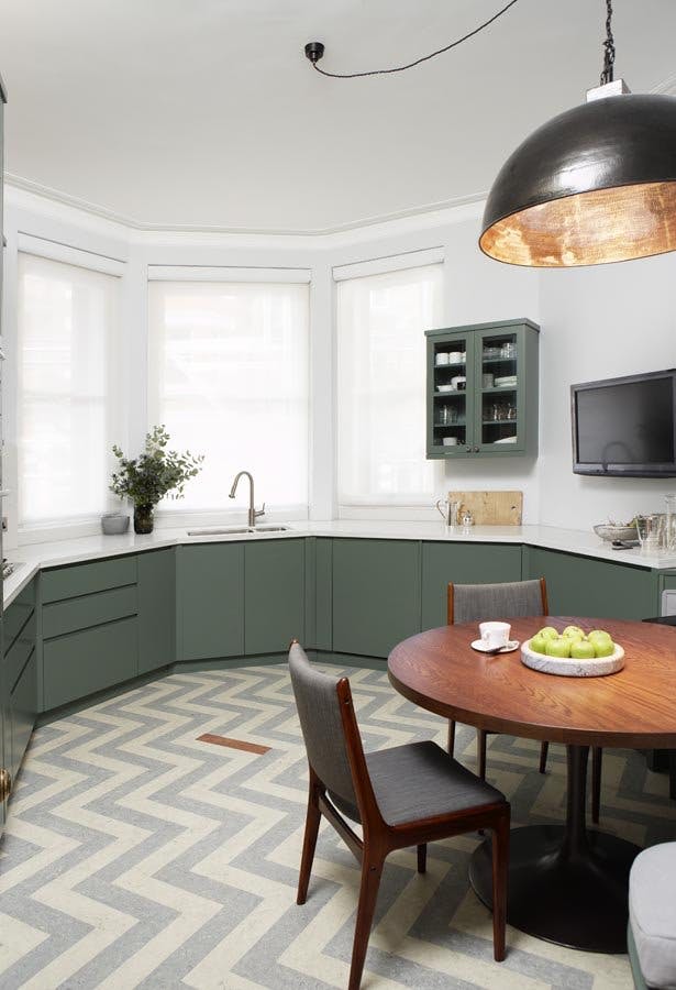
Overloading the premises with a drawing is a waste of money. If the wall is covered with wallpaper with an ornament, then the linoleum should be monotonous or imitating parquet.
If the wall is monochromatic, then linoleum may be patterned, but the wall color must be present in the pattern by 30%.
How to choose for different rooms?
Some, presenting repairs in the apartment, see one sheet of linoleum, laid in all the rooms. However, this is not a sign of perfect taste, since each room has its own personality, therefore the mood should be different.
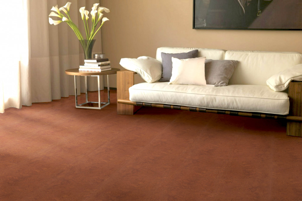
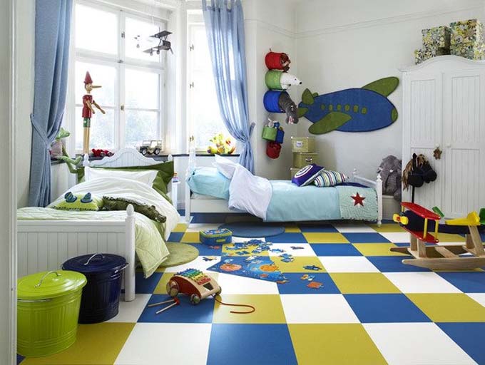
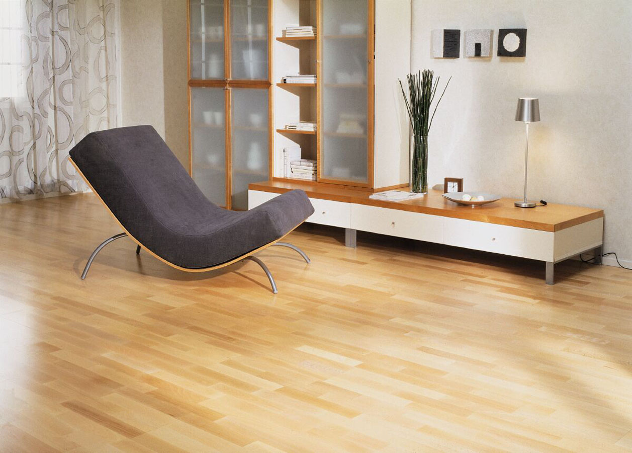
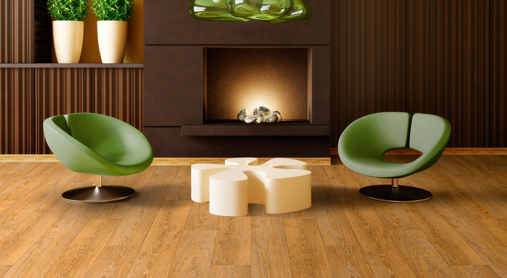
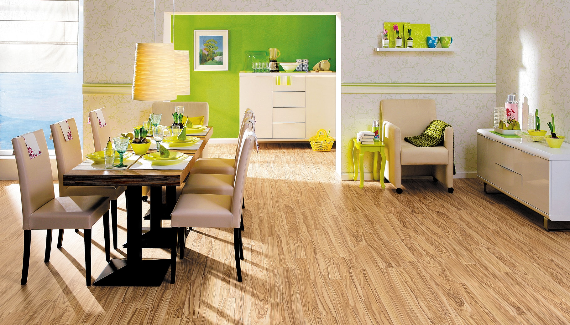
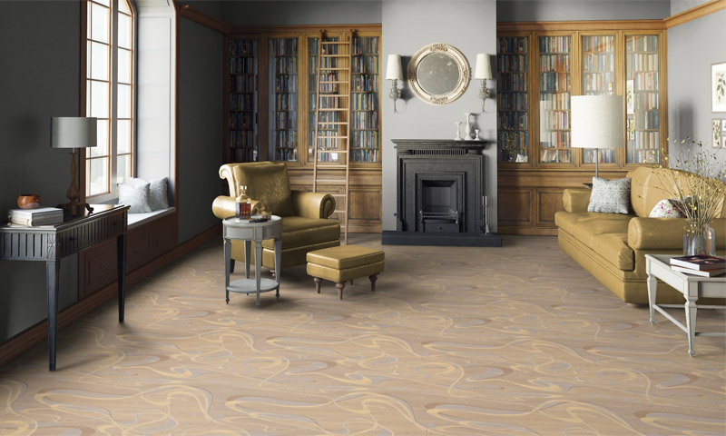
For the living room flooring it is better to choose brown, orange, green and even yellow, because these colors create a friendly atmosphere, they are part of nature and can create a feeling of soil, grass or a flowering meadow under your feet.

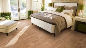
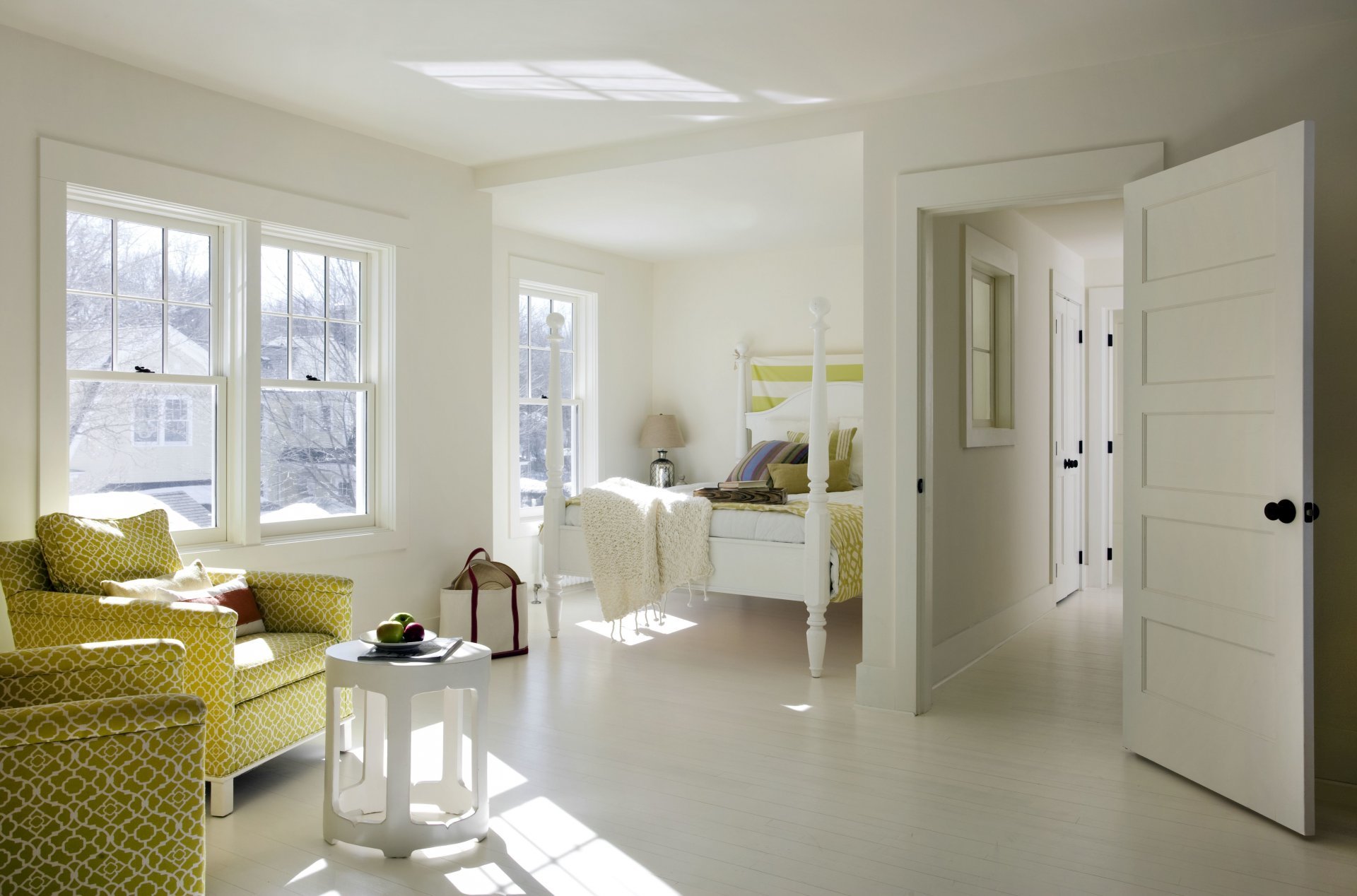
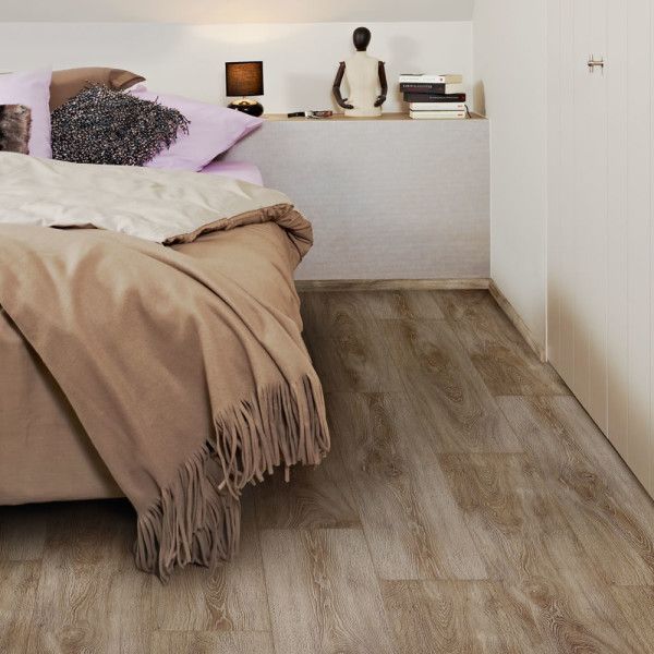
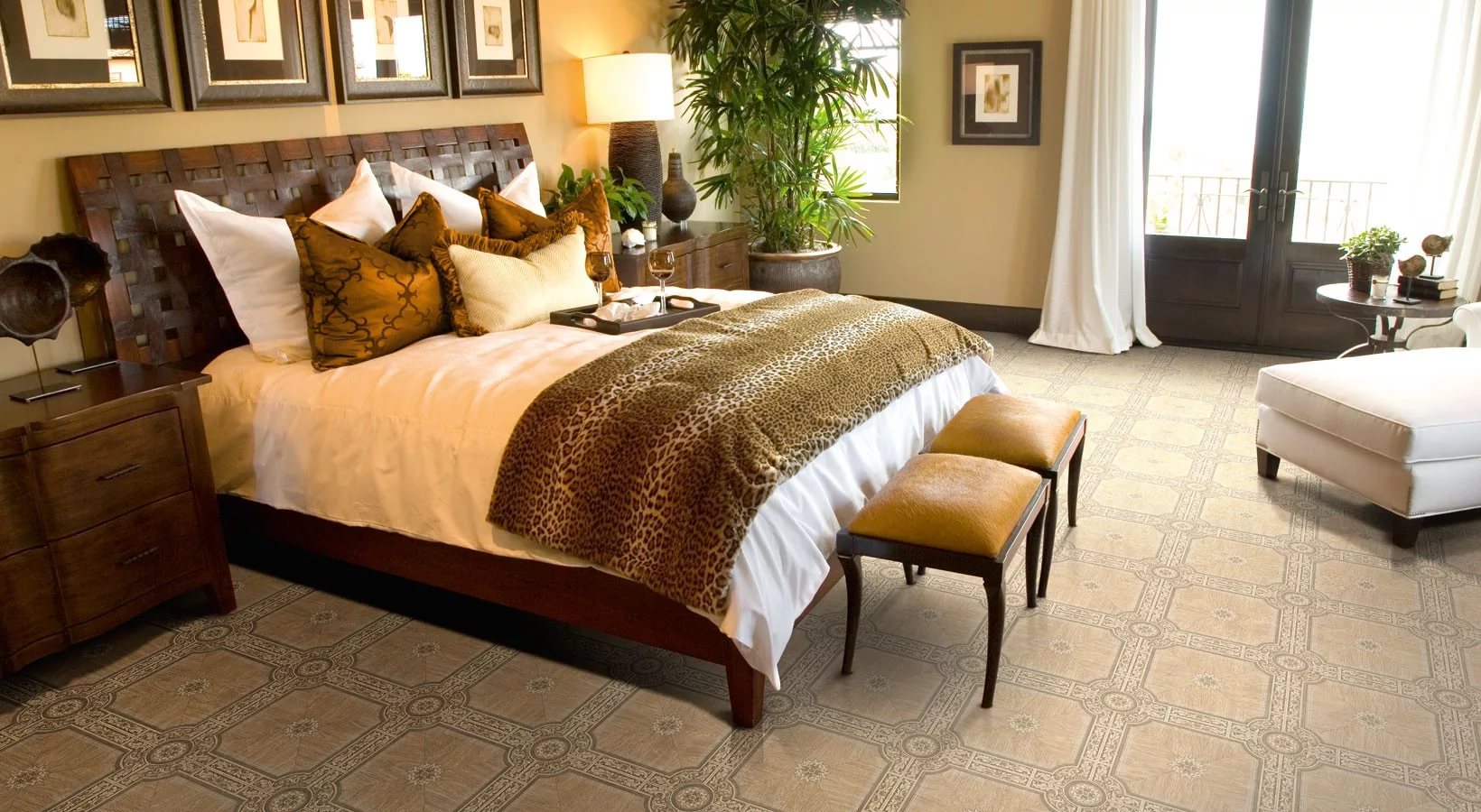
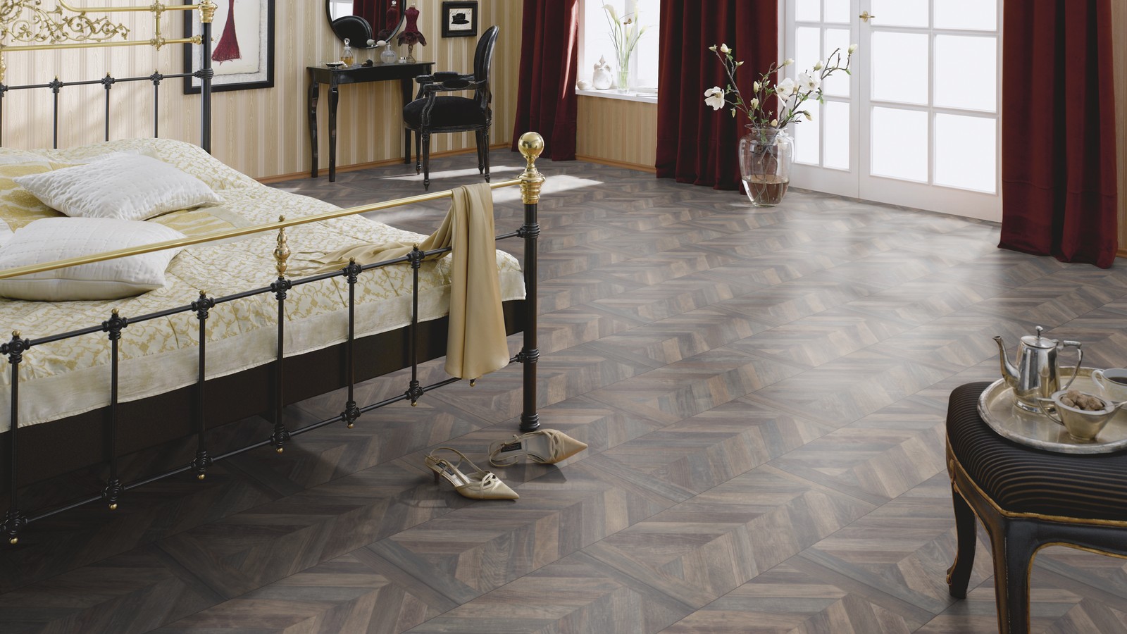
If the bedroom is designed for one person, then one of the colors that tune in for relaxation is blue, pink, white, beige, and peach. However, keep in mind, pastel colors contribute to care in yourself. If this is the bedroom of the spouses, then the colors should combine a couple. For example, brown, dark green, purple, and red sex can gently increase sexuality.
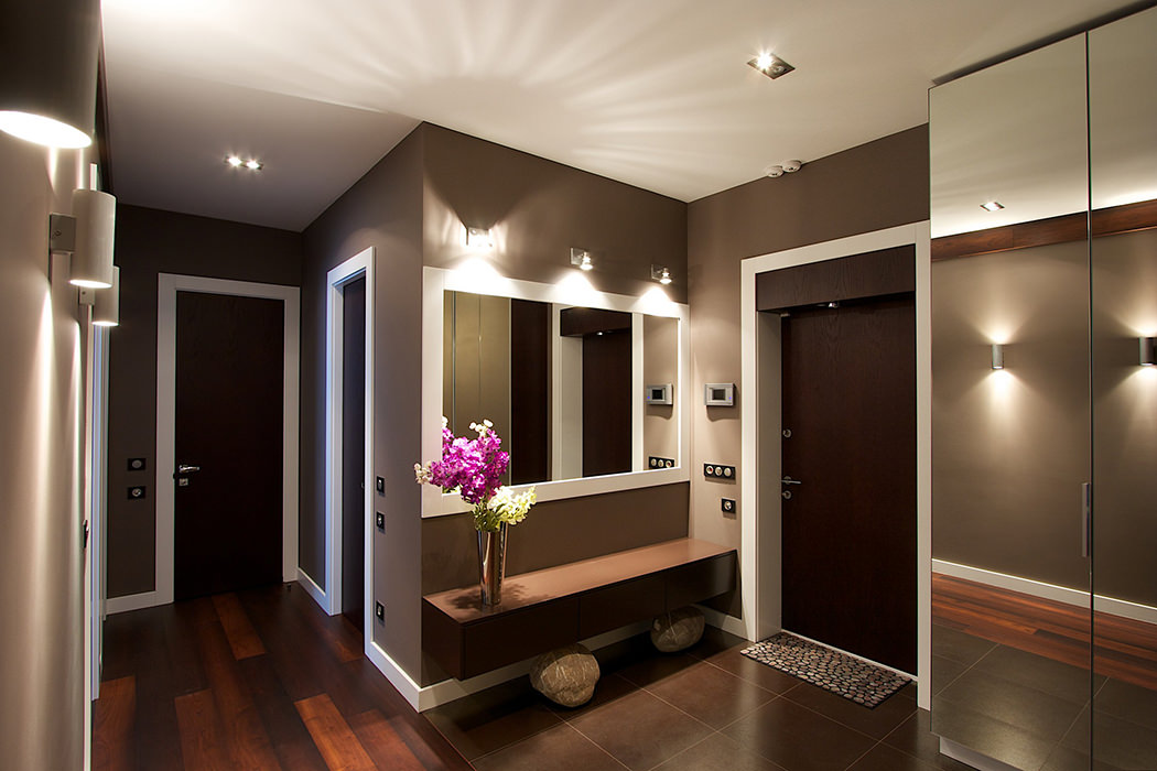
For the corridor, it is better to choose a color on which dirt is least noticeable. These are dark shades of blue, gray and brown.
There are colors that are universal for any room. These are shades of brown and beige.
Common mistakes
It is better to know in advance about possible errors when choosing linoleum, so that you do not have to regret it at the end of the repair:
- Color linoleum, chosen for the love of color, and not based on the design of the room. This happens when they change the floor in their bedroom. As a result, the color of the floor is not combined with the situation. This error can be avoided by choosing a neutral color (white, beige, woody).
- The color of linoleum is too bright. If you take an image that has a dominant color as the basis for the artistic solution of a room, then choose it for walls.For the floor, take the darkest monochrome option. In addition, it will help hide the unevenness of the floor.
- Furniture "hangs" in the air. Such a feeling, according to reviews, is created if the color of the floor is white, and the color of the furniture is black or dark brown. Remember, if the white floor is solid, the furniture should not be a contrast, it can be light brown or light gray. If you want to choose a light floor under black furniture, then let it be an imitation of a board or cage.
Beautiful ideas in the interior of the apartment
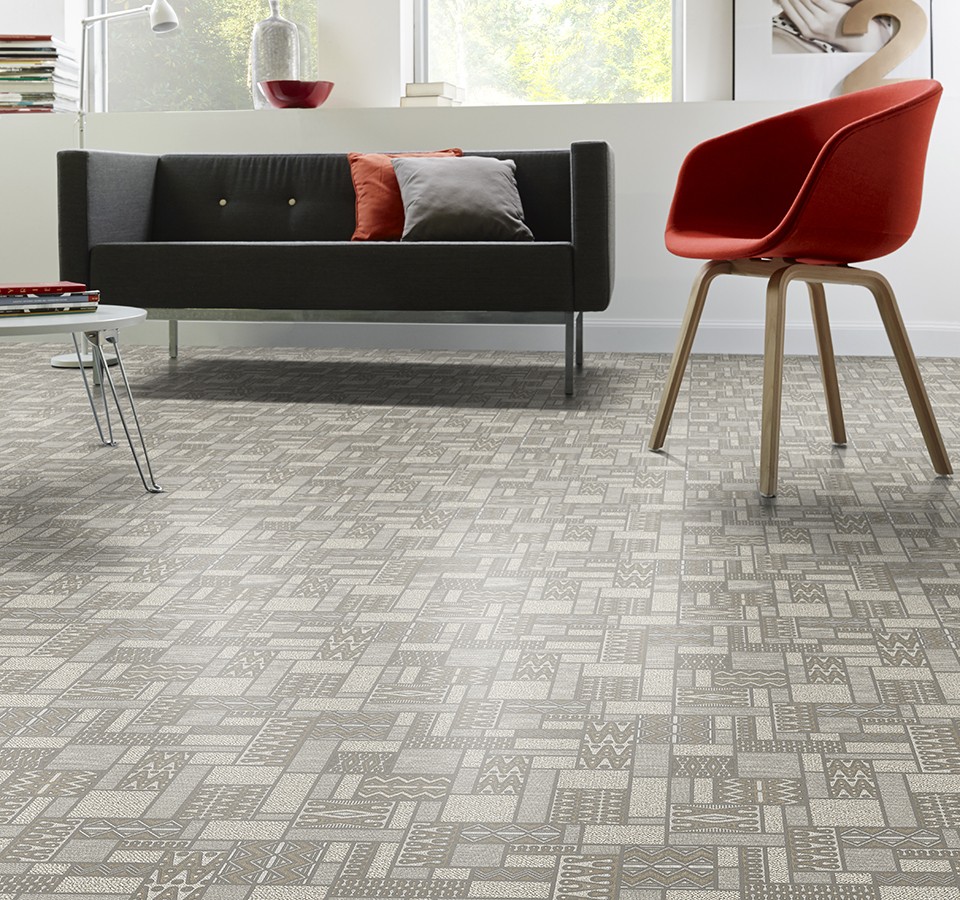
Create a minimalist design can only be using white. Assess how exactly gray linoleum looks, not inferior in appearance to laminate. The composition of the room looks stylish thanks to a combination of 4 colors: white and gray create the basis of the room, white calms, and gray gives the illusion of stability, red makes an energetic touch.
Purple linoleum would not be a risky combination if you make the wall color the same as the floor color. The rich tone looks great with the ornate silhouette of the bed, refined lamps look good against the wall. The result was an original bedroom for a young dreamer.
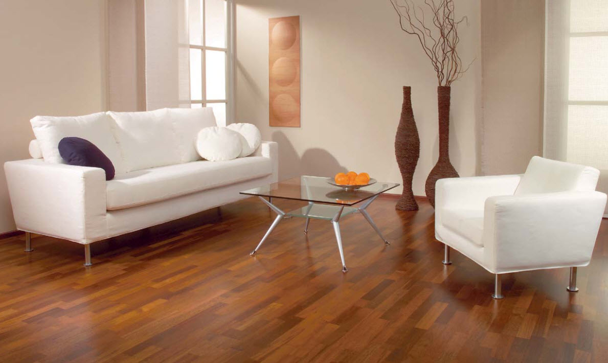
Please note that it is the rich color of the floor covering in the living room that creates a friendly atmosphere of comfortable rest. Immediately and imperceptibly, the interior design is made according to the shade of coffee with milk, the white sofas against the background of the floor look cozy, the visitors of such a living room unconsciously feel the urge to stay in it longer and drink coffee.
Learn more about how to choose linoleum and its color, you will learn from the following video.